Color Printing 101: the RGB & CMYK gamuts

The science behind color itself is at the heart of printing – and key to meeting the expectations you have for a beautifully printed project. The first step in understanding the boundaries of printable color is to know that the human eye can detect much more color than is possible for your computer monitor to display. In turn, your monitor can show more colors than it is possible to reproduce in offset printing.

The best illustration of this is a color gamut comparison chart where you can actually see the ‘real estate’ involved in each spectrum. (It’s always seemed odd to me that we use this illustration either on a printed page or a monitor… both of which are limiting the actual colors they are trying to represent!) In the figure below, the entire color shape represents all the visible spectrum of light.

Color spectrum - RGB & CMYK gamuts
Color Gamut Comparison

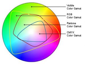
The RBG color area represents the specific wavelengths of light your monitor emits, and is clearly a much smaller area. Even smaller is the CMYK gamut showing colors that can be reproduced with printing inks. Cyan, Magenta and Yellow pigments (K or Black is added to create depth, definition and ensure a true black color) work as filters that subtract certain wavelengths of light and reflect others. They combine to create a spectrum of printable color.

Switching a file from RGB to CMYK in PhotoShop on your screen can visually show you the color shift that occurs when you switch to a more restrictive gamut. Try it on a random image and see if you notice a significant loss of color. Some printers prefer you leave your images in RBG mode with ICC profiles attached, while others prefer you go ahead and switch to CMYK mode, as that will inevitably happen before the printing process.

Most cameras and scanners capture color in RGB mode (or to get even more technical, the “sRGB” mode, or a standard definition of what colors can be shown on a computer monitor, as opposed to all the RGB colors that can be seen visually with reflective light). Some cameras have the aRGB (AdobeRGB) definition or a selection called “Raw” – it can capture more colors digitally than you will be able to see, but may be helpful when you edit and adjust your photographs in an editing program such as PhotoShop.

Printing methods are able to reproduce only a certain gamut of colors as well. When files contain colors that fall outside of that gamut, the RIP process must decide what to do with those colors – i.e., how to alter them in specific ways to make them become a color which is printable – and this is decided by the Rendering Intent options of the RIP software or printer driver. Rendering intents are mathematical formulas that alter out-of-gamut colors in predefined ways.

When an exact color match is needed on your print project, consider using a spot color ink in your design. Metallic inks also can give a great effect that isn’t possible with combinations of just the 4-color process inks. Paper or media choice will also affect and enhance the quality of printed colors.

Contact us at ImageSmith for quotes on all your marketing projects, and more useful tips on how to create custom, high impact marketing solutions.

Using HTML Entities for Special Characters

At ImageSmith, we develop for a Content Management System (CMS) called DotNetNuke. This allows our clients to easily make text and image changes with a simple login. Usually the only type of content that needs to be added or updated is plain text, but sometimes you will run into the need of a special character like the copyright symbol (©) or a fraction (½). In HTML, an entity was can render pretty much any symbol imaginable using the combination of a few characters.

Using the Correct Syntax For HTML Entities

To make an HTML entity you have to follow a format. You type an ampersand, then the entity name, and you finish with a semicolon. If you type “©” in the source code of an HTML document you will get the copyright symbol like this: Copyright © 2011 by ImageSmith.

Pretty neat huh? There are many entities you can use on your website. For example, say you want to write content for the Romans in ancient Greece? There are entities for that:

Α Β Γ Δ Ε Ζ Η Θ Ι Κ Λ Μ Ν Ξ Ο Π Ρ Σ Τ Υ Φ Χ Ψ Ω
α β γ δ ε ζ η θ ι κ λ μ ν ξ ο π ρ ς σ τ υ φ χ ψ ω ϑ ϒ ϖ

To see a complete list of HTML entities, visit W3C (World Wide Web Consortium) for a current list of Character Entity References.

Do you need a website makeover or a completely new internet presence for your company? If so don’t hesitate to contact us for a free estimate and evaluation for your internet needs.

The Psychology of Color: What Do Colors “Mean”?

Color choice in design – whether you are painting a bedroom or developing a brand – involves a critical set of decisions that can easily lead your project astray. As in most things, some people have a talent for choosing color – its appropriate use, mixing and matching with other colors, varying hues and shades to create a desired effect – and they can do it intuitively. But for the rest of us, there is help – lots of it – in making color selections based on the security of a more scientific approach, or at least a time-tested one.

Color Choice for Print, Web, Marketing projects
Good color selection for any project is critical to its success.

Please don’t choose a color for your website or print project based on the fact that you like green. It’s great to like green… but it may not be the most effective choice for the brand you are illustrating or effect you are hoping to create. Also, any color on the color wheel has an almost unlimited variation of hue and saturation that can take a warm color into the cool spectrum and a happy color into melancholy! The choice of secondary colors in your palette can also disturb or enhance the effect you are creating and must be selected with all of this in mind. A lot of things to think about – right?

Two great resources to get you thinking about what your color selection might convey: check out Andy Crofford’s infographic at TechKing.com for a beautiful illustration of the color spectrum and how each stop along the way can best be used in design and what it represents.

Another great infographic is from Kissmetrics.com, explaining how color selection affects purchasing among consumers.

Here’s a brief framework of color psychology basics (at least on the positive side – with changes in hue and saturation, these colors can take on societally defined negative connotations as well):

White: clarity, openness, simplicity
Black: power, elegance, mystery
Gray: calm, a conservative approach
Brown: stability, hearth & home
Blue: dependability, security
Purple: wealth, nobility, creativity
Green: balance, rejuvenation, spring
Yellow: happiness, light, energy
Orange: energetic, warm, autumn
Red: passion, aggression, fire

Bear in mind, these are attributes Western society attaches to these colors. Many marketers have found out the hard way that these do not always hold consistent cross-culturally!

A great resource for developing a palette of colors to work with on any project is Adobe Color CC (formerly kuler) – built directly into InDesign and accessed with the Color Theme Tool. You can create various color themes with a simple click on any photo or artwork, add them to your swatches or export them into Creative Cloud Apps.

If your issue is the color paper you are printing on, Neenah Paper has both an app and an online Paper Selector to help.

Contact us at ImageSmith for quotes on all your marketing projects, and more useful tips on how to create custom, high impact marketing solutions.