IMAGESMITH has been hard at work here in western North Carolina providing print and marketing solutions for small and medium sized businesses for 40 years. We are happy to have been nominated as a Top NC Printing Company by The Startup Pill for our innovation and expertise in navigating a quickly changing marketing landscape. You can check out the rest of this list of great Tarheel print innovators here.
We love print, and the expanding and powerful role it plays in today’s ever-changing marketing mix. Still, the term “printer” can sound misleading. Today, printers do far more than put ink on paper. We have become media communications specialists for business owners and marketers, and we are your closest and most knowledgeable sources for consulting on your overall marketing strategy. A good printer will understand your budget, your marketing goals, and be able to suggest many strategies for creating results: integrated marketing strategies, direct mail, targeted variable data printing, promotional products, signage, branding, website development and e-commerce, social media marketing techniques, and unique design ideas. Discuss with them your target audience, your brand goals, who your consumer is, what your mission, budget, and specific goals are for the year. Together, we can develop and recommend specific marketing strategies that you can use to translate into profit and customer recognition of your brand and your work. The bottom line: why drain your energy trying to learn the new world of marketing on TOP of running your business when you already have a marketing consultant waiting to talk with you?
Call us at 828.684.4512 for any marketing needs. As a printer, we understand communication, design, and teamwork. Your printer should be able to provide you with the latest information, inspiration, technical advice, and innovative ideas for communicating your message through print, design and typography, signage, apparel, variable data printing and direct mail, integrated marketing and environmentally responsible printing. If they can’t, you have the wrong printer! The best advice, always, is to ASK YOUR PRINTER!
ImageSmith is now partnered with Extreme Awards & Engraving – our in-house partner providing custom engraved trophies and awards for employee recognition programs, sporting events, and promotional needs. With our new sister company, we will be sharing space, resources and expertise in a collaboration designed to further provide you with one place to meet all of your marketing needs… Under One Roof! Visit them online at www.extremeae.com or call direct at 828.684.4538.
ImageSmith is a full-service print and marketing provider located in Arden, North Carolina. Contact us at ImageSmith for quotes on all your print and marketing projects, and more useful tips on how to create custom, effective, high impact marketing solutions.
Seeing something enlarged to a great size can reveal unseen tiny flaws – think of that bad selfie in harsh lighting. But by the same token, greatly reducing an image can create it’s own problems with recognition and readability. That’s where microtype and optical sizing can create better design.
Great typography is a pleasure to read. But the requirements for that readability change with a font’s size. Today the need for easy-to-read small or “micro” type sizes is increasing in both print and digital applications. Why now more than before? E-books, smart watches, phones, and other devices with small screens require fonts with quick readability at a small size and resolution. On the print side, prescription bottles with dosage directions, food packaging with nutritional info, and almost all product packaging that includes ingredients or warnings need a readable font at small point sizes to clearly impart information.
In general, most fonts were designed for the average reading environment – as in comfortably reading a book or newspaper – in the 8 point to 14 point range, and for a viewer with 20/20 vision. Being vector-based – they can scale both tiny or huge with no loss of detail. The assumption is generally that “one size fits all.” Yet the human eye definitely has different requirements.
When fonts are scaled up larger – think billboards or wide format signage – small imbalances that were unnoticeable at 10 point become very noticeable. Designers usually adjust tracking and kerning to compensate, which works well as there are usually a relatively small number of words on most really large displays.
Microtypography deals with type generally below 8 point in size. Certain letterforms at small sizes tend to blend together or become indistinguishable from other similarly shaped letters. Loosening kerning and tracking to give the type more “air” is a quick fix, but definitely not an ideal solution. The great type foundries and classic font designers are now addressing this need for easily legible microfonts.
One great example is Monotype’s Helevetica Now. They have redesigned all 40,000+ characters in the font for the 21st century and its demands. Designers can choose from three optical masters: Micro for small point sizes, Text for what we consider normal print applications, and Display for large, wide format designs. Each is designed to perform most effectively at its own size, taking into account all the visual nuances and needs the human eye demands for a comfortable reading experience.
Call us at 828.684.4512 for any marketing needs. As a printer, we understand communication, design, and teamwork. Your printer should be able to provide you with the latest information, inspiration, technical advice, and innovative ideas for communicating your message through print, design and typography, signage, apparel, variable data printing and direct mail, integrated marketing and environmentally responsible printing. If they can’t, you have the wrong printer! The best advice, always, is to ASK YOUR PRINTER!
ImageSmith is now partnered with Extreme Awards & Engraving – our in-house partner providing custom engraved trophies and awards for employee recognition programs, sporting events, and promotional needs. With our new sister company, we will be sharing space, resources and expertise in a collaboration designed to further provide you with one place to meet all of your marketing needs… Under One Roof! Visit them online at www.extremeae.com or call direct at 828.684.4538.
ImageSmith is a full-service print and marketing provider located in Arden, North Carolina. Contact us at ImageSmith for quotes on all your print and marketing projects, and more useful tips on how to create custom, effective, high impact marketing solutions.
The humble flyer – a staple of print marketing, remains one of the most familiar print pieces through the years. In a digital world, it is easy to under appreciate their impact. But flyers are as successful and versatile in marketing today as at any previous time, especially when you create them with multi-purpose uses in mind.
We often think of flyers in a limited way: they announce the band playing this weekend on the corner, or the 20% off Back-to-School sale. Those get the job done but are temporary and single-use. They are also easy chances to go “off brand” in design and tone, which is not helpful. To get more for your money when printing flyers, consider ways to develop multipurpose content within a broader vision for your message. You may want to distribute a thousand flyers in a targeted mailing by a certain date, but with a content tweak or two, that same piece can do more work. You can print extra in the same run to use as collateral in sales outreach or distribution in-store, without incurring extra print costs in production. If you need a flyer to announce a new product, for example, the same piece can also be used as:
Planning a strategy to your market outreach, rather than just looking from event to event, is a game-changer for small and medium sized businesses. Just as a restaurant might develop different menus for lunch, dinner, take-out, or catering, you can create a series of flyers that target different types of customers with the specific products or services that would appeal most to them. The more targeted you craft your message, the greater your chance of success – just like online. The trick to making that work is the upfront planning.
The flyer does not have to just be a boring sheet of paper. Consider die-cuts, folds and perf, attachments, special spot coatings, or foil metallics are some of the options you can try. Placing that flyer within a smart marketing plan will make your print more successful and cost efficient. Consistent branding across multiple creative projects will supercharge flyers.
Print and direct mail get proven results. They are at the core of a successful marketing mix, no matter what size business you have. Developing a marketing plan to drive it all is the key to powerful print and cost efficiency.
Call us at 828.684.4512 for any marketing needs. As a printer, we understand communication, design, and teamwork. Your printer should be able to provide you with the latest information, inspiration, technical advice, and innovative ideas for communicating your message through print, design and typography, signage, apparel, variable data printing and direct mail, integrated marketing and environmentally responsible printing. If they can’t, you have the wrong printer! The best advice, always, is to ASK YOUR PRINTER!
ImageSmith is now partnered with Extreme Awards & Engraving – our in-house partner providing custom engraved trophies and awards for employee recognition programs, sporting events, and promotional needs. With our new sister company, we will be sharing space, resources and expertise in a collaboration designed to further provide you with one place to meet all of your marketing needs… Under One Roof! Visit them online at www.extremeae.com or call direct at 828.684.4538.
ImageSmith is a full-service print and marketing provider located in Arden, North Carolina. Contact us at ImageSmith for quotes on all your print and marketing projects, and more useful tips on how to create custom, effective, high impact marketing solutions.
“My perfect new reflex blue brand color printed PURPLE!”
Whether you are a designer or business owner who hired a designer, you expect your color choices to look the same on paper as they did on your desktop monitor — and also the same on your boss’ cellphone where he viewed your proof, on your website where a coworker converted your design into a webpage, on signage, on packaging, and on all your marketing tools that will reach your audience. What sounds deceptively simple at first is actually a VERY tall order in a world where color reproduction and color perception are influenced by so many factors.
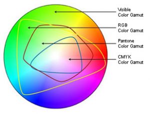
That’s where the collaboration between a trustworthy printer and experienced designer come to the rescue! Technology makes the creation, production, and sharing of amazing designs incredibly easy. And while color management is now standardized and more affordable than in comparison to “the old days,” it is NOT a given and requires more understanding and communication up front to avoid any pitfalls and nasty surprises at print time. Digital speed has still not changed some basic, unalterable facts of the science of color and how our eyes perceive it. Your blue came out purple because of the divide between RGB and CMYK color gamuts.
Color Gamut Comparison
In simplest terms, the colors available in the RGB color gamut (what you can see on your screen) are much greater than the colors available in the CMYK gamut (what can be printed). There are many ways print professionals try to minimize the color shift in the conversion from RGB to CMYK, but they are not all perfect solutions and some colors reveal much more visible differences than others. While the RGB gamut can display a large number of shades and nuances in darker blues, the CMYK gamut is more limited. In trying to reproduce those faint differences, the cyan and magenta used to create the blue with ultimately blend toward purple. Understanding this way back at the point of inspiration and design is essential to avoiding disappointment at the point of print.
One of the most standard ways to guard against unwanted results (like purplish blues) is to base designs in the Pantone® Matching System library of colors. If you define the blue in your design as a specific PMS blue, then your printer will know, and then be able to take steps to match the color against this “universal” standard. You will both have a standard against which to measure your blue. It is like a built-in instruction of how the color should be rendered.
Defining a “spot blue” in your work does not mean you must always print offset, using the spot ink. Still, it gives your printer a marker of what you intend that blue to be at output. Now here comes the next hurdle – you will need to take into account the color shift that will happen when printing a PMS-defined color in CMYK. Again, we can thank the differences in color gamuts for that. For many colors, the shift is slight – for others it can be significant. Designers and printers should be able to show you both color swatches of the PMS color you chose, and of any color shift that will occur from switching to the CMYK equivalent of that color.
And not to make things seem even harder, but color perception is also influenced by a host of other issues. The type, color and material of substrate you are printing on can vastly alter certain colors. Specialty finishes like gloss overlaminates or UV coating can as well. Screen calibrations of monitors used in the design and proofing process can influence how colors appear, and the lighting where any screen or print is viewed is also a factor.
One more interesting phenomenon: metamerism. Without getting into the science behind the term, some colors that are actually different will appear identical to the human eye under certain lighting conditions and different under others. There are at least 12 conditions that can create this metamerism: light, angle of view, size, distance, time, scenery, gloss… even differences in the human eye itself.
So what about that problem with dark blues? If you are using blue in your logo or designs, and are concerned about a color shift toward purple, be certain that the cyan and magenta values in the CMYK definition of your blue color vary by at least 30% (some recommend 40%). Anything less than that, especially with dark colors, and the blue and red will mix to render purple – it is just a fact of physics.
Knowing these types of technical color issues is important if you choose to buy your print online from a large, bulk print provider. They will print exactly what you sign off on when you submit your file. When you work with your local printshop, a good relationship between you, your designer, and your printer will bring you a team approach to getting the exact color you want on all your valuable marketing.
Call us at 828.684.4512 for any marketing needs. As a printer, we understand communication, design, and teamwork. Your printer should be able to provide you with the latest information, inspiration, technical advice, and innovative ideas for communicating your message through print, design and typography, signage, apparel, variable data printing and direct mail, integrated marketing and environmentally responsible printing. If they can’t, you have the wrong printer! The best advice, always, is to ASK YOUR PRINTER!
ImageSmith is now partnered with Extreme Awards & Engraving – our in-house partner providing custom engraved trophies and awards for employee recognition programs, sporting events, and promotional needs. With our new sister company, we will be sharing space, resources and expertise in a collaboration designed to further provide you with one place to meet all of your marketing needs… Under One Roof! Visit them online at www.extremeae.com or call direct at 828.684.4538.
ImageSmith is a full-service print and marketing provider located in Arden, North Carolina. Contact us at ImageSmith for quotes on all your print and marketing projects, and more useful tips on how to create custom, effective, high impact marketing solutions.
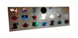
Foil stamping is a great way to add eye-catching shine and metallic glow to your print projects. Even a small touch of foil on a printed piece can bring it alive in a way regular inks never can. Foils have been around a long time (having once been done by hand) and today there are also several new digital and toner-based processes that can help meet the demands of any print budget, deadline, or run length. From the design side, defining the foil stamp area is generally no harder than defining a new spot color in your layout.
Probably the most well-known foiling process is Hot Foil Stamping. It requires a special metal die that is heated and pressed into the paper, creating a nice indentation in the finished piece. The hot foil process uses only one color of foil at a time, and is generally too costly for short runs. The final effect, however, elevates any print piece from average to classic – in other words, perfect for that customer who always says to “make it pop!”
Cold Foil Transfer is accomplished on a 6-color press. The first 2 units apply adhesive and foil, the other 4 are for CMYK printing. Overprinting CMYK onto the foil creates a whole gamut of metallic colors that would not be possible with one-color hot foil stamping. Besides gold, silver, and copper foil, there are also holographic foils which reflect a broad spectrum of colors back to the eye, as well as matte, gloss, pearled and pigmented foils from which to choose. Again, this can be a costly process, is often limited to coated stock only, and is not a great fit for a short-run budget.
New digital processes use either toner or a polymer varnish to attach the metallic foil, and can be cost-effective on short or medium sized runs. Also, metallic foil substrates are a great option – opaque CMYK inks are illuminated by the metallic media, and white can be under printed on specific elements to retain true or non-metallic color where desired. PaperSpecs has a great “Foil Cheat Sheet” you can download free here, outlining all the current processes.
To define the foil stamp area in your layout, just make all those objects be a new spot color – name it “FOIL” if you choose. You can get clear specs from your vendor or PSP, but in short they will need a separation from your design that only contains the area to be “foiled.” Foil stamping is also a great option when choosing from the huge variety of promotional products that can be branded for your marketing. Foiling can be used on most items from keychains to coffee mugs – in a wide variety of colors and finishes.
And speaking of varnishes, spot UV varnish coatings can give a flash of highlights to a printed piece in much the same way a metallic foil does. When the paper catches the light, these elements shine and give the illusion of depth and dimension but in a more subtle way than a metallic ink or foil. They too are simply defined in prepress as a spot color separation in the same way the foil is setup.
So the options are out there today for employing great metallic foils and effects without any extra hassle for design, prepress, or budget concerns. The main limitation is often envisioning what the final product will look like — you will not really be able to create a digital or hard copy proof that will accurately preview the often stunning effects foil stamping can create. Perhaps the best way to do that is to ask your print provider for a sample of previous projects that successfully used foil. They should be happy to help you out.
In fact, rely on your printer for advice and direction with all of your integrated marketing. They should be able to provide you with everything from encouragement along the way to complete design, layout, copywriting, production, multi-purposing, online implmentation and distribution of your marketing outreach. If they can’t, you have the wrong printer! The best advice, always, is to ASK YOUR PRINTER!
ImageSmith is a full-service print and marketing provider located in Arden, North Carolina. Contact us at ImageSmith for quotes on all your marketing projects, and more useful tips on how to create custom, effective, high impact marketing solutions.
Pantone’s Color of the Year for 2019 is Living Coral. Pantone selects their Color of the Year based on fashion and design trends, with an eye toward representing the current mood and culture of the creative market. While the color is receiving a lot of attention in the design world, be aware that it – like many colors – also comes with a fairly significant “color shift” when printed in CMYK. Here’s a brief explanation as to why:
Color Gamut Comparison
The human eye sees MANY more colors than are reproducible in print. Your computer monitor (which is RGB) also displays a different set of colors than either of those print processes. And the Pantone color libraries include many more colors than offset or digital CMYK print processes can recreate. Check out this blog for a more detailed explanation of color gamuts – but this chart is a pretty clear explanation of how a color you select out of a Pantone library may or may not fall within the ability of CMYK printing to create.
Pantone tries to prepare us for these facts of life. In their Color Bridge swatch book, you can see the difference in the spot color swatch and its CMYK equivalent. They include the following disclaimers on their “Tools for Designers” portion of the Color of the Year webpage:
*CMYK values are approximate and were established under specific criteria. To be used as a starting point only. When reproducing these colors in CMYK, please have the printer adjust them visually on the specific substrate and within your printing parameters so that the best possible simulation to the color is achieved.
+Please note: The color may appear different under various light sources due to metamerism. This metamerism is to be expected between multiple substrates due to varying methods of product manufacturing. (link)
About Metamerism
Colors that appear to “match” or look the same to the human eye under some lighting conditions but not others are called metamers. The colors are actually different in that they reflect different wavelengths of light, but can appear the same under some conditions of light or the substrates on which they are printed due to the limitations of human sight.
Pantone strives to supply us with a common language to share and interpret colors in our work. That’s a large job. The science of mixing ink for print is different than for dyeing fabric or mixing wall paint. You can imagine the complexity behind maintaining a consistent color definition when the substrates include silk, cotton, wool, polyester, plastic, glass, wood, paper, adhesives, drywall, plaster, and on and on.
Rely on your printer for advice and direction with color and consistency in branding. They should be able to answer any questions ahead of printing, and provide you with everything from initial inspiration to complete design, layout, copywriting, production, multi-purposing, online implmentation and distribution of your marketing outreach. If they can’t, you have the wrong printer! The best advice, always, is to ASK YOUR PRINTER!
ImageSmith is a full-service print and marketing provider located in Arden, North Carolina. Contact us at ImageSmith for quotes on all your marketing projects, and more useful tips on how to create custom, effective, high impact marketing solutions.
Trade show booths, converted envelopes, coffee mugs, die cut folders, POS displays, folded mailpieces… what first step do all these design projects share? In each case, you will want to ask for a template from your printer before you design.
The print, signage and promotional products world continues to diversify with custom branding opportunities that allow you to print on just about any object you could want. Throw in the creative use of die-cuts, spot coatings, textures, and folds and starting your project layout on the right foot becomes all the more important. For the designer, that means working with vendor-supplied templates to make sure your design ends up printing in the right spot with no expensive surprises or added cost.
Vendors are usually glad to supply a pre-press template for your specific project. In fact, many require your files be submitted on their template – and for very good reason. The positioning, size, and bleed area are critical for successful output on projects using various substrates and printing surfaces, and complex bindery or finishing processes. When you submit files that need no adjustments, you save prepress and art department fees that would be needed to correct or modify your files, or perhaps save having to pay for a job that did not print as you hoped.
Often, however, instructions are vague about exactly HOW to work with the template. Here are a few pointers that may help. In MOST cases, the template you will receive is a PDF. If you are using the most common desktop publishing software – anything from Quark Xpress to the Adobe Creative Cloud Suite – the PDF can be used in several ways to guide your layout without getting in the way of your work.
We love Illustrator for many great reasons and it is generally our preferred software for design of promotional products, wide format signage, vehicle wraps, and even some regular print jobs that have complex die cuts or folds. The PDF template can be placed into Illustrator like an object, on its own layer, and used as a guide. But the most helpful way is to begin by choosing File–Open With (rather than just File Open) and pick Illustrator as your app rather than Acrobat. (If, as sometimes happens, the template PDF uses fonts that your computer does not have, just ignore the warnings. While they may not print well on your end, the vendor who made the template will have them, so no problem.)
Templates are almost always vector objects that will open and be editable in Illustrator. Of course you don’t want to edit the template, but it can be helpful to have the ability to manipulate it when using many layers or when you need to hide parts of the template in order to proof your project to a customer. You may also need to copy and use curved shapes or other features of the template when creating masks or other design elements.
Many PDF templates are very user-friendly in Illustrator. They use specific non-printing colors to designate the layout and help you see the placement of things like folds, edges and dyelines while specifying how much bleed area you need to allow as well. They will generally have the template elements on locked layers so you don’t accidentally edit them. Most have a blank layer already prepared for you to work on. If not, always leave the template on it’s own layer(s) and create a new layer to contain your print elements.
Sometimes, it is preferable to prepare your layout in InDesign or another page layout application. You can simply File–Place the PDF template into your document. It makes sense to create – and lock – a layer just for the template file. You can then turn visibility on and off as needed and move it up or down in the layer order as well. Your document size in InDesign should be the same size as the entire template, including crop marks if applicable. Upon export, you would generally turn all fonts to outlines and create your PDF/X1A with no crops or bleeds other than whats included in the template.
These PDF templates generally include other important information to guide your design. They will specify whether you need to use PMS spot colors or stick to all process. They define needed bleed area. And they usually spell out the resolution, size, and embedding specs for any images you include.
Templates save time, headache, and money throughout the course of your design project. Make it a practice to ask ahead of time for a template, and make the template your friend.
Call us at 828.684.4512 for any marketing needs. As a printer, we understand communication and design. Your printer should be able to provide you with the latest information, inspiration, technical advice, and innovative ideas for communicating your message through print, design and typography, signage, apparel, variable data printing and direct mail, integrated marketing and environmentally responsible printing. If they can’t, you have the wrong printer! The best advice, always, is to ASK YOUR PRINTER!
ImageSmith is now partnered with Extreme Awards & Personalization – our in-house partner providing custom engraved trophies and awards for employee recognition programs, sporting events, and promotional needs. With our new sister company, we will be sharing space, resources and expertise in a collaboration designed to further provide you with one place to meet all of your marketing needs… Under One Roof! Visit them online at www.extremeae.com or call direct at 828.684.4538.
Call us at 828.684.4512. ImageSmith is a full-service print and marketing provider located in Arden, North Carolina. Contact us at ImageSmith for quotes on all your print and marketing projects, and more useful tips on how to create custom, effective, high impact marketing solutions.
We discussed the conflict between transparency and spot colors, and the ensuing print problems, in a previous blog post. That content is included below, but in addition we added some more information on how to resolve this conflict if you have already created your files in InDesign or Illustrator and either been contacted by your printer for file revisions, or worse, received a print job with “unexpected results.”
Using a spot or PMS color in a layout often makes sense to the designer – after all, we all want to ensure correct color output across our brand. But when you place a spot color logo, for example, in a project bound for CMYK process printing, you may be setting up a conflict that can ruin your print output. When you go to save or output your file to pdf, you may see the above warning – and it is an important one! If you have used a spot or PMS color in your InDesign, Quark or Illustrator layout and then applied some type of transparency effect — drop shadows, blending modes, gradients, feathering, etc — then this warning is telling you that your file will NOT print correctly. Your file will look fine on screen, and often even when printed from a desktop printer, but high quality print output will be compromised. Controlling your Swatches palette and color usage, and understanding color definitions, can prevent this problem. First a little background…
With the release of InDesign 2.0 back in 2001, Adobe integrated transparency effects directly into its layout program. New tools allowed us to apply editable transparency effects to text, graphics, and images, the result being a greatly enhanced set of design tools. PDF 1.4 debuted in Acrobat 5 at this time as the first version of PDF that supported transparency. The only catch was that most printer’s RIPs at the time were not ready to handle the transparency effects. Havoc ensued.
Times have changed since then and Postscript level 3 processors and pdf workflows effectively manage the flattening of transparent files at the correct time to produce accurate output. But the conflict between spot or PMS colors and transparency lives on. Saving your file as a PDF/X-1a doesn’t prevent the problem either as the X-1a definition allows for both spot and cmyk color definitions.
If your InDesign or Illustrator color palette is using nothing but CMYK (or RGB and LAB) colors, you can use transparency with no problems. If you place, for example, your logo or a piece of art with a predefined PMS or spot color into your layout, then you have imported that color into your Swatches palette. In turn, if you apply that swatch to color text or graphics and use a transparency effect on them, a high resolution output from offset or digital printing will result in the object printing as a blank or with an unintended color. Your print provider will most likely NOT be able to convert the spot color to process and retain the correct transparency effect. You must convert the spot color to process in your native file(s) and re-export to pdf.
The PMS Green with a transparency effect added will appear correctly on screen (left), but print as a solid (right).
The Fix: Keep Strict Control Over the Colors & Color Definitions in Your Swatches Palette
If you place your Spot Color logo into InDesign, that PMS color shows up in your Swatches palette and can not be removed or edited. (Deleting the logo will allow you to remove the swatch or change it.) So the simplest way to avoid any problems – and save time and prepress charges – is to create a CMYK version of your Spot Color logo for use in all projects bound for CMYK output, and to keep a close eye on all the colors that show up in your palette.
If you have already designed your project with spot colors brought in from placed artwork, getting rid of or redefining all those colors can be difficult. Replacing the artwork with CMYK versions is the first step. Once you have done that, the palette will allow you to delete and replace any UNUSED PMS swatches, or to redefine them to CMYK. This weeding out process can be complex, depending on how many colors have been created. In InDesign, you can delete color swatches tied only to native InDesign elements (i.e., not originating in any placed artwork) and be prompted to choose another color for all those elements currently using the one you are deleting. The final test is to choose “Remove all Unused Colors” from the pop-out menu on the Swatches Palette. If any PMS color swatches still remain, that color is being used somewhere in your layout. If it doesn’t interact in any way with a transparency effect, that will be fine. But if it does, you will get those dreaded “unexpected results.”
The Swatches Palette can quickly become a swamp of colors with conflicting names and definitions.
Obviously, the easiest fix is to be aware as you build your file of the colors in your palette, and notice how they change with each piece of artwork you place. If you see a PMS color show up, you know that last placed logo or element is bringing in that color. If you then use that color for a drop shadow, gradient, or transparent effect, it will not output correctly. Learn to control your swatches by experimenting with editing, changing and deleting them – getting an understanding of the differences in CMYK, LAB, RGB and spot color modes.
Why is “Transparency” Creating Trouble?
Before being “flattened”, transparency is considered “live” and exists as an optical effect onscreen and in video. It must be flattened in order to print. At this stage, the tranparent region is broken up into smaller non-transparent sections that can then be translated by the RIP (raster image processor) into a printable image. It is, however, a complex process and trouble spots arise from the use of spot colors as discussed above, where text or vector objects overlap pixel-based objects, and possibly with the overlapping of RGB and CMYK images. You can read Adobe’s Designers Guide for Transparency and Print at this link for further reference.
Rely on your printer for advice and direction with any questions you have when designing files that use transparency. They should be able to provide you with the time and money saving technical advice, and work with you on file preparation and submission. If they can’t, you have the wrong printer. The best advice, always, is to ASK YOUR PRINTER!
Shop our full ImageSmith catalog online here. We can work with you to find the best option to suit your needs. Please note, prices in online catalog do not include decoration, but call us for a quote at 828.684.4512. ImageSmith is a full-service print and marketing provider located in Arden, North Carolina. Contact us at ImageSmith for quotes on all your marketing projects, and more useful tips on how to create custom, effective, high impact marketing solutions.
So you’re hiring someone to create a logo? Pretty important step for any business venture. When working with a graphic designer, marketing agency or full service print provider to craft your brand (or to modify an existing one), it pays to know what to expect. As with most things, a little knowledge beforehand – in this case about digital file types – can save you time and money down the road.
The design process is creative and fluid – enjoy the ride! – but in the end you are contracting for a complete set of digital files or assets that can be used reliably by you or your vendors to produce marketing across all channels with consistent, repeatable quality. Your printer needs a 4-color logo? No problem. Your sign guy wants the final version with the tag line and PMS colors? You’ve got it covered. You may not understand all the digital details of how the files were created, but you can confidently supply the required files to your vendors. A large step forward in understanding all these files is to be aware of one basic difference: pixel vs. vector
Pixel-based files are essentially images and come with limitations.
Pixel-based (or raster) files can be used for many marketing applications and are preferred for web usage and Microsoft® Office, among others. Think of them as photographs – they live as beds or layers of pixels and are resolution-dependent. If you enlarge them, they lose resolution and eventually appear fuzzy or distorted. Want to edit or amend them? Depending on how they were saved, that could be difficult if not impossible. (While PhotoShop can seamlessly work with vector objects and type, chances are your files will have been flattened or otherwise saved without those capabilities.) File types include .tif, .jpg, .png, .psd, .gif and others.
Vewctors are defined shaped, easily editable and resizable.
Vector-based files are preferred for wide format printing, spot color printing or most instances where enlargement or extensive repurposing is needed. They exist as mathematical curves and points that remain crisp when displayed at any size. Almost always, a vector file can become a pixel-based file with just a “save” or “export” from the native application – not true if going from pixel to vector. Just having a handle on this basic difference between a design created as pixels v. vectors can set you on the right track for a successful branding or marketing project. File types include .ai, .eps and .svg.
With regard to creativity, great designs and ideas come from many sources – from a team of highly educated, experienced professionals to a creative student with a sketchpad. But whomever you hire, be clear from the start that what you will receive in the end if a set of digital, editable brand essentials that will work without further cost to you for all of your marketing projects: from print to web, office applications to wide format signage. If you designer only provides you pixel-based files, they will need to give specific instructions as to how these files can be used by your vendors for large format printing, signage, and other applications. If they can’t – don’t close the deal!
Ask your designer/provider a few basic questions in the beginning: How will they create your files? What software will they use? What file types will you be provided upon completion? Will they direct you in which file types are suggested for specific usage? And hang onto those original files – we often see clients with their digital logo files lost in the shuffle over the years, which can be an expensive mistake. Any professional will be happy to explain any questions you have. Just be sure they can provide their designs to you in the formats you will need or be prepared to incur future costs in file conversion or re-creation.
WARNING: pixel-based files can be saved from photo-editing software as EPS files, so remember that just because a file has an EPS suffix, it has not been magically converted to a vector file. Also, pixel images can be placed into vector draw programs like Illustrator and saved as .AI or .EPS files. Still, not vector!
Call us at 828.684.4512 for any marketing needs. As a printer, we understand communication and design. Your printer should be able to provide you with the latest information, inspiration, technical advice, and innovative ideas for communicating your message through print, design and typography, signage, apparel, variable data printing and direct mail, integrated marketing and environmentally responsible printing. If they can’t, you have the wrong printer! The best advice, always, is to ASK YOUR PRINTER!
ImageSmith is now partnered with Extreme Awards & Personalization – our in-house partner providing custom engraved trophies and awards for employee recognition programs, sporting events, and promotional needs. With our new sister company, we will be sharing space, resources and expertise in a collaboration designed to further provide you with one place to meet all of your marketing needs… Under One Roof! Visit them online at www.extremeap.comor call direct at 828.684.4538.
Optical illusions – where the perceived reality of a viewed object is different than the actual physical attributes being viewed – are interesting phenomena. Occasionally an unintended illusion will pop up in the print work here at our shop, and it usually takes a little convincing to prove to our press operators and art department that the problem is in the viewing…not a mistake in the print files or print process itself.
Gradients Can Trick the Eye
Above is the press sheet layout for a 4-up printed card which will later be cut out and folded in half. However, coming off the press, the 4-up sheets appear like the left side is darker than the right, especially on the outer side of the card. (In person, the effect was even more dramatic than it shows up here onscreen as it was printing on a metallic paper.) We were stumped at first as to what could cause this – the pdf file was preflighted, all the images were rendering correctly. We wondered about a problem with the press, the imagesetter, the layers within the pdf file. Finally, it took cutting a finished sheet apart by the crop marks to see that once separated, the gradients looked fine. Placed next to each other, the light to dark gradient tricked the eye into thinking one side of the press sheet was darker.
Repeating Patterns and Distortion
The 2-up sheets printed above have a decorative border with a repeating pattern that flows in one direction to the halfway point and then reverses its orientation for the second half on all four sides. If you let your eye wander slowly along the borders, especially the longer vertical sides, it appears that the borders are bent and not a perfect square shape overall. The eagle eyes of our press operator noticed the subtle “bend” in the lines and decided that either the file or the imaging plate itself was somehow warped. Placing a ruler or straight edge on the press sheet reveals that, despite what your eyes are telling you, the line is perfectly straight across all four sides of the paper.
You can read more about optical illusions and view galleries of them at a surprisingly great number of websites as many people find the tricks our eyes can play on us to be a fascinating topic.
Call us at 828.684.4512 for any marketing needs. As a printer, we understand communication and design. Your printer should be able to provide you with the latest information, inspiration, technical advice, and innovative ideas for communicating your message through print, design and typography, signage, apparel, variable data printing and direct mail, integrated marketing and environmentally responsible printing. If they can’t, you have the wrong printer! The best advice, always, is to ASK YOUR PRINTER!
ImageSmith is now partnered with Extreme Awards & Personalization – our in-house partner providing custom engraved trophies and awards for employee recognition programs, sporting events, and promotional needs. With our new sister company, we will be sharing space, resources and expertise in a collaboration designed to further provide you with one place to meet all of your marketing needs… Under One Roof! Visit them online at www.extremeae.com or call direct at 828.684.4538.
Call us at 828.684.4512. ImageSmith is a full-service print and marketing provider located in Arden, North Carolina. Contact us at ImageSmith for quotes on all your print and marketing projects, and more useful tips on how to create custom, effective, high impact marketing solutions.


 Seeing something enlarged to a great size can reveal unseen tiny flaws – think of that bad selfie in harsh lighting. But by the same token, greatly reducing an image can create it’s own problems with recognition and readability. That’s where
  Great typography is a pleasure to read. But the requirements for that readability change with a font’s size. Today the need for easy-to-read small or “micro” type sizes is increasing in both print and digital applications. Why now more than before? E-books, smart watches, phones, and other devices with small screens require fonts with quick readability at a small size and resolution. On the print side, prescription bottles with dosage directions, food packaging with nutritional info, and almost all product packaging that includes ingredients or warnings need a readable font at small point sizes to clearly impart information.
 In general, most fonts were designed for the average reading environment – as in comfortably reading a book or newspaper – in the 8 point to 14 point range, and for a viewer with 20/20 vision. Being
 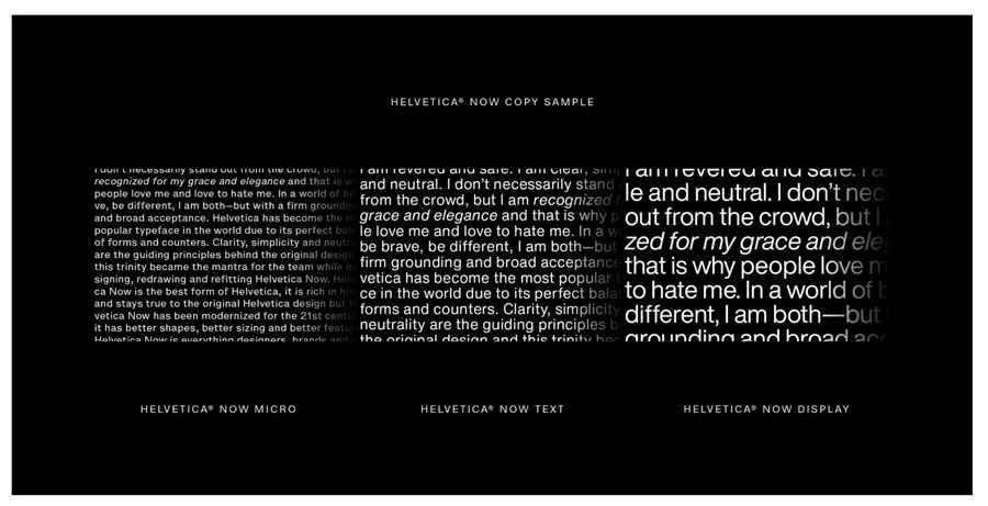 One great example is
 Planning a strategy to your market outreach, rather than just looking from event to event, is a game-changer for small and medium sized businesses. Just as a restaurant might develop different menus for lunch, dinner, take-out, or catering, you can create a series of flyers that
  The flyer does not have to just be a boring sheet of paper. Consider
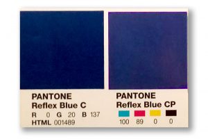 Defining a “spot blue” in your work does not mean you must always print offset, using the spot ink. Still, it gives your printer a marker of what you intend that blue to be at output. Now here comes the next hurdle – you will need to take into account the color shift that will happen when printing a PMS-defined color in CMYK. Again, we can thank the differences in color gamuts for that. For many colors, the shift is slight – for others it can be significant. Designers and printers should be able to show you both color swatches of the PMS color you chose, and of any color shift that will occur from switching to the CMYK equivalent of that color.
 Cold Foil Transfer is accomplished on a 6-color press. The first 2 units apply adhesive and foil, the other 4 are for CMYK printing. Overprinting CMYK onto the foil creates a whole gamut of metallic colors that would not be possible with one-color hot foil stamping. Besides gold, silver, and copper foil, there are also holographic foils which reflect a broad spectrum of colors back to the eye, as well as matte, gloss, pearled and pigmented foils from which to choose. Again, this can be a costly process, is often limited to coated stock only, and is not a great fit for a short-run budget.


