Twitter uses a specific blue – not the same as Facebook blue, or Ford blue, or “Big Blue” IBM. Coke always wants the same red, whether its on a T-shirt, paper, plastic, a television screen or a glass bottle. To reproduce color consistently, especially across different media, platforms, techonologies and visual arenas, everyone needs to be communicating in the same language of color, so to speak. The PANTONE® Matching System is that language – an industry standard and means of selecting, communicating, reproducing, matching and controlling colors. For offset, lithographic printing, Pantone created a Color Formula Guide with well over 1000 classified colors that fill the CMYK gamut. From a set of basic inks, each of these colors can be mixed.
For spot color printing, the Pantone Guide contains ink mixing instrusctions for each color, a “recipe” with amounts given both in parts and percentages. If a printer needs a large quantity of ink, or is doing regular printing for clients who use a specific color for their brand, these inks will be purchased premixed. But for smaller quantities, each color in the Pantone Guide can be created with a mixture of 2 or more of 14 standard base colors. They are: Yellow, Yellow 012, Orange 021, Warm Red, Red 032, Rubine Red, Rhodamine Red, Purple, Violet, Blue 072, Reflex Blue, Process Blue, Green, and Black.
In the image above, our printer is mixing PMS 151 Orange for a client’s job. The formula for that exact color is 12 parts of PANTONE Yellow (or 75%) and 4 parts of PATNONE Warm Red (or 25%). For this small amount of ink needed, he weighs each ink amount on a scale and then mixes thoroughly together for the correct color match, which is then tested alongside the PANTONE preprinted swatch for that color to doublecheck the outcome.
Pantone recently unveiled their cloud system of color management, PANTONELive: “a cloud-based color bank.” It is a color management system for companies and brand owners who do marketing over a large variety of media and across a diverse geographical area to ensure everyone is speaking that same color language.
ImageSmith is a full-service print and marketing provider located in Arden, North Carolina. Contact us at ImageSmith for quotes on all your marketing projects, and more useful tips on how to create custom, effective, high impact marketing solutions.
Today ImageSmith surprised me with a little celebration for my 15th anniversary with the company and a very generous gift of a brand new iPad. Our discussion at the gathering centered around the changes in our business over the past 15 years and the vast differences technology has created in that relatively brief span of time. Back in 1997, hardly anyone at work had a mobile phone; few used the internet or even had a home computer.
Oddly enough, I had been reading online this very morning about the new issue of Newsweek that highlights the return of the show “Mad Men” with a retro 60s issue and an amazing recreation of retro print advertising from that era. The rate of change in this industry from then to now has exponentially increased. Print quickly adapted to new computer technology in the ’80s, drastically altering the way graphics are created, business is done and ultimately the very heart of what the printing industry is today. From my own experience here at ImageSmith, I could see the major ways technology has created this rapid change:
THE INTERNET
In the 90s, the art department was completely a Mac platform (Mac certainly led the way with graphics software and innovation) and the only other computers were PCs used for the front office and accounting. Files were transferred on floppy disks or zip disks. Proofs were faxed or hand delivered. The idea of communication or doing business via the internet seemed fanciful.
TODAY: communication inside and beyond the company is via the internet. Computers network through a wifi connection and a central server. Orders are placed online, files transferred, deliveries scheduled and tracked… to do otherwise would seem painfully slow and unprofitable.
SOFTWARE
The change in graphics software is always rapid and amazing. In 1997, we were using Adobe PageMaker for our layout (it had only recently been acquired by Adobe from Aldus). PhotoShop and Illustrator were used for photo and graphics manipulation, but only minimally integrated with the actual desktop layout duties of PageMaker. Many clients created their jobs in QuarkXpress, Microsoft Word, Corel Draw – and the confusing task of the art department was to try to handle and image these files cross platform from PC to Mac without disastrous font conflicts and software glitches. The idea of a “portable document format” or pdf was on the horizon.
TODAY: Adobe Creative Suite provides virtually flawless integration of PhotoShop, Illustrator, Acrobat and InDesign. A totally pdf workflow moves client jobs seamlessly from desktop to press or web. Print design can be cross-purposed to web pages, mobile apps, e-books, etc.
PRINTING TECHNOLOGY
Many jobs were still created physically on paper and then photographed. “Paste-up” was the means of gluing into position different page elements. It all seems very primitive now. The process of making plates for offset printing also relied on photography. Negatives were imaged, stripped into position, manually color separated, and burned onto plates.
TODAY: Computer-to-plate and computer-to-press techonology completely removes the photographic element in printing. Digital layouts are rasterized and imaged onto plates for the press in exact position. Increasingly, digital presses are replacing the offset process to meet the growing demand for short run, full color print.
DATA STORAGE
In 1997, a typical print job would fit easily onto a standard 3.5 inch, 1.44MB floppy disk. Artwork and client jobs were archived onto floppies. These were replaced by SyQuests – able to hold 44 or 88 MB or data, and then Zip Disks from iOmega with the amazing capacity to hold 100 MB. In the late 90s, most all computers, PC and Mac, came with a built-in floppy and Zip drive. Over the years, the Zip yielded to the CD and then the DVD for removable storage options.
TODAY: File sizes for some print jobs today dwarf the capacity of all of these removable data storage devices. High capacity servers and cloud-based storage solutions manage files and the process of archiving data.
With all of these changes has come a core redefinition of what small and mid-sized print operations are about. Printers have expanded to become multi-media specialists, marketing consultants and e-commerce solution providers to meet the equally drastic changing needs of their clients. Integrated marketing techniques combine the realms of print with mobile, email, wide format printing, signage, printwear, branded merchandise and social media. Looking ahead to the landscape of the NEXT fifteen years is exciting and daunting. Mobile and cloud-based technology will continue to drive the marketing into the world of augmented reality, 3-D printing, conductive ink and other as-yet unknown innovations.
ImageSmith is a full-service print and marketing provider located in Arden, North Carolina. Contact us at ImageSmith for quotes on all your marketing projects, and more useful tips on how to create custom, effective, high impact marketing solutions.
After writing a recent blog-post about the significant role of print and paper in our culture, I started thinking about how that has to show up in our popular music as well. And since blog-posts love to take the form of lists, why not take a look at how print, paper, and ink have been portrayed in popular song…
Paperback Writer – The Beatles (1966)
Seems appropriate to start the list with a classic from pop music’s royalty. The paperback novel emerged in it’s mass market format in the 1930s, and quickly became the affordable, accessible way for works both great and less than great to reach new mass markets of readers. Lennon & McCartney show a man desperate to land a job as just such an author. 1000 pages? That’s one thick paperback.
If You Could Read My Mind – Gordon Lightfoot (1970)
Sticking with the theme of a paperback novel, the simile in Lightfoot’s ode to lost love is a comparison between his thoughts and a book, “the kind the drug stores sell.” The hero, the broken heart, the ending that’s “just too hard to take.” A ton of romance novels have carried that plot-line over the years.
Everyday I Write the Book – Elvis Costello (1983)
The best example I know of a song trying to be a book – Costello describes his love affairs ups and downs as chapters, paragraphs, seeing himself as a man with a mission in “two or three editions.” He knows that regardless of how the affair plays out, he will “still own the film rights and be working on the sequel.”
Paper Roses – Marie Osmond (1973)
Well, originally is was Anita Bryant who had a hit with this tune. But a very young Osmond, well before Weight Watchers and Dancing With the Stars, sang about a false love with a comparison between real roses and ones made of paper. Let’s make it clear, however, paper roses last longer than the real thing, are also biodegradable, and require no pesticides to produce. No reason to go around knocking paper roses!
Centerfold – The J. Geils Band (1982)
An iconic publishing image, the centerfold of a magazine was spotlighted in this 80’s song about a young man discovering his high school homeroom angel in a porn magazine.
Black and White – Three Dog Night (1972)
A hit in 1972 for Three Dog Night, the song uses the image of ink on paper to flesh out their metaphor of racial equality and harmony. Interestingly enough, the song was first written in 1954 in response to the Brown v. Board of Education ruling desegregating public schools. The original verse: “Their robes were black, Their heads were white, The schoolhouse doors were closed so tight. Nine judges all set down their names, To end the years and years of shame.” Pretty cool, huh?
Yesterday’s Papers – The Rolling Stones (1967)
A lesser known Stones ballad compares a fading love affair to old newspapers. A clear illustration of how print and the daily newspaper for many years were central to our culture: “Every day means the turn of a page / Yesterday’s papers are such bad news / Same thing applies to me and you.”
Want Ads – Honey Cone (1971)
A big hit in the early 70s, long before match.com, Tindr or Grindr. This song, redone by Taylor Dayne in the 90s, is about a time not so long ago when trying to find a match by running an ad in the classified section of the newspaper was a novel approach. “He’s been lying… I’m going to the Evening News.”
Signs – The Five Man Electrical Band (1971)
A big, angry protest song from the early 70s, this tune decries the exclusion and intolerance of society for the “long-haired, freaky people.” The printed signs… “blocking up the scenery, breaking my mind.”
Paper and Ink – Tracy Chapman (2000)
Chapman’s fifth album reminds us how print can be valued – especially when printing money.
Legal Tender – The B-52’s (1983)
When print goes bad: the B-52s gave us what is arguably the best dance song ever about a federal crime. Jelly jars and heavy equipment, the B’s were in the basement learning to print.
Any songs yet about a Kindle or iPad? I don’t know, but I’m sure there soon will be. I purposely didn’t include any songs here about letters or mail – there seem to be enough good titles on that topic to merit a future blog-post.
ImageSmith is a full-service print and marketing provider located in Arden, North Carolina. Contact us at ImageSmith for quotes on all your marketing projects, and more useful tips on how to create custom, effective, high impact marketing solutions.
No copyright is claimed in any of the above links to YouTube videos, and to the extent that material may appear to be infringed, it is asserted that such alleged infringement is permissible under fair use principles in U.S. copyright laws. If you believe material has been used in an unauthorized manner, please contact us.
Too often as printers, we assume everyone else understands the basics of print technology. Full color, spot color, process, digital, offset, thermography, letterpress, wide format… there are many paths to create a beautiful and effective printed product – decisions have to be made about which path is the best to take. The type of printing you need for your project should take into account many factors: budget, branding concerns, time constraints, intended use, and essentially the overall scope of your marketing plan. It becomes important that you have a printer you can communicate with freely and clearly. Your printer should be able to explain your options clearly. One basic topic in looking at the options for color printing is to understand what is meant by spot colors vs. full color.
Spot color refers to color generated in offset printing by a single ink. That ink could be a “pure” color or mixed according to a formula. Process, or 4-color printing, uses four spot colors to generate a full-color gamut: Cyan, Magenta, Yellow and Black (CMYK). Some more advanced processes use six spot colors, adding Orange and Green to provide an even larger gamut. This is called hexachromatic process printing, or CMYKOG. At times, however, you may want to print using just one or two colors – for example let’s say blue and black. This is a classic example of two color printing.
Pantone is clearly the authority on color – a provider of color systems and leading technology for accurate communication of color. The Pantone Matching System has long been the standard for defining “spot colors.” If you have a blue lion in your logo, you want that lion to always appear in the same shade of blue – not sky blue on your letterhead, royal blue on an employee’s shirt and some shade of purple on the website. The PMS system is a way to standardize that color for the printing process, and your printer can show you swatches to select the PMS number that you can then define as an integral part of your brand. Also keep in mind that with these two colors, you can enhance the design of your piece by using “screens” or tints of those colors. 50% of black gives gray; a percentage of the PMS blue will provide varying shades as well. With a good design, a two-color printed piece can have much depth and style. (Pantone is a rich resource for all topics on color. Check out which color they chose Color of the Year for 2012.)
Any PMS color, printed from a single ink, can also be translated into the closest CMYK match. Your blue lion can be printed by the 4-color process method when you choose to create a full color piece. There will be a slight variation in the shade or hue of the blue, however – no PMS to CMYK conversion is exact. In most cases, the difference is tolerable or even unoticeable, but with a few colors the shift is more dramatic. The CMYK gamut can not replicate all colors visible to the human eye. Again, your printer can show you side-by-side swatches of what the PMS color will look like once converted to CMYK. Some brands are so specific about their color that they budget for 5-color offset print jobs where full color printing is needed, but they are willing to pay for another pass to get the PMS color of that lion exactly right every time.
Have the discussion with your printer to learn the process they are using to produce your print materials. They can explain about color gamuts, PMS color matches, and even color psychology and selection. You will also want to translate these colors for other uses such as your website or online marketing. There you will need web-safe color matches that seek to maintain an accurate match for your blue lion on the web as well. You will be in good hands with a printer who can help you with both the artistic, creative process and the technical concerns of production.
ImageSmith is a full-service print and marketing provider located in Arden, North Carolina. Contact us at ImageSmith for quotes on all your marketing projects, and more useful tips on how to create custom, effective, high impact marketing solutions.
We love technology – the instantaneous flow of information and data, the interconnectedness of people who would never otherwise meet, the crowd-sourcing of digital solutions. In our line of work, we have marveled at the seismic shift in the ease and innovation of creating graphics and images, the global opportunities that opened when file transfers and commerce moved online, and the digital transition from plates and darkroom photo processing to computerized pdf workflows. It all makes for an exciting age in which to live. Technology has quickly, and not always painlessly, transformed the print industry from one about ink and paper into one of interactive communication, new media and data interpretation. And yet…. there’s just something about paper.
At the heart of this human love for paper is the physical, solid, stackable nature of the thing. It is organic. It has weight. You can hold it in your hand and point to the truth – “See? It’s right there in black and white.” Or color. Whether it is centuries of reliance on the physicality of having the “written word” in your hand, or whether it is something more primal, paper and printing hold a powerful place in our psyche. Think about it: your birth certificate, your child’s first crayon drawings from school, report cards, your ticket stub from a favorite concert, a treasured valentine or love letter, a “welcome home” sign, a sketch of a great idea, an autograph of your hero. At all the important, memorable moments of your life, paper has played a central role. It is usually the means by which you remember and treasure those events – unplugged.
Today, technology is clearly altering some of that relationship. The recent bankruptcy of Kodak seems to many of us who grew up in the last half of the twentieth century to be unthinkable. Yet they have announced they are going out of the film business. The woes of the USPS are a result of email and digital communications usurping the role of snail mail. Newpapers and magazines are struggling with the transition from paper to online versions. But paper still carries the word and image of our culture in ways that electronic media is not yet able to – by its very physical nature and our historic appreciation for its reliable, tactile properties. It is still capable of putting your message right into someone’s hands regardless of internet providers or the accessibility of a wifi signal.
Still not convinced? Watch this great video from Domtar’s “Paper because…” initiative that spotlights the contradiction between students who at first say they want to live in a paperless world – until they are told their diplomas will be handed out in pdf format.
An electronic diploma would convince most all students that paper has a clear place in our lives and futures. Maybe the tech future will gradually change this romantic attachment we have to the beauty and functionality of paper, but I doubt it will erase it anytime soon.
ImageSmith is a full-service print and marketing provider located in Arden, North Carolina. Contact us at ImageSmith for quotes on all your marketing projects, and more useful tips on how to create custom, effective, high impact marketing solutions.
We love paper. Its feel, smell, texture, weight. Selecting the right paper for a print project is an important part of the design of any printed piece. We understand that most designers and print buyers are not experts on paper, nor do they have the time to become one! They, therefore, rely on a good relationship with their printer to make smart paper selections. It can get confusing: matte, glossy, semi-gloss, premium, UV coating, lamination, caliper, grain direction, brightness, opacity. Then there’s all the information about recyclable content, chain of custody and other green concerns. Throw in the chemistry involved when ink or toner hits the paper and you encounter terms like dot gain, absorbency, coating, rasterization. A lot of science lives behind the manufacture of paper and the printing process itself. So how do you begin to choose the right paper for your job in the face of so many choices?
Let’s start with a wide view, by looking at a few manufacturers of quality lines of paper for print. Below are a few of our favorites – papers that are affordable, yet offer top quality performance. They all come in offerings of varied finishes, grades, weights, colors and are optimized for both press and digital printing.
Sappi Flo – an industry standard print paper at an affordable price. High quality and environmentally sustainable. (Sappi also produces a hilarious online video series about the insanity in a local print shop called “Off Register.” Well worth checking out!)
Domtar Cougar – a great environmental choice, Cougar papers offer vibrant color contrast, smoothness and high quality.
Classic from Neenah – the Classic line from Neenah, aptly named, offers best-in-class quality, performance, compatibility and availability. The family includes Classic Crest, Classic Columns, Classic Cotton, Classic Laid and Classic Linen.
Mohawk – fine paper and envelopes, engineered for brilliant color, runability and detailed images.
There are five basic grades of paper: bond, offset or uncoated book, coated book, text, and cover. Within each of these grades are varieties of content, appearance, end use, original purpose, grain direction, finish, opacity, brightness… you get the idea. You have a LOT of choices. And in the realm of specialty papers, there are even more. With your printer’s help, you can narrow down what selection will work best for your project and budget. All major paper manufacturers are happy to supply samples, information and guidance on paper purchases.
In the process of browsing for the right paper, you might get curious about some terms you run across, such as sizing (a solution added to paper pulp to make it less absorbent), brightness (the percentage of a wavelength of blue light that paper reflects), caliper (the thickness of a sheet of paper, measured in 1/1000ths of an inch and referred to as point size), or acid free (paper with no acid, they have a pH higher than 7 and alkaline properties to resist aging). For a great detailed glossary of all things paper, check out the Glatfelter site. They are a global provider of specialty print papers. Or call us. As mentioned earlier… we love paper.
ImageSmith is a full-service print and marketing provider located in Arden, North Carolina. Contact us at ImageSmith for quotes on all your marketing projects, and more useful tips on how to create custom, effective, high impact marketing solutions.
We are connected today in every way possible – smart phones, texts, tweets, phone calls, mobile GPS, even blogs. But can you remember the last hand written note or card you received? I bet you can! And that is important – it shows the powerful impact of a handwritten note. They always find their way to the top of the mail that is piling up on your desk.
Taking time to do hand written notes may be a struggle, but the benefits can be huge. As we all know in this challenging economy we are all looking for something that makes us stand out. This small inexpensive detail will speak volumes. A note to say thank you for a great meeting, happy birthday or even just thanks for your time shows that you are ready to give clients the personal service that they are so hungry for. They can act as a relationship builder or the stepping stone to your next order from your client.
Personalized note paper or stationery is a smart choice once you get into the habit of note writing. Having the paper and envelopes at your work station will save time and remind you to write a note when the time is right. They should be branded with your company look and feel, including your contact information
How ever you plan to use this powerful tool, just remember to be consistent. Keep a roll of stamps with you. Write the notes while conversations are fresh on your mind or their last order just shipped out the door. This is one time that you can keep “time on your side” by mailing when you are still fresh in the minds of your clients. And if you are really feeling ambitious, send all your customers a note wishing them a Happy Valentine’s Day, or even just “Thanks for being a great Customer.”
The power of this secret weapon lies in it’s sincerity. In a world that is often OVER-connected, a personalized, hand written note speaks louder than any digital communication can. Receiving the note in the mail is an actual physical interaction – something not yet possible online. Read more at these links about the power of hand written notes and the lost art of note writing. Sometimes, low tech is still the best choice.
ImageSmith is a full-service print and marketing provider located in Arden, North Carolina. Contact us at ImageSmith for quotes on all your marketing projects, and more useful tips on how to create custom, effective, high impact marketing solutions.
You have encountered moiré (pronounced ‘more-ray’) patterns many times and perhaps not known the term for what you were witnessing. When a television is photographed or videotaped, those annoying interference patterns and running lines are a moiré effect. If you have ever seen a person on television wearing a striped or patterned piece of clothing and it appears to undulate or move in a strange optical illusion – that is a moiré as well (specifically called “strobing”). The moiré appears whenever two grids are overlaid at a conflicting angle, or if they have differing mesh sizes.
In the world of offset print and graphics, moiré patterns arise in two main ways. First, and most commonly, when a preprinted image is scanned, interference occurs between the ruling of the dot pattern of the original print and the scanner’s sample pattern. Filters can be used during the scan process to “descreen” the result and minimize the moiré, however it is always best in printing to avoid scans of pre-printed pieces for your artwork. Even descreening results in a less sharp image, and a ‘softer’ or fuzzier appearance.
Second, and less common thanks to Raster Image Processors (RIPs) and their digital control over imaging, are the moiré patterns than can occur when the four screen angles used in offset printing conflict. Each color in 4-color process printing is screened into a pattern of dots, and then angled differently to form a full color image. A standard set of screen angles to avoid a moiré is 105° cyan, 75° magenta, 90° yellow and 45° black, although the visibility of moiré is not always predictable, with some images exhibiting a moiré where others do not.
A great way to see how a moiré pattern works is to check out the demos at mathematik.com and mathworld.com. For a great explanation about screen angles and halftone patterns, be sure and read the Quality in Print blog.
Contact us at ImageSmith for quotes on all your marketing projects, and more useful tips on how to create custom, high impact graphics and marketing solutions.
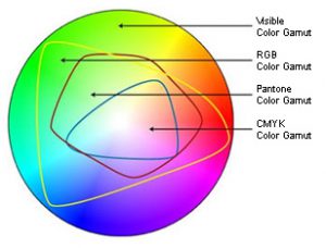
The science behind color itself is at the heart of printing – and key to meeting the expectations you have for a beautifully printed project. The first step in understanding the boundaries of printable color is to know that the human eye can detect much more color than is possible for your computer monitor to display. In turn, your monitor can show more colors than it is possible to reproduce in offset printing.
The best illustration of this is a color gamut comparison chart where you can actually see the ‘real estate’ involved in each spectrum. (It’s always seemed odd to me that we use this illustration either on a printed page or a monitor… both of which are limiting the actual colors they are trying to represent!) In the figure below, the entire color shape represents all the visible spectrum of light.
The RBG color area represents the specific wavelengths of light your monitor emits, and is clearly a much smaller area. Even smaller is the CMYK gamut showing colors that can be reproduced with printing inks. Cyan, Magenta and Yellow pigments (K or Black is added to create depth, definition and ensure a true black color) work as filters that subtract certain wavelengths of light and reflect others. They combine to create a spectrum of printable color.
Switching a file from RGB to CMYK in PhotoShop on your screen can visually show you the color shift that occurs when you switch to a more restrictive gamut. Try it on a random image and see if you notice a significant loss of color. Some printers prefer you leave your images in RBG mode with ICC profiles attached, while others prefer you go ahead and switch to CMYK mode, as that will inevitably happen before the printing process.
Most cameras and scanners capture color in RGB mode (or to get even more technical, the “sRGB” mode, or a standard definition of what colors can be shown on a computer monitor, as opposed to all the RGB colors that can be seen visually with reflective light). Some cameras have the aRGB (AdobeRGB) definition or a selection called “Raw” – it can capture more colors digitally than you will be able to see, but may be helpful when you edit and adjust your photographs in an editing program such as PhotoShop.
Printing methods are able to reproduce only a certain gamut of colors as well. When files contain colors that fall outside of that gamut, the RIP process must decide what to do with those colors – i.e., how to alter them in specific ways to make them become a color which is printable – and this is decided by the Rendering Intent options of the RIP software or printer driver. Rendering intents are mathematical formulas that alter out-of-gamut colors in predefined ways.
When an exact color match is needed on your print project, consider using a spot color ink in your design. Metallic inks also can give a great effect that isn’t possible with combinations of just the 4-color process inks. Paper or media choice will also affect and enhance the quality of printed colors.
Contact us at ImageSmith for quotes on all your marketing projects, and more useful tips on how to create custom, high impact marketing solutions.