

GREAT IDEA – why not put your logo and tag line on a bandana! They make a great as promotional products or swag gifts for customers, or to display for sale. The classic bandana with a paisley pattern seems to never go out of style. (You can read about the facsinating history of the bandana here.) We love these custom printed bandanas that incorporate a customer logo seamlessly into that classic design. They are lightweight woven cotton with screen printing in white and come in the whole rainbow of colors you would expect. We’d love to help you get set up with your own – to get started just click here or give us a call: 828-684-4512.

The pet bandana version is also pretty awesome – a triangular shape makes it easier to tie around your best friend’s neck. They come in different sizes to fit the tiniest dogs or cats or some king-size buddies. The entire imprint area can be designed with your repeating logo or with some other shape or design of your choice. You can find this item here (along with thousands of other promotional products you can browse and order).
 You’ll need a version of your logo that works reversed out in all white with no screens – and we can help you with that. In our large bandana sample here, we used the logo at a larger size in the center, and then in four smaller imprint areas on each of the four corners. When folded, you’ll always see one of the logos. You might want to include a tagline or web address as well if the imprint area works better with that information.
Developing your logo in different variants is important for multichannel marketing. Never settle for one “FINAL” version of your logo from your designer with the idea that it can multitask for every need. Your mark can exist in different “flavors” that will be versatile enough to work in full color, single color with screens, spot color and at different sizes from tiny imprints to billboard size, offset to online. The standard full color logo that looks just perfect on your letterhead may not be the version that works for embroidery on uniforms, screenprinting, promotional products, black and white forms, single color designs, or wide format prints. For versatility of use, it’s also great to have your logo designed in a “Tall” (portrait) and “Wide” (landscape) version. Think about it: what might look good on a round coaster might look pretty tiny if you decide to print it on the side of a pencil!
Call us at 828.684.4512 to order your bandanas, or for any marketing needs. As a printer, we understand communication and design. Your printer should be able to provide you with the latest information, inspiration, technical advice, and innovative ideas for communicating your message through print, design and typography, signage, apparel, variable data printing and direct mail, integrated marketing and environmentally responsible printing. If they can’t, you have the wrong printer! The best advice, always, is to ASK YOUR PRINTER!
ImageSmith is now partnered with Extreme Awards & Engraving – our in-house partner providing custom engraved trophies and awards for employee recognition programs, sporting events, and promotional needs. With our new sister company, we will be sharing space, resources and expertise in a collaboration designed to further provide you with one place to meet all of your marketing needs… Under One Roof! Visit them online at www.extremeae.com or call direct at 828.684.4538.

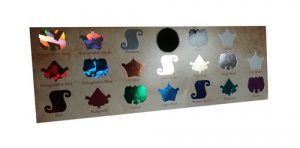 Cold Foil Transfer is accomplished on a 6-color press. The first 2 units apply adhesive and foil, the other 4 are for CMYK printing. Overprinting CMYK onto the foil creates a whole gamut of metallic colors that would not be possible with one-color hot foil stamping. Besides gold, silver, and copper foil, there are also holographic foils which reflect a broad spectrum of colors back to the eye, as well as matte, gloss, pearled and pigmented foils from which to choose. Again, this can be a costly process, is often limited to coated stock only, and is not a great fit for a short-run budget.


