IMAGESMITH has been hard at work here in western North Carolina providing print and marketing solutions for small and medium sized businesses for 40 years. We are happy to have been nominated as a Top NC Printing Company by The Startup Pill for our innovation and expertise in navigating a quickly changing marketing landscape. You can check out the rest of this list of great Tarheel print innovators here.
We love print, and the expanding and powerful role it plays in today’s ever-changing marketing mix. Still, the term “printer” can sound misleading. Today, printers do far more than put ink on paper. We have become media communications specialists for business owners and marketers, and we are your closest and most knowledgeable sources for consulting on your overall marketing strategy. A good printer will understand your budget, your marketing goals, and be able to suggest many strategies for creating results: integrated marketing strategies, direct mail, targeted variable data printing, promotional products, signage, branding, website development and e-commerce, social media marketing techniques, and unique design ideas. Discuss with them your target audience, your brand goals, who your consumer is, what your mission, budget, and specific goals are for the year. Together, we can develop and recommend specific marketing strategies that you can use to translate into profit and customer recognition of your brand and your work. The bottom line: why drain your energy trying to learn the new world of marketing on TOP of running your business when you already have a marketing consultant waiting to talk with you?
Call us at 828.684.4512 for any marketing needs. As a printer, we understand communication, design, and teamwork. Your printer should be able to provide you with the latest information, inspiration, technical advice, and innovative ideas for communicating your message through print, design and typography, signage, apparel, variable data printing and direct mail, integrated marketing and environmentally responsible printing. If they can’t, you have the wrong printer! The best advice, always, is to ASK YOUR PRINTER!
ImageSmith is now partnered with Extreme Awards & Engraving – our in-house partner providing custom engraved trophies and awards for employee recognition programs, sporting events, and promotional needs. With our new sister company, we will be sharing space, resources and expertise in a collaboration designed to further provide you with one place to meet all of your marketing needs… Under One Roof! Visit them online at www.extremeae.com or call direct at 828.684.4538.
ImageSmith is a full-service print and marketing provider located in Arden, North Carolina. Contact us at ImageSmith for quotes on all your print and marketing projects, and more useful tips on how to create custom, effective, high impact marketing solutions.
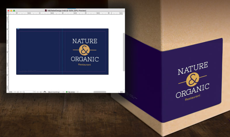
“My perfect new reflex blue brand color printed PURPLE!”
Whether you are a designer or business owner who hired a designer, you expect your color choices to look the same on paper as they did on your desktop monitor — and also the same on your boss’ cellphone where he viewed your proof, on your website where a coworker converted your design into a webpage, on signage, on packaging, and on all your marketing tools that will reach your audience. What sounds deceptively simple at first is actually a VERY tall order in a world where color reproduction and color perception are influenced by so many factors.
That’s where the collaboration between a trustworthy printer and experienced designer come to the rescue! Technology makes the creation, production, and sharing of amazing designs incredibly easy. And while color management is now standardized and more affordable than in comparison to “the old days,” it is NOT a given and requires more understanding and communication up front to avoid any pitfalls and nasty surprises at print time. Digital speed has still not changed some basic, unalterable facts of the science of color and how our eyes perceive it. Your blue came out purple because of the divide between RGB and CMYK color gamuts.
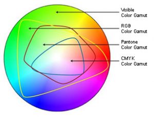
Color Gamut Comparison
In simplest terms, the colors available in the RGB color gamut (what you can see on your screen) are much greater than the colors available in the CMYK gamut (what can be printed). There are many ways print professionals try to minimize the color shift in the conversion from RGB to CMYK, but they are not all perfect solutions and some colors reveal much more visible differences than others. While the RGB gamut can display a large number of shades and nuances in darker blues, the CMYK gamut is more limited. In trying to reproduce those faint differences, the cyan and magenta used to create the blue with ultimately blend toward purple. Understanding this way back at the point of inspiration and design is essential to avoiding disappointment at the point of print.
One of the most standard ways to guard against unwanted results (like purplish blues) is to base designs in the Pantone® Matching System library of colors. If you define the blue in your design as a specific PMS blue, then your printer will know, and then be able to take steps to match the color against this “universal” standard. You will both have a standard against which to measure your blue. It is like a built-in instruction of how the color should be rendered.
Defining a “spot blue” in your work does not mean you must always print offset, using the spot ink. Still, it gives your printer a marker of what you intend that blue to be at output. Now here comes the next hurdle – you will need to take into account the color shift that will happen when printing a PMS-defined color in CMYK. Again, we can thank the differences in color gamuts for that. For many colors, the shift is slight – for others it can be significant. Designers and printers should be able to show you both color swatches of the PMS color you chose, and of any color shift that will occur from switching to the CMYK equivalent of that color.
And not to make things seem even harder, but color perception is also influenced by a host of other issues. The type, color and material of substrate you are printing on can vastly alter certain colors. Specialty finishes like gloss overlaminates or UV coating can as well. Screen calibrations of monitors used in the design and proofing process can influence how colors appear, and the lighting where any screen or print is viewed is also a factor.
One more interesting phenomenon: metamerism. Without getting into the science behind the term, some colors that are actually different will appear identical to the human eye under certain lighting conditions and different under others. There are at least 12 conditions that can create this metamerism: light, angle of view, size, distance, time, scenery, gloss… even differences in the human eye itself.
So what about that problem with dark blues? If you are using blue in your logo or designs, and are concerned about a color shift toward purple, be certain that the cyan and magenta values in the CMYK definition of your blue color vary by at least 30% (some recommend 40%). Anything less than that, especially with dark colors, and the blue and red will mix to render purple – it is just a fact of physics.
Knowing these types of technical color issues is important if you choose to buy your print online from a large, bulk print provider. They will print exactly what you sign off on when you submit your file. When you work with your local printshop, a good relationship between you, your designer, and your printer will bring you a team approach to getting the exact color you want on all your valuable marketing.
Call us at 828.684.4512 for any marketing needs. As a printer, we understand communication, design, and teamwork. Your printer should be able to provide you with the latest information, inspiration, technical advice, and innovative ideas for communicating your message through print, design and typography, signage, apparel, variable data printing and direct mail, integrated marketing and environmentally responsible printing. If they can’t, you have the wrong printer! The best advice, always, is to ASK YOUR PRINTER!
ImageSmith is now partnered with Extreme Awards & Engraving – our in-house partner providing custom engraved trophies and awards for employee recognition programs, sporting events, and promotional needs. With our new sister company, we will be sharing space, resources and expertise in a collaboration designed to further provide you with one place to meet all of your marketing needs… Under One Roof! Visit them online at www.extremeae.com or call direct at 828.684.4538.
ImageSmith is a full-service print and marketing provider located in Arden, North Carolina. Contact us at ImageSmith for quotes on all your print and marketing projects, and more useful tips on how to create custom, effective, high impact marketing solutions.
Pantone’s Color of the Year for 2019 is Living Coral. Pantone selects their Color of the Year based on fashion and design trends, with an eye toward representing the current mood and culture of the creative market. While the color is receiving a lot of attention in the design world, be aware that it – like many colors – also comes with a fairly significant “color shift” when printed in CMYK. Here’s a brief explanation as to why:
Color Gamut Comparison
The human eye sees MANY more colors than are reproducible in print. Your computer monitor (which is RGB) also displays a different set of colors than either of those print processes. And the Pantone color libraries include many more colors than offset or digital CMYK print processes can recreate. Check out this blog for a more detailed explanation of color gamuts – but this chart is a pretty clear explanation of how a color you select out of a Pantone library may or may not fall within the ability of CMYK printing to create.
Pantone tries to prepare us for these facts of life. In their Color Bridge swatch book, you can see the difference in the spot color swatch and its CMYK equivalent. They include the following disclaimers on their “Tools for Designers” portion of the Color of the Year webpage:
*CMYK values are approximate and were established under specific criteria. To be used as a starting point only. When reproducing these colors in CMYK, please have the printer adjust them visually on the specific substrate and within your printing parameters so that the best possible simulation to the color is achieved.
+Please note: The color may appear different under various light sources due to metamerism. This metamerism is to be expected between multiple substrates due to varying methods of product manufacturing. (link)
About Metamerism
Colors that appear to “match” or look the same to the human eye under some lighting conditions but not others are called metamers. The colors are actually different in that they reflect different wavelengths of light, but can appear the same under some conditions of light or the substrates on which they are printed due to the limitations of human sight.
Pantone strives to supply us with a common language to share and interpret colors in our work. That’s a large job. The science of mixing ink for print is different than for dyeing fabric or mixing wall paint. You can imagine the complexity behind maintaining a consistent color definition when the substrates include silk, cotton, wool, polyester, plastic, glass, wood, paper, adhesives, drywall, plaster, and on and on.
Rely on your printer for advice and direction with color and consistency in branding. They should be able to answer any questions ahead of printing, and provide you with everything from initial inspiration to complete design, layout, copywriting, production, multi-purposing, online implmentation and distribution of your marketing outreach. If they can’t, you have the wrong printer! The best advice, always, is to ASK YOUR PRINTER!
ImageSmith is a full-service print and marketing provider located in Arden, North Carolina. Contact us at ImageSmith for quotes on all your marketing projects, and more useful tips on how to create custom, effective, high impact marketing solutions.
We discussed the conflict between transparency and spot colors, and the ensuing print problems, in a previous blog post. That content is included below, but in addition we added some more information on how to resolve this conflict if you have already created your files in InDesign or Illustrator and either been contacted by your printer for file revisions, or worse, received a print job with “unexpected results.”
Using a spot or PMS color in a layout often makes sense to the designer – after all, we all want to ensure correct color output across our brand. But when you place a spot color logo, for example, in a project bound for CMYK process printing, you may be setting up a conflict that can ruin your print output. When you go to save or output your file to pdf, you may see the above warning – and it is an important one! If you have used a spot or PMS color in your InDesign, Quark or Illustrator layout and then applied some type of transparency effect — drop shadows, blending modes, gradients, feathering, etc — then this warning is telling you that your file will NOT print correctly. Your file will look fine on screen, and often even when printed from a desktop printer, but high quality print output will be compromised. Controlling your Swatches palette and color usage, and understanding color definitions, can prevent this problem. First a little background…
With the release of InDesign 2.0 back in 2001, Adobe integrated transparency effects directly into its layout program. New tools allowed us to apply editable transparency effects to text, graphics, and images, the result being a greatly enhanced set of design tools. PDF 1.4 debuted in Acrobat 5 at this time as the first version of PDF that supported transparency. The only catch was that most printer’s RIPs at the time were not ready to handle the transparency effects. Havoc ensued.
Times have changed since then and Postscript level 3 processors and pdf workflows effectively manage the flattening of transparent files at the correct time to produce accurate output. But the conflict between spot or PMS colors and transparency lives on. Saving your file as a PDF/X-1a doesn’t prevent the problem either as the X-1a definition allows for both spot and cmyk color definitions.
If your InDesign or Illustrator color palette is using nothing but CMYK (or RGB and LAB) colors, you can use transparency with no problems. If you place, for example, your logo or a piece of art with a predefined PMS or spot color into your layout, then you have imported that color into your Swatches palette. In turn, if you apply that swatch to color text or graphics and use a transparency effect on them, a high resolution output from offset or digital printing will result in the object printing as a blank or with an unintended color. Your print provider will most likely NOT be able to convert the spot color to process and retain the correct transparency effect. You must convert the spot color to process in your native file(s) and re-export to pdf.
The PMS Green with a transparency effect added will appear correctly on screen (left), but print as a solid (right).
The Fix: Keep Strict Control Over the Colors & Color Definitions in Your Swatches Palette
If you place your Spot Color logo into InDesign, that PMS color shows up in your Swatches palette and can not be removed or edited. (Deleting the logo will allow you to remove the swatch or change it.) So the simplest way to avoid any problems – and save time and prepress charges – is to create a CMYK version of your Spot Color logo for use in all projects bound for CMYK output, and to keep a close eye on all the colors that show up in your palette.
If you have already designed your project with spot colors brought in from placed artwork, getting rid of or redefining all those colors can be difficult. Replacing the artwork with CMYK versions is the first step. Once you have done that, the palette will allow you to delete and replace any UNUSED PMS swatches, or to redefine them to CMYK. This weeding out process can be complex, depending on how many colors have been created. In InDesign, you can delete color swatches tied only to native InDesign elements (i.e., not originating in any placed artwork) and be prompted to choose another color for all those elements currently using the one you are deleting. The final test is to choose “Remove all Unused Colors” from the pop-out menu on the Swatches Palette. If any PMS color swatches still remain, that color is being used somewhere in your layout. If it doesn’t interact in any way with a transparency effect, that will be fine. But if it does, you will get those dreaded “unexpected results.”
The Swatches Palette can quickly become a swamp of colors with conflicting names and definitions.
Obviously, the easiest fix is to be aware as you build your file of the colors in your palette, and notice how they change with each piece of artwork you place. If you see a PMS color show up, you know that last placed logo or element is bringing in that color. If you then use that color for a drop shadow, gradient, or transparent effect, it will not output correctly. Learn to control your swatches by experimenting with editing, changing and deleting them – getting an understanding of the differences in CMYK, LAB, RGB and spot color modes.
Why is “Transparency” Creating Trouble?
Before being “flattened”, transparency is considered “live” and exists as an optical effect onscreen and in video. It must be flattened in order to print. At this stage, the tranparent region is broken up into smaller non-transparent sections that can then be translated by the RIP (raster image processor) into a printable image. It is, however, a complex process and trouble spots arise from the use of spot colors as discussed above, where text or vector objects overlap pixel-based objects, and possibly with the overlapping of RGB and CMYK images. You can read Adobe’s Designers Guide for Transparency and Print at this link for further reference.
Rely on your printer for advice and direction with any questions you have when designing files that use transparency. They should be able to provide you with the time and money saving technical advice, and work with you on file preparation and submission. If they can’t, you have the wrong printer. The best advice, always, is to ASK YOUR PRINTER!
Shop our full ImageSmith catalog online here. We can work with you to find the best option to suit your needs. Please note, prices in online catalog do not include decoration, but call us for a quote at 828.684.4512. ImageSmith is a full-service print and marketing provider located in Arden, North Carolina. Contact us at ImageSmith for quotes on all your marketing projects, and more useful tips on how to create custom, effective, high impact marketing solutions.
Color is one of the foundational elements of graphic design and visual marketing both in print or online. Pondering color choice in the brands that surround us and the possible reasons behind those choices can be enlightening – so over the next few blog posts we will take a quick look at the local Asheville area and check out who feels blue and who wants you to see red. Speaking of red…
Why choose red? Major corporations spend millions branding themselves, and you can bet the color of their logo is no random choice. Target, Coca-Cola, Adobe, Nike, Xerox and a host of other international enterprises look to the color red to identify and represent their essence in our minds. What is the message of red?
The current consensus on what red “means” traces back to the common experience we all share from nature of the color: fire and blood. Emotions associated with those two elemental red sightings center around, at least in western cultures, love, passion, intensity, aggressiveness, emotion, excitement, urgency and power. At the same time, marketers have to consider that every positive reflects its opposite or negative interpretation. For red, that includes danger, warning, injury and, from our experience in traffic, the need to STOP!
Subtle changes in the color can build new meanings: a shift toward burgundy can symbolize more warmth, experience, tradition or calmness; a lean toward light red and the emphasis shifts toward the attributes of pink, which include femininity, playfulness, affection or joy. Combinations with other colors increase and fragment the experience in increasingly creative ways.
All this can begin to sound like a lot of psychological hoo-ha (a technical term, no doubt) except for the fact that as humans we react emotionally to color, and we recall a set of connoted meanings attached to that visual experience. Smart marketing uses that to advantage through consistent branding, establishing a positive connection and memory through color.
So how does a brand call upon one perception of a color and not others, bearing in mind each consumer has individual tastes and preferences? The challenge for marketers is to choose appropriate colors to work within the context of the larger message they hope to create and the product or service that represents. It is never as simple as “red = power.” Red doesn’t sell more widgets than blue. But red, when used in the appropriate context, can help successfully attach specific feelings and energy to the experience of a brand.
So who chose red in the Asheville area to represent their business or organization? A lot of successful folks let red stand up for them with all its passion, intensity and aggression:
Different shades of red, but all making a strong statement: cyclist advocacy group Asheville on Bikes, Chef Anthony Cerratos’ Strada Italiano restaurant, Architect Robert M Todd’s Red House Architecture, Lexington Avenue eatery Mela Indian Restaurant, the world’s largest self-pour bar Pour Taproom, the Citizen-Times’ Asheville Scene website and publication, and the downtown institution Tops for Shoes. Aggressiveness, intensity, love, passion, excitement… all in line with the natural properties of how we experience red.
Red shares an equal spotlight with black in these well-known local brands: Asheville’s own 12 Bones Smokehouse, ABYSA – the Asheville Buncombe Youth Soccer Association, the Asheville Grown Business Alliance of independent businesses, and Loving Food Resources, the food pantry for persons living with HIV/AIDS or in hospice care.
Combining red with yellow or orange is an analogous color combination that further uses the palette of colors from fire. This combo calls to mind warmth, the sun, the hearth. It is a popular combo locally: New Belgium, the original Barley’s Taproom & Pizzeria, Mamacita’s Mexican Grill, Asheville Brewing Company pub, restaurant and theater, and Haywood Road’s West End Bakery.
Straying away from the regular PMS 185 or 486 reds are a few other local brands that tend more toward burgundy or a wine color: Brother Wolf Animal Rescue, East Asheville’s The Social bar and restaurant, AB Tech Community College and the home of local hard-hitting journalism, The Asheville Blade.
Need some more red inspiration? Here’s a great list of over 70 new, creative logos that prove the marketing power of red. We will follow up with an eye out for another local color in our next blog post.
Call us at 828.684.4512 for any marketing needs. As a printer, we understand communication and design. Your printer should be able to provide you with the latest information, inspiration, technical advice, and innovative ideas for communicating your message through print, design and typography, signage, apparel, variable data printing and direct mail, integrated marketing and environmentally responsible printing. If they can’t, you have the wrong printer! The best advice, always, is to ASK YOUR PRINTER!
ImageSmith is now partnered with Extreme Awards & Engraving – our in-house partner providing custom engraved trophies and awards for employee recognition programs, sporting events, and promotional needs. With our new sister company, we will be sharing space, resources and expertise in a collaboration designed to further provide you with one place to meet all of your marketing needs… Under One Roof! Visit them online at www.extremeae.com or call direct at 828.684.4538.
Call us at 828.684.4512. ImageSmith is a full-service print and marketing provider located in Arden, North Carolina. Contact us at ImageSmith for quotes on all your print and marketing projects, and more useful tips on how to create custom, effective, high impact marketing solutions.
Another year in the rearview mirror. Imageblog – our online newstand of conjecture, knowledge, experience and opinion about print, design, marketing, technology and sustainability – takes the last day of a busy year to glance back at the topics we touched on in the past 12 months. Editorially, we strive to cover topics of interest to graphic designers, print buyers and small business owners involved in empowering their brand through effective marketing. With a year-end overview, we notice a few trends in our blog:
Creative Cloud: Adobe’s Cutting Edge
Adobe moved us all to the cloud in 2014 with new versions of all our favorite software programs, new features available only in the cloud-based apps, and new ways to share, collaborate and learn interactively. Keeping up with the CC innovations could be a time-consuming job this year, but thankfully Adobe did it’s typical stellar job of integrating new tools and features in an intuitive, user-friendly interface. In June, we discussed issues relevant to print designers when Upgrading to Adobe CC and settling into the new stand-alone versions of InDesign, PhotoShop and Illustrator. Another article focused in on the changes for Illustrator, which included a reworked pen tool, pencil tool and “Live Corners.” For InDesign, we took a look at how to Auto Generate QR Codes with Data Merge (which seemed unthinkable a few years ago), the wonderful new Color Theme tool, and the evolution of Kuler into Adobe Color.
Graphic Design Tips & Tricks
As always, we love to share ideas that might make the life of a graphic designer or busy business owner a little easier when preparing files for print or marketing projects. This year that included blog posts on How to Properly Create Bleed Area for a print project, an easy strategy for using layers to keep auto page numbering on top of other elements in InDesign, and how to design and create mock-ups of product labels. We’re always on the lookout for blogs featuring great prepress tips, and are happy to share new ideas and secrets as we learn them.
Time flies – and as it does we note the passing of great leaders in the design and print world, as well as the passage of trends and techniques in a quickly changing field. This past year, ImageBlog posted a remembrance of Al Feldstein, the well-loved and long-time editor of MAD magazine, as well as one on the great Massimo Vignelli, who almost single-handedly brought the European modernist aesthetic to American design. We also took a curious look back at some vintage artifacts from our own pre-digital Prepress Department.
Who’s Doing It Right: Great Design in the Real World
Cheers to a great and exciting 2015 ahead. We wish you enormous success with your small business marketing ventures as we all continue to learn and innovate.
Call us at 828.684.4512 for any marketing needs. As a printer, we understand communication and design. Your printer should be able to provide you with the latest information, inspiration, technical advice, and innovative ideas for communicating your message through print, design and typography, signage, apparel, variable data printing and direct mail, integrated marketing and environmentally responsible printing. If they can’t, you have the wrong printer! The best advice, always, is to ASK YOUR PRINTER!
ImageSmith is now partnered with Extreme Awards & Engraving – our in-house partner providing custom engraved trophies and awards for employee recognition programs, sporting events, and promotional needs. With our new sister company, we will be sharing space, resources and expertise in a collaboration designed to further provide you with one place to meet all of your marketing needs… Under One Roof! Visit them online at www.extremeae.com or call direct at 828.684.4538.
Call us at 828.684.4512. ImageSmith is a full-service print and marketing provider located in Arden, North Carolina. Contact us at ImageSmith for quotes on all your print and marketing projects, and more useful tips on how to create custom, effective, high impact marketing solutions.
The latest update for Adobe InDesign CC 2014 gives you a great new tool for creating a beautiful matching color palette based on the images and artwork already in your layout. The Color Theme tool will create for you 5 different 5-swatch palettes or themes of color with a simple click based on the objects you have selected on your page, which you can then add to your swatches palette or export to Adobe Color (formerly Kuler – will get to that in a moment) for use in other applications and on other devices.
If you have a photograph placed on your page, select the new tool then click the photo. The Color Theme tool will select a range or palette of colors based on that image. It will also work on a vector object, shape or a selected area of your layout including several different objects. A main 5-swatch color theme shows up automatically. By clicking on the down arrow you will see four additional “themes”: Colorful, Bright, Dark and Muted. These will give you variations of the basic theme from which to choose.
A button to the right allows you to add any or all of the themes to your Swatches palette. Option clicking that button will allow you to add just an individual color. The colors are by default defined according to your “document intent.” If you hadn’t noticed, whenever you create a new InDesign document, there is a drop-down menu called Intent where you choose if your creation is heading for the Print world, for the Web or for Digital Publishing (e-Pubs). By double clicking the actual Color Theme tool in the toolbar, you can choose to leave your colors “defined as per document intent” or go ahead and decide for yourself to have the colors rendered as CMYK or RGB. In the prepress department here, we were hoping the tool would include the magic of matching the closest PMS color to the selected sample, but no such luck…..yet.
Now here’s another new feature. Adobe Kuler is now Adobe Color. You can access your Creative Cloud Color account directly in InDesign by going to Window – Color – Adobe Color Themes. In the panel that opens, you can access all your previously defined Kuler… er, Color themes, explore the themes of others just as you did with the mobile app or online, or create new ones from scratch. Any themes you create in PhotoShop or Illustrator are also here to share. Adobe has integrated the favorite advancements of its former Kuler app directly into the Creative Cloud applications in a very seamless, easy to use way.
You can watch a couple of very brief overviews of these new features from Adobe by going to Help – What’s New… These new features are very intuitive and a great tool for your color inspiration. The integration of Adobe Color directly into the Creative Cloud apps is very handy and will be welcomed by the Kuler/Color community, though I’m already finding it difficult to stop calling it Kuler.
Strive to buy your print locally! A community printer will understand communication and design, with a special emphasis on your local market. They should be able to provide you with the latest information, inspiration, technical advice, and innovative ideas for communicating your message through print, design and typography, signage, apparel, variable data printing and direct mail, integrated marketing and environmentally responsible printing. If they can’t, you have the wrong printer! The best advice, always, is to ASK YOUR PRINTER!
Call us at 828.684.4512. ImageSmith is a full-service print and marketing provider located in Arden, North Carolina. Contact us at ImageSmith for quotes on all your print and marketing projects, and more useful tips on how to create custom, effective, high impact marketing solutions.
The Adobe suite of Creative Cloud programs continues to expand, encompassing far more than the standard prepress desktop publishing tools to which many graphic designers and printers have become accustomed. In addition to our graphic design/print trifecta of InDesign, PhotoShop and Illustrator, CC includes over a dozen separate industry-leading programs for website and mobile app development, video and audio editing, and additional perks like Bridge, TypeKit and Behance. The entire bundle – as well as the upkeep of consistent fixes and updates – can seem a daunting beast to contain.
So… after getting settled in with the Adobe cloud-based versions and their new subscription service last year, the introduction of CC 2014 seemed to come around pretty suddenly. With all new stand-alone installations of InDesign, PhotoShop and Illustrator – didn’t we just do this? – the rapidity of updates might seem a little unsettling. Luckily, Adobe has made the change this time as painless as possible. While I in no way pretend to be up on all the latest tech improvements and cutting-edge changes in the Creative Cloud suite (the website says there are “hundreds”), I can tell you some of the perks we encountered installing the new programs that take the edge off the change and even got us excited about the new improvements.
First, Acrobat has not changed in the 2014 update. Acrobat is essential for file transfer between graphic designers and printers, so new updates can often impact standard procedures in unexpected ways! In our printshop, we use some very specific third-party plug-ins for Acrobat XI Pro that are essential to our prepress workflow – imposition, preflighting, repurposing, etc. Traditionally, when Acrobat upgrades to an entirely new version, we have to wait a while for all the plug-ins to release compatible updates. That won’t be a problem for you this time around.
To be clear, InDesign, PhotoShop and Illustrator CC 2014 are all new versions. You can leave your previous CC and CS versions installed and running, and choose to uninstall them at a later time if you desire. You will, however, have to reinstall any plug-ins to your new 2014 versions in order to access them.
Adobe did a GREAT job in creating a seamless transition experience for InDesign users. Updating to InDesign CC 2014 will automatically migrate your presets and settings from the previous version to your 2014 joint. No jarring initial view that bears little resemblance to the InDesign interface you have grown to love – your workspaces, preferences, and keyboard shortcuts are all automatically transferred. The “What’s New” introductory pop-up window includes access to easy-to-view videos of the 5 major enhancements as well a link to the Adobe website with more information on all 11 of the important changes. The videos will introduce you to:
The aforementioned seamless update to customize your interface just like you had it before. (Even our plug-in for Ajar’s HTML5 export installed – wasn’t expecting that.)
A new EPUB fixed layouts export definition. It does a better job of handling illustrations and photography when exporting to EPUB, as well as creating your Table of Contents and handling interactive video and audio.
An awesome new feature that allows you to move rows and columns in Tables with just a click and drag.
The handy ability to group colors within your swatches palette.
Enhancements to the Search feature: you can now search forward and backward using “Find Previous” as well as “Find Next.”
PhotoShop and Illustrator have some great new features for designers preparing files for print, also. Illustrator’s new attractions are a newly rebuilt pencil tool, the ability to reshape path segments, Live Shapes, Live Corners and integration with Typekit. The “Welcome” screen does a good job of introducing all of the new features. PhotoShop includes new Path and Shape Blur Effects, Typekit, new Smart Guide features, and selection of an area based on what is in focus. Installing the new versions did not automatically import my old workspace and preferences, unfortunately.
Overall, don’t fear the change of an update to CC 2014 – the new perks are worth the effort and the transition for us went hitch-free. With that behind you, you’ll be ready for the next one coming down the line.
Strive to buy your print locally! A community printer will understand communication and design, with a special emphasis on your local market. They should be able to provide you with the latest information, inspiration, technical advice, and innovative ideas for communicating your message through print, design and typography, signage, apparel, variable data printing and direct mail, integrated marketing and environmental responsible printing. If they can’t, you have the wrong printer! The best advice, always, is to ASK YOUR PRINTER!
Call us at 828.684.4512. ImageSmith is a full-service print and marketing provider located in Arden, North Carolina. Contact us at ImageSmith for quotes on all your print and marketing projects, and more useful tips on how to create custom, effective, high impact marketing solutions.
Last year we featured a blogpost on an antique piece of bindery equipment still being used in our print shop. Today, we’re thinking about a few other vintage relics that have been gathering dust in the art department. The pre-digital days in prepress were not all that long ago – extending into the 1990s. The print industry was an early adopter of computer technology with digital imaging technologies, workflow and of course design software from the early days of Adobe, Quark, Corel, Aldus and others. Early Macs were the industry leader in digital typesetting, page layout and graphics. Both the design process and the photographic techniques used to image plates for offset printing underwent a rapid transition just before the new millennium.
The 90s saw the tail end of prepress imaging techniques that had evolved over decades. Design skills included “paste-up” – manually positioning type and graphics onto each master sheet for printing. You’ll really appreciate a straight tool line once you paste on a piece of tool-line tape by hand! For graphic elements and photographs, anything other than 100% black had to be rasterized by imagesetters into “dots” to create grayscale halftones. Full color printing required four separate pieces of developed film, “stripped” into exact position with a hand-trimmed mask. Large print shops had many full-time employees whose job was to “strip” plates for the press, usually at light tables like the one seen at the top of this post. Below are some relics from those days when graphic design was as much craft as art:
Resizing graphics and text was often done photographically before desktop publishing – requiring some math skills for percentages of enlargement or reduction. This handy tool was invaluable.
Paste-up: manually creating a master of the printed page. Red Litho Tape was used to block any light shining through a stripping sheet. “Cold Type” supplies included decorative tool lines in the form of tape. E-rulers were handy for measuring point size of imaged type.
Strippers were small metal tabs used to keep film in perfect alignment for processing plates. It was also the name for the folks who handled that entire process. The orange sheet here is a stripping sheet, where printable areas would be opened up (masked) to allow photographic imaging of the press plates.
Manual skills and a steady hand were essential skills for paste-up. The T-square and other tools helped. Also, much of the imaging process relied on traditional photographic techniques to achieve proper color and grayscale output.
The skill and craft of fine printing and effective marketing is more alive today in the digital world than ever before. Strive to buy your print locally! A community printer will understand communication and design, with a special emphasis on your local market. They should be able to provide you with the latest information, inspiration, technical advice, and innovative ideas for communicating your message through print, design and typography, signage, apparel, variable data printing and direct mail, integrated marketing and environmental responsible printing. If they can’t, you have the wrong printer! The best advice, always, is to ASK YOUR PRINTER!
Call us at 828.684.4512. ImageSmith is a full-service print and marketing provider located in Arden, North Carolina. Contact us at ImageSmith for quotes on all your print and marketing projects, and more useful tips on how to create custom, effective, high impact marketing solutions.
The story may be true or may be apocryphal, but either way it illustrates a good point: The logo below was Apple’s logo until the day Steve Jobs decided they needed to order embroidered polo shirts.
That logo would never work well stitched at a small size onto your work shirt. Is your logo up to the demands of integrated marketing? Does it fly as well in print as online, stitched onto clothing, 10 feet wide on outdoor signage? While your goal is one unified brand image, that does not necessarily mean you will only have one logo for all purposes.
The logo design you tweaked and approved back on day one is really put to test when you begin to market across different media. Initially, many folks think of their logo only in terms of how it will appear on a card, letterhead or envelope – or perhaps how it will appear in full RBG color on their website home page. But when you begin to explore other marketing needs, the very design of that logo may prove to be limited, to not carry the same impact. For instance, a logo design may look great in full color, but when the day comes you need a solid white logo reversed out on a dark background as an awning over the front doorway entrance, the limitations of the design become apparent. Many times, more complex designs look great at a large scale but then don’t work well if you try to imprint them onto small promotional objects or on websites. Balance is also important – a logo with one oversized element may look fine onscreen, but when printed at a small scale the type can be illegible due to the difference in size with the larger element. The logo that looks great in full color on your website will need to work just as well embroidered on company uniforms, imprinted onto promotional keychains or ink pens, and embossed onto a formal letterhead. That initial design process needs to include the logo in all its variations.
Many brand images are designed with some built in variety to accommodate varying layouts and usage needs: for instance, your designer should offer you a “wide” version, a “tall” or “stacked” version, a version with and without a tagline or company “motto”. This set of logos will allow versatility in your marketing without altering the impact and unity of your brand image. Likewise, your designer can create your logo in the necessary range of color combinations: all black, reversed out as all white on a black or colored background, spot color versions using one or more defined PMS colors, and a full color version as both CMYK and RGB.
Famous brands like Coca-Cola employ a variety of type-styles, logos and brand images to differentiate their products and campaigns.
And the simplest part is often the one forgotten: once finalized, you will definitely want to have control of your brand by having possession of your actual logo… er, logos! Even if you do not have the software necessary to edit or change your logo, you will want to have the digital files in hand and a basic understanding of what file types you need for different outputs. Your designer and printer should be happy to supply you with these files.
Files… because there is never just one file that works for all occasions. While it is certainly not mandatory, a logo that begins it’s life as a vector is a happy logo! It can be edited, scaled, redesigned, converted, and proves to be the most conveniently versatile file type. Vector logos can be saved as a native .ai file or an .eps file. These can then be easily converted to other common file types such as .tiff, .jpg, .gif or .png. While you do not have to know all the mechanics behind each of these file extensions, you may be asked to provide specific ones. Your web designer may need a .gif or .png while your t-shirt vendor may ask for a vector file in two spot colors. With just the options mentioned in this post, your final logo set would consist of 30 separate digital files!
So, saving or exporting your logo to exist as different file types is not so difficult (well, if it begins as a vector file!) A well-designed logo will work well in spot colors, full color, reversed or as black and white. A logo that is created as part of a design package including a style manual will have its usage already thought out — work with your designer to ensure the versatility of your logo and brand, and once finalized to understand your different file types for marketing usage.
ImageSmith is proud to be a printer in an exciting era of digital communication. Your printer should be able to provide you with the latest information, inspiration, technical advice, and innovative ideas for communicating your message through print, design and typography, signage, apparel, variable data printing and direct mail, integrated marketing and environmental responsible printing. They should also be able to work with you to solve any difficult prepress issues with your files. If they can’t, you have the wrong printer! The best advice, always, is to ASK YOUR PRINTER!
Call us at 828.684.4512. ImageSmith is a full-service print and marketing provider located in Arden, North Carolina. Contact us at ImageSmith for quotes on all your print and marketing projects, and more useful tips on how to create custom, effective, high impact marketing solutions.


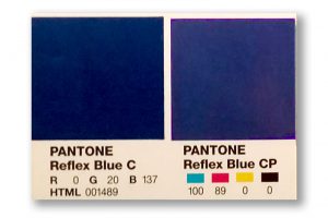 Defining a “spot blue” in your work does not mean you must always print offset, using the spot ink. Still, it gives your printer a marker of what you intend that blue to be at output. Now here comes the next hurdle – you will need to take into account the color shift that will happen when printing a PMS-defined color in CMYK. Again, we can thank the differences in color gamuts for that. For many colors, the shift is slight – for others it can be significant. Designers and printers should be able to show you both color swatches of the PMS color you chose, and of any color shift that will occur from switching to the CMYK equivalent of that color.


