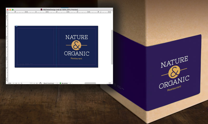
“My perfect new reflex blue brand color printed PURPLE!”
Whether you are a designer or business owner who hired a designer, you expect your color choices to look the same on paper as they did on your desktop monitor — and also the same on your boss’ cellphone where he viewed your proof, on your website where a coworker converted your design into a webpage, on signage, on packaging, and on all your marketing tools that will reach your audience. What sounds deceptively simple at first is actually a VERY tall order in a world where color reproduction and color perception are influenced by so many factors.
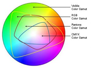
That’s where the collaboration between a trustworthy printer and experienced designer come to the rescue! Technology makes the creation, production, and sharing of amazing designs incredibly easy. And while color management is now standardized and more affordable than in comparison to “the old days,” it is NOT a given and requires more understanding and communication up front to avoid any pitfalls and nasty surprises at print time. Digital speed has still not changed some basic, unalterable facts of the science of color and how our eyes perceive it. Your blue came out purple because of the divide between RGB and CMYK color gamuts.

In simplest terms, the colors available in the RGB color gamut (what you can see on your screen) are much greater than the colors available in the CMYK gamut (what can be printed). There are many ways print professionals try to minimize the color shift in the conversion from RGB to CMYK, but they are not all perfect solutions and some colors reveal much more visible differences than others. While the RGB gamut can display a large number of shades and nuances in darker blues, the CMYK gamut is more limited. In trying to reproduce those faint differences, the cyan and magenta used to create the blue with ultimately blend toward purple. Understanding this way back at the point of inspiration and design is essential to avoiding disappointment at the point of print.
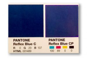
One of the most standard ways to guard against unwanted results (like purplish blues) is to base designs in the Pantone® Matching System library of colors. If you define the blue in your design as a specific PMS blue, then your printer will know, and then be able to take steps to match the color against this “universal” standard. You will both have a standard against which to measure your blue. It is like a built-in instruction of how the color should be rendered.
 Defining a “spot blue” in your work does not mean you must always print offset, using the spot ink. Still, it gives your printer a marker of what you intend that blue to be at output. Now here comes the next hurdle – you will need to take into account the color shift that will happen when printing a PMS-defined color in CMYK. Again, we can thank the differences in color gamuts for that. For many colors, the shift is slight – for others it can be significant. Designers and printers should be able to show you both color swatches of the PMS color you chose, and of any color shift that will occur from switching to the CMYK equivalent of that color.
And not to make things seem even harder, but color perception is also influenced by a host of other issues. The type, color and material of substrate you are printing on can vastly alter certain colors. Specialty finishes like gloss overlaminates or UV coating can as well. Screen calibrations of monitors used in the design and proofing process can influence how colors appear, and the lighting where any screen or print is viewed is also a factor.
One more interesting phenomenon: metamerism. Without getting into the science behind the term, some colors that are actually different will appear identical to the human eye under certain lighting conditions and different under others. There are at least 12 conditions that can create this metamerism: light, angle of view, size, distance, time, scenery, gloss… even differences in the human eye itself.
So what about that problem with dark blues? If you are using blue in your logo or designs, and are concerned about a color shift toward purple, be certain that the cyan and magenta values in the CMYK definition of your blue color vary by at least 30% (some recommend 40%). Anything less than that, especially with dark colors, and the blue and red will mix to render purple – it is just a fact of physics.
Knowing these types of technical color issues is important if you choose to buy your print online from a large, bulk print provider. They will print exactly what you sign off on when you submit your file. When you work with your local printshop, a good relationship between you, your designer, and your printer will bring you a team approach to getting the exact color you want on all your valuable marketing.
Call us at 828.684.4512 for any marketing needs. As a printer, we understand communication, design, and teamwork. Your printer should be able to provide you with the latest information, inspiration, technical advice, and innovative ideas for communicating your message through print, design and typography, signage, apparel, variable data printing and direct mail, integrated marketing and environmentally responsible printing. If they can’t, you have the wrong printer! The best advice, always, is to ASK YOUR PRINTER!
ImageSmith is now partnered with Extreme Awards & Engraving – our in-house partner providing custom engraved trophies and awards for employee recognition programs, sporting events, and promotional needs. With our new sister company, we will be sharing space, resources and expertise in a collaboration designed to further provide you with one place to meet all of your marketing needs… Under One Roof! Visit them online at www.extremeae.com or call direct at 828.684.4538.


