Marketing Plan: Get More from Your Print Flyers

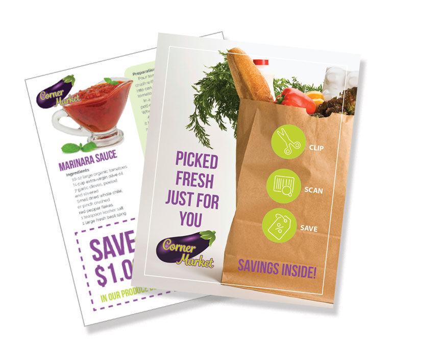
Marketing flyers

The humble flyer – a staple of print marketing, remains one of the most familiar print pieces through the years. In a digital world, it is easy to under appreciate their impact. But flyers are as successful and versatile in marketing today as at any previous time, especially when you create them with multi-purpose uses in mind.

We often think of flyers in a limited way:  they announce the band playing this weekend on the corner, or the 20% off Back-to-School sale. Those get the job done but are temporary and single-use. They are also easy chances to go “off brand” in design and tone, which is not helpful. To get more for your money when printing flyers, consider ways to develop multipurpose content within a broader vision for your message. You may want to distribute a thousand flyers in a targeted mailing by a certain date, but with a content tweak or two, that same piece can do more work.  You can print extra in the same run to use as collateral in sales outreach or distribution in-store, without incurring extra print costs in production. If you need a flyer to announce a new product, for example, the same piece can also be used as:

  • a stand alone direct mail piece
  • an insert into a company overview folder
  • an in-store handout
  • a sales call leave-behind piece
  • and also as a print advertisement or digital ad

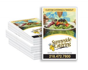
Catering flyersPlanning a strategy to your market outreach, rather than just looking from event to event, is a game-changer for small and medium sized businesses. Just as a restaurant might develop different menus for lunch, dinner, take-out, or catering, you can create a series of flyers that target different types of customers with the specific products or services that would appeal most to them.  The more targeted you craft your message, the greater your chance of success – just like online. The trick to making that work is the upfront planning.

Folded flyersThe flyer does not have to just be a boring sheet of paper. Consider die-cuts, folds and perf, attachments, special spot coatings, or foil metallics are some of the options you can try. Placing that flyer within a smart marketing plan will make your print more successful and cost efficient. Consistent branding across multiple creative projects will supercharge flyers. 

Print and direct mail get proven results. They are at the core of a successful marketing mix, no matter what size business you have. Developing a marketing plan to drive it all is the key to powerful print and cost efficiency.

Call us at 828.684.4512 for any marketing needs. As a printer, we understand communication, design, and teamwork. Your printer should be able to provide you with the latest information, inspiration, technical advice, and innovative ideas for communicating your message through print, design and typography, signage, apparel, variable data printing and direct mail, integrated marketing and environmentally responsible printing. If they can’t, you have the wrong printer! The best advice, always, is to ASK YOUR PRINTER!

ImageSmith is now partnered with Extreme Awards & Engraving – our in-house partner providing custom engraved trophies and awards for employee recognition programs, sporting events, and promotional needs. With our new sister company, we will be sharing space, resources and expertise in a collaboration designed to further provide you with one place to meet all of your marketing needs… Under One Roof! Visit them online at www.extremeae.com or call direct at 828.684.4538.


ImageSmith is a full-service print and marketing provider located in Arden, North Carolina. Contact us at ImageSmith for quotes on all your print and marketing projects, and more useful tips on how to create custom, effective, high impact marketing solutions.

Foil Stamping Shines – More Options from Metallics

Foil Stamping - Hot, Cold and Digital

Foil stamping is a great way to add eye-catching shine and metallic glow to your print projects. Even a small touch of foil on a printed piece can bring it alive in a way regular inks never can. Foils have been around a long time (having once been done by hand) and today there are also several new digital and toner-based processes that can help meet the demands of any print budget, deadline, or run length. From the design side, defining the foil stamp area is generally no harder than defining a new spot color in your layout.

Probably the most well-known foiling process is Hot Foil Stamping. It requires a special metal die that is heated and pressed into the paper, creating a nice indentation in the finished piece. The hot foil process uses only one color of foil at a time, and is generally too costly for short runs. The final effect, however, elevates any print piece from average to classic – in other words, perfect for that customer who always says to “make it pop!”
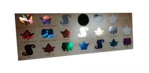
Sample Foil Swatches Cold Foil Transfer is accomplished on a 6-color press. The first 2 units apply adhesive and foil, the other 4 are for CMYK printing. Overprinting CMYK onto the foil creates a whole gamut of metallic colors that would not be possible with one-color hot foil stamping. Besides gold, silver, and copper foil, there are also holographic foils which reflect a broad spectrum of colors back to the eye, as well as matte, gloss, pearled and pigmented foils from which to choose. Again, this can be a costly process, is often limited to coated stock only, and is not a great fit for a short-run budget.

New digital processes use either toner or a polymer varnish to attach the metallic foil, and can be cost-effective on short or medium sized runs. Also, metallic foil substrates are a great option – opaque CMYK inks are illuminated by the metallic media, and white can be under printed on specific elements to retain true or non-metallic color where desired. PaperSpecs has a great “Foil Cheat Sheet” you can download free here, outlining all the current processes.

InDesign Layout for Foil Stamping

To define the foil stamp area in your layout, just make all those objects be a new spot color – name it “FOIL” if you choose. You can get clear specs from your vendor or PSP, but in short they will need a separation from your design that only contains the area to be “foiled.” Foil stamping is also a great option when choosing from the huge variety of promotional products that can be branded for your marketing. Foiling can be used on most items from keychains to coffee mugs – in a wide variety of colors and finishes.

And speaking of varnishes, spot UV varnish coatings can give a flash of highlights to a printed piece in much the same way a metallic foil does. When the paper catches the light, these elements shine and give the illusion of depth and dimension but in a more subtle way than a metallic ink or foil. They too are simply defined in prepress as a spot color separation in the same way the foil is setup.spot UV coating adds gloss to print

So the options are out there today for employing great metallic foils and effects without any extra hassle for design, prepress, or budget concerns. The main limitation is often envisioning what the final product will look like — you will not really be able to create a digital or hard copy proof that will accurately preview the often stunning effects foil stamping can create. Perhaps the best way to do that is to ask your print provider for a sample of previous projects that successfully used foil. They should be happy to help you out.

In fact, rely on your printer for advice and direction with all of your integrated marketing. They should be able to provide you with everything from encouragement along the way to complete design, layout, copywriting, production, multi-purposing, online implmentation and distribution of your marketing outreach. If they can’t, you have the wrong printer! The best advice, always, is to ASK YOUR PRINTER!

ImageSmith is a full-service print and marketing provider located in Arden, North Carolina. Contact us at ImageSmith for quotes on all your marketing projects, and more useful tips on how to create custom, effective, high impact marketing solutions.
USPS Stamps Have a New Feel – Textured Coatings & Thermochromic Ink


USPS Stamps: Textured Sports Stamps and Thermochromic Ink Eclipse Stamps

The USPS continues to excel with great design, print and marketing ideas in their innovative new postage stamps. Their newest releases take the plain printed stamp to a whole new experience level. They combine cool, engaging print techniques with a topical interest in current events and culture.

USPS Sports Stamps

In honor of the America’s favorite sports, the USPS chose the kick off of the U.S. Open golf championship to debut a series of stamps with an actual “feel.” The Have a Ball! Forever stamps are round, and honor the sports of baseball, basketball, football, golf, kickball, soccer, tennis, and volleyball. Each has a special textured coating to simulate the surface of each ball. You can feel the baseball’s stitching, the golf ball’s dimples, the tennis ball’s seams, raised panels on a soccer ball and volleyball, and the unique patterns of a football, basketball and kickball. For the philatelist, you can order first-day-of-issue postmarks and first-day covers here. On Twitter, follow the hashtag of #Haveaballstamps.

Total Eclipse of the Sun Forever Stamps

To top that creative print idea, the USPS will commemorate a rare total solar eclipse, which crosses the entire width of the continental United States on August 21, with the Total Eclipse of the Sun Forever stamp. What makes this stamp as unique as the eclipse which it commemorates? The heat of your finger pressed onto the stamp will transform the image of the darkened moon blocking the sun into an image of the full moon. This is the first time the USPS has used thermochromic ink in printing stamps. This ink is vulnerable to UV light and, since it is a forever stamp, should not be exposed to direct sunlight to preserve the effect.  For collectors, you can also purchase a special envelope to help protect the stamp pane. On Twitter, follow the hashtag #EclipseStamps.

Remember, the USPS receives no tax dollars for operating expenses. They fund their operations through the sale of postage, products and services.

Using an actual stamp – as opposed to a permit imprint –helps to boost “open rates” for direct mail marketing, providing a personal touch. For a specially targeted mailing of limited size, these textured and innovative forever stamps might prove eye-catching enough to pay for themselves in improved response.


Call us at 828.684.4512 for any marketing needs. As a printer, we understand communication and design. Your printer should be able to provide you with the latest information, inspiration, technical advice, and innovative ideas for communicating your message through print, design and typography, signage, apparel, variable data printing and direct mail, integrated marketing and environmentally responsible printing. If they can’t, you have the wrong printer! The best advice, always, is to ASK YOUR PRINTER!

ImageSmith is now partnered with Extreme Awards & Personalization – our in-house partner providing custom engraved trophies and awards for employee recognition programs, sporting events, and promotional needs. With our new sister company, we will be sharing space, resources and expertise in a collaboration designed to further provide you with one place to meet all of your marketing needs… Under One Roof! Visit them online at www.extremeae.com or call direct at 828.684.4538.


Call us at 828.684.4512. ImageSmith is a full-service print and marketing provider located in Arden, North Carolina. Contact us at ImageSmith for quotes on all your print and marketing projects, and more useful tips on how to create custom, effective, high impact marketing solutions.

The Campus Arboretum of HCC Celebrates First 50 Years with Beautiful Print Exhibit

HCC display

Celebrating the beauty of a “living laboratory” calls for a beautiful exhibit. The Haywood Community College Foundation in Clyde, NC is doing just that for the anniversary of the HCC Campus Arboretum and “First Fifty Years of Stewardship” in their exhibit Forest, Farm + Garden, 1966 – 2016. Through a mix of print, mounting and lighting techniques, the exhibited historical information and images combine to engage and inform visitors in a museum-quality experience. Visiting is a great way to learn more about local landscapes and horticulture – as well as check out in person some quality print examples, substrates and display ideas.

The landscape, gardens and collections of Haywood Community College and its Campus Arboretum are recognized as “one of the most beautifully landscaped areas in Haywood County.” The current exhibit honors the original vision of landscape architect Doan Ogden as well as the years of continued stewardship over the campus and its collections: greenhouses, a dahlia garden, orchard, working vegetable gardens, rhododendron garden, mill pond and grist mill. The HCC campus today stands as a “tapestry of landscapes that together capture the heritage of he Southern Appalachian Mountains and its people.” This HCC display is made possible through generous gifts from the Charitable Foundation of the International Dendrology Society and individual society members. Proceeds from the sale of exhibit catalog, photos and posters will be used to further education, outreach and stewardship of the Campus Arboretum.

HCC Mill Pond
Photo by Benjamin Porter

The exhibit is located in the Mary Cornwell Gallery of the Creative Arts Building on the HCC campus, and will be open from October 1 through November 19, 2016.

Forest, Farm + Garden, 1966 – 2016 employs a blend of different print, mounting and display techniques to tell the story of 50 years of stewardship on the HCC campus. New photographs by Benjamin Porter as well as historic plans, photos and maps from the founding director John Palmer’s records bring to life the history and achievements. Check out below some of the print techniques that can be used for any permanent or temporary display to engage viewers.

Campus Arboretum HCC display


Dye-Sublimation Fabric Printing – colorful graphics and text come alive on the rich texture of fabrics through a process known as dye-sublimation, or “Dye Diffusion Thermal Transfer Printering.” This “soft signage” preserves the drape and texture of fabric, and has the bonus of being lighter in weight and less expensive to ship than heavier traditional signage.

Mounted, Adhesive Vinyl, Wide Format Prints – sharp photographic quality prints on glossy vinyl are great for any large-scale display. The adhesive vinyl substrate provides high quality, colorfast output with vibrant colors. Mounting the finished prints onto foam core, corrugated plastic, or PVC backing provides depth and relief to a wall-mounted display in the same way traditional framing does, but without the expense or hardware.HCC display

Flatbed UV Printing – signage can also be printed directly onto substrates up to 6 inches in depth on a flatbed printer, eliminating the need for mounting. UV print bonds directly to the surface of the substrate and provides clear, full-color output in one step. Print pre-mounted plastic, wood or metal surfaces or even pre-stretched canvases for a stand-out wall display.

Contour Cut Vinyl Lettering – for a great visual display of the written word, contour cut vinyl lettering combines great typography with mountable adhesive for an exhibit with a  museum-quality finish. Letters are laser cut from any color of adhesive vinyl, the excess areas “weeded” away, and the text can then be mounted directly on a wall or display. Printed in reverse, the letters can be mounted on the back of glass or other clear substrates for a see-through effect as well.

Talk to your printer about these and more great ideas to create your own one-of-a-kind exhibit or display for everything from an event or opening to a tradeshow or retail window or lobby display.


Call us at 828.684.4512 for any marketing needs. As a printer, we understand communication and design. Your printer should be able to provide you with the latest information, inspiration, technical advice, and innovative ideas for communicating your message through print, design and typography, signage, apparel, variable data printing and direct mail, integrated marketing and environmentally responsible printing. If they can’t, you have the wrong printer! The best advice, always, is to ASK YOUR PRINTER!

ImageSmith is now partnered with Extreme Awards & Personalization – our in-house partner providing custom engraved trophies and awards for employee recognition programs, sporting events, and promotional needs. With our new sister company, we will be sharing space, resources and expertise in a collaboration designed to further provide you with one place to meet all of your marketing needs… Under One Roof! Visit them online at www.extremeae.com or call direct at 828.684.4538.


Call us at 828.684.4512. ImageSmith is a full-service print and marketing provider located in Arden, North Carolina. Contact us at ImageSmith for quotes on all your print and marketing projects, and more useful tips on how to create custom, effective, high impact marketing solutions.
Print Surprise: Optical Illusions at the Press


Optical illusions – where the perceived reality of a viewed object is different than the actual physical attributes being viewed – are interesting phenomena. Occasionally an unintended illusion will pop up in the print work here at our shop, and it usually takes a little convincing to prove to our press operators and art department that the problem is in the viewing…not a mistake in the print files or print process itself.

Gradients Can Trick the Eye

Optical illusion on press sheets

Above is the press sheet layout for a 4-up printed card which will later be cut out and folded in half. However, coming off the press, the 4-up sheets appear like the left side is darker than the right, especially on the outer side of the card. (In person, the effect was even more dramatic than it shows up here onscreen as it was printing on a metallic paper.) We were stumped at first as to what could cause this – the pdf file was preflighted, all the images were rendering correctly. We wondered about a problem with the press, the imagesetter, the layers within the pdf file. Finally, it took cutting a finished sheet apart by the crop marks to see that once separated, the gradients looked fine. Placed next to each other, the light to dark gradient tricked the eye into thinking one side of the press sheet was darker.

Gradient optical illusion


Repeating Patterns and Distortion

repeating pattern optical illusion

The 2-up sheets printed above have a decorative border with a repeating pattern that flows in one direction to the halfway point and then reverses its orientation for the second half on all four sides. If you let your eye wander slowly along the borders, especially the longer vertical sides, it appears that the borders are bent and not a perfect square shape overall. The eagle eyes of our press operator noticed the subtle “bend” in the lines and decided that either the file or the imaging plate itself was somehow warped. Placing a ruler or straight edge on the press sheet reveals that, despite what your eyes are telling you, the line is perfectly straight across all four sides of the paper.

Optical illusion of a square decorative border

You can read more about optical illusions and view galleries of them at a surprisingly great number of websites as many people find the tricks our eyes can play on us to be a fascinating topic.


Call us at 828.684.4512 for any marketing needs. As a printer, we understand communication and design. Your printer should be able to provide you with the latest information, inspiration, technical advice, and innovative ideas for communicating your message through print, design and typography, signage, apparel, variable data printing and direct mail, integrated marketing and environmentally responsible printing. If they can’t, you have the wrong printer! The best advice, always, is to ASK YOUR PRINTER!

ImageSmith is now partnered with Extreme Awards & Personalization – our in-house partner providing custom engraved trophies and awards for employee recognition programs, sporting events, and promotional needs. With our new sister company, we will be sharing space, resources and expertise in a collaboration designed to further provide you with one place to meet all of your marketing needs… Under One Roof! Visit them online at www.extremeae.com or call direct at 828.684.4538.


Call us at 828.684.4512. ImageSmith is a full-service print and marketing provider located in Arden, North Carolina. Contact us at ImageSmith for quotes on all your print and marketing projects, and more useful tips on how to create custom, effective, high impact marketing solutions.
“First Among Many”: Library of Congress Exhibit on Early American Printing

Thomas Paine's Common Sense


If you find yourself in Washington, DC this summer, the Library of Congress has a must-see, free public exhibit covering the foundation of printing in the American colonies.  Called “First Among Many: The Bay Psalm Book and Early Moments in American Printing,” the exhibit will run from June 4, 2015 to January 2, 2016. The LoC press release says the amazing collection of printed papers will:

“…tell the story of early printing in the American colonies, spanning 100 years, as printing evolved from a colonial necessity to the clarion of freedom.”


The centerpiece of the exhibit is two copies of the Bay Psalm Book of 1640. Only 11 copies are known to exist, and the book is both the first English-language book in North America and the first printed book of American poetry. It is also the most expensive printed book ever – having sold at Sotheby’s for $14,165,000 to entrepreneur and philanthropist David Rubenstein in 2013.

You can peruse the Bay Psalm Book online for free (see below), courtesy of the Old South Church in Boston – but nothing tops the ability to see the actual printed work in person this year at the Library of Congress.

Digital Bay Psalm Book


Other rare printed items from the colonial period will also be on exhibit:

  • A Poor Richard’s Almanac by Ben Franklin from the 1740s
  • Thomas Paine’s Common Sense pamphlet from 1776
  • The Federalist essays of 1788 from Alexander Hamilton, James Madison and John Jay
  • Poet Phillis Wheatley’s 1773 Poems on Various Subjects, Religious and Moral. Wheatley was the first African American published poet and the first published African American woman
  • An Algonquian Indian Bible from 1663
  • The first novel ever printed in the colonies: The Power of Sympathy, 1789 by William Hill Brown

Phillis Wheatley's poems and Poor Richard's Almanack


For those unable to get to DC, the Library of Congress will also maintain an online version – here. This exhibit truly highlights the role printing played in America’s founding and independence. That influence continues today as print evolves through an ongoing information and technological revolution. Print is communication – it will change, but never be relegated to just a museum exhibit.


Call us at 828.684.4512 for any marketing needs. As a printer, we understand communication and design. Your printer should be able to provide you with the latest information, inspiration, technical advice, and innovative ideas for communicating your message through print, design and typography, signage, apparel, variable data printing and direct mail, integrated marketing and environmentally responsible printing. If they can’t, you have the wrong printer! The best advice, always, is to ASK YOUR PRINTER!

ImageSmith is now partnered with Extreme Awards & Engraving – our in-house partner providing custom engraved trophies and awards for employee recognition programs, sporting events, and promotional needs. With our new sister company, we will be sharing space, resources and expertise in a collaboration designed to further provide you with one place to meet all of your marketing needs… Under One Roof! Visit them online at www.extremeae.com or call direct at 828.684.4538.


Call us at 828.684.4512. ImageSmith is a full-service print and marketing provider located in Arden, North Carolina. Contact us at ImageSmith for quotes on all your print and marketing projects, and more useful tips on how to create custom, effective, high impact marketing solutions.

Quick InDesign Tip: Discover the Story Editor


InDesign Story Editor

Many InDesign users may primarily work on image heavy, single page documents such as flyers, office stationary, business cards, posters or ads. But if you have ever found yourself in charge of laying out significant amounts of text for projects such as annual reports, directories, or even your great American novel, the often-overlooked Story Editor in InDesign can be your best friend.


Toolbox for PageMaker 4.0, before Adobe Systems purchase
The Aldus PageMaker 4.0 Toolbox

Like most every feature in an Adobe product, you will discover layers of functionality the deeper you decide to explore. This article intends to just open the door on a feature that is a little bit hidden. Back in the days of PageMaker, the InDesign predecessor originally produced by a company named Aldus, manipulation of text was the heart and soul of the program. Tools to import and arrange graphics and photos were essential and expanding with every upgrade, but PageMaker’s “reason to be” was styling and control of text and the Story Editor was it’s powerhouse. Whenever you work with large amounts of text, it still is today.

Artwork from PageMaker Story Editor

The most basic function of the Story Editor is to allow you to see overset text that fills up a text frame or page without having to go ahead and flow the rest of your text onto new pages or off on the pasteboard area. Click within a block of text and hit Command+Y (Ctrl+Y) or Edit > Edit in Story Editor to open up your text in its own window. Think of it like a “word processor” view of the entire placed text, scrollable even for hundreds of pages in one long view. (The original Aldus software manual described the Story Editor as “PageMaker’s word processor.”) This view of your text does not show line breaks, styling (other than basic bold, italic, underlined), or other design/layout attributes – what you get is the raw complete text where you can write, edit, correct, search and manipulate without the distractions of the layout. (If you are familiar with WordPress, the Story Editor is similar to the Text or HTML view rather than the Visual tab.)

From this window you can work on large amounts of text flow in a multi-page document. If you are still writing your content, or just searching out edits and corrections, this view gives you the control to write and edit without turning pages, screen redraws, or design distractions. If you ever find yourself confused as to why a portion of text is not “acting” as expected, check the Story Editor to see any hidden text variable or markers such as Drop Caps, Index Markers or Hyperlinks. Often you can delete or edit these here much easier than in the normal layout view. Even if you are just working on text that is difficult to see on screen due to size, rotation or special effects, a quick Command+Y will let you see and edit the text in a straightforward window and the changes will update live in both displays. The Story Editor is also the place to manage more advanced tricks like footnotes, XML or tagged text, and conditional text.

Open your Story Editor just to get a feel for how it can benefit you in your own style of working with InDesign.

Story Editor Preferences Pane
Set the font and appearance for your Story Editor view

Be aware that each independent text block or series of linked blocks will open its own Story Editor window – there is not one single Story Editor for an entire Indesign document. Also know that you can customize the look and display of your editor from the InDesign Preferences/Story Editor Display window. Take a few moments to explore the Story Editor and save yourself a lot of time, clicks and frustration on future design jobs.


Call us at 828.684.4512 for any marketing needs. As a printer, we understand communication and design. Your printer should be able to provide you with the latest information, inspiration, technical advice, and innovative ideas for communicating your message through print, design and typography, signage, apparel, variable data printing and direct mail, integrated marketing and environmentally responsible printing. If they can’t, you have the wrong printer! The best advice, always, is to ASK YOUR PRINTER!

ImageSmith is now partnered with Extreme Awards & Engraving – our in-house partner providing custom engraved trophies and awards for employee recognition programs, sporting events, and promotional needs. With our new sister company, we will be sharing space, resources and expertise in a collaboration designed to further provide you with one place to meet all of your marketing needs… Under One Roof! Visit them online at www.extremeae.com or call direct at 828.684.4538.


Call us at 828.684.4512. ImageSmith is a full-service print and marketing provider located in Arden, North Carolina. Contact us at ImageSmith for quotes on all your print and marketing projects, and more useful tips on how to create custom, effective, high impact marketing solutions.

The New Yorker at 90: The Art of Great Cover Art

It’s easy to love The New Yorker. Their editorials, criticism, opinion, reporting, poetry, and celebrated cartoons have consistently set a gold standard of excellence for publishing.  The venerable magazine is celebrating 90 years of groundbreaking, respected coverage of much more than the New York literary scene, and must be basking in the accolades from readers and critics. You know you’re pretty influential when bloggers take the time to praise and interpret the shape of just one letter in your masthead!

The New Yorker covers provide a master class in creative illustration and graphic design. Timely and often controversial cover art is a mainstay of the magazine as the New York Times notes the covers have taken a distinctive shift “from polite to provocative.” The editors seek out innovative artists who movingly capture the nation’s excitement, fear, contradictions or spirit in a graphic image that gets noticed, sells magazines and ultimately proves the enduring power of print.

Great graphic design brings order and meaning to a complex or hard-to-define subject – and The New Yorker covers excel at that. Wit and creativity are needed to illustrate a complex point of view or clash of points of view in a deceptively simple artwork. Some magazines rely on the excitement and buzz generated by a controversial cover image simply to get attention for attention’s sake – think Sports Illustrated’s swimsuit issue or the outlandish banner headlines of the tabloids. Conversely, The New Yorker covers do more than exploit an event’s moment in the mainstream spotlight – and they often make news in and of themselves.

Often a great cover image becomes indelibly linked in our minds to the events or topics they address. As the covers below prove, the creation of a great cover illustration also has a story behind the scenes that is equally interesting:

The New Yorker Covers
© The New Yorker

Sept. 24, 2001: read the story behind the uncredited cover commemorating the tragedy of 9/11.

Dec. 8, 2014: Bob Staake’s poignant illustration of the racial divisions in Ferguson, MO.

July 21, 2008: “The Politics of Fear” by Barry Blitt – one of the most satirically controversial covers in The New Yorker’s history.


The New Yorker Covers
© The New Yorker

July 8, 15, 2013: “Moment of Joy” by Jack Hunter, celebrating the defeat of the Defense of Marriage Act (DOMA).

Jan. 19, 2015: “Solidarité” by Ana Juan, memorializing the massacre at the French satirical magazine Charlie Hebdo.

Dec. 16, 2013: “Madiba” by Kadir Nelson, for the passing of Nelson Mandela.


To show the importance of cover art to the magazine’s essence, The New Yorker decided to print not one but 9 different covers – one for each decade – for it’s special anniversary double issue. Each image seeks to bring the iconic cartoon dandy Eustace Tilley who appeared on the first cover in 1925 into the 21st century. And in order to ensure they stay as relevant and dynamic in the next 90 years as they have in the past, the magazine just hired ad agency SS+K to steer and coax it’s brand progression.


Call us at 828.684.4512 for any marketing needs. As a printer, we understand communication and design. Your printer should be able to provide you with the latest information, inspiration, technical advice, and innovative ideas for communicating your message through print, design and typography, signage, apparel, variable data printing and direct mail, integrated marketing and environmentally responsible printing. If they can’t, you have the wrong printer! The best advice, always, is to ASK YOUR PRINTER!

ImageSmith is now partnered with Extreme Awards & Engraving – our in-house partner providing custom engraved trophies and awards for employee recognition programs, sporting events, and promotional needs. With our new sister company, we will be sharing space, resources and expertise in a collaboration designed to further provide you with one place to meet all of your marketing needs… Under One Roof! Visit them online at www.extremeae.com or call direct at 828.684.4538.


Call us at 828.684.4512. ImageSmith is a full-service print and marketing provider located in Arden, North Carolina. Contact us at ImageSmith for quotes on all your print and marketing projects, and more useful tips on how to create custom, effective, high impact marketing solutions.