5 Reasons to Love the Vector Version of Your Logo

Yes… you need a vector version of your logo! You may not be able to place or use it in a Word document, but for any high quality printing or output (or for spot or “2-color” printing) you should insist your designer supply you with the vector logo. Preferably, it will be the way your logo was originally created, and you will not have to pay or struggle to convert it from a pixel-based image after it has already become an integral part of your brand. Here are the reasons why:

  • Vector artwork can be scaled to any size needed and maintain its perfect clarity. They have crisp edges at any size as they are based on mathematical formulas rather than a bed of pixels.
  • They maintain a clear, transparent background when placed over other artwork or elements in your design. PNG files also have this ability but are pixel based so… (see reason #1)
  • They can function either in RGB or CMYK color modes as well as carry spot color definitions. You can select exact PMS color matches so that your brand is always reproduced consistently. While there are methods to include spot color information in a pixel-based file (DCS files from PhotoShop with spot color channels) they are, again, not resizeable and do not include easy trap information for printing.
  • You can easily switch a vector logo to a pixel-based file (.TIF, .JPG, .PNG, etc.) for manipulation, web use or other instances… but it is difficult and sometimes impossible to travel from pixel to vector in a satisfactory manner.
  • This last reason can be debatable and I am sure there are exceptions to the rule, but: as most logos need to be clean, vivid and memorable, vector shapes readily lend themselves to these qualities. The logos you know and remember are almost always designed as vector shapes rather than fuzzy, artistic brushstrokes or photographic effects.

WARNING: pixel-based files can be saved as EPS files, but be aware that just because it has an EPS suffix it has not been magically converted to a vector file. Also, pixel images can be placed into vector draw programs like Illustrator and saved as .AI or .EPS files. Again, not vector!

Vector shapes can be resized
both of these images are .EPS files, but the one on the left is pixellated. The one on the right is a true vector logo.
Contact us at ImageSmith for quotes on all your marketing projects, and more useful tips on how to create custom, high impact graphics and marketing solutions.


8 Good Reasons to Use FSC Certified Paper

FSC – Forest Stewardship Council. This is a global, non-governmental organization that was established in 1993 to oversee responsible forest management to protect both the world’s forests and its forest-dependent communities.

Forest Stewardship Council
Forest Stewardship Council Logo

You see their logo on many products, from paper to building supplies, and there are many good reasons to both look for it on the forest products you purchase and insist on the logo on products you or your company use.

  • It protects the ENVIRONMENT. Forest products coming from FSC certified forests must be grown, managed and harvested in a way that is good for the habitat and the future growth of the forest.
  • It helps indigenous PEOPLE. All local, regional and global laws must be followed in harvesting and transporting FSC products, respecting the health and environment of indigenous people.
  • You are helping EMPLOY local workers. FSC forests must employ a local workforce at a decent salary to run their operations.
  • You are helping EDUCATE. FSC forest owners must support their local communities in many ways, especially in the development of schools.
  • Its for the FUTURE. Forests will be here for generations to come for others to enjoy and use.
  • FSC is the only paper certification ENDORSED by most major environmental groups. These groups include World Wildlife Fund, Greenpeace and The Woodland Trust.
  • It helps YOU, your business and your bottom line as consumers appreciate a commmitment to green practices and being able to participate in supporting sustainability through their purchases. It is a competitive advantage for you.
  • You can show your own commitment to SUSTAINABILITY. The FSC logo is widely respected and increasingly recognized as the standard in responsible forest management. That reflects on your brand.

ImageSmith is proud to offer FSC papers with Chain of Custody certification. You can use, at no extra cost, these on-product labels on your printed material — a globally trusted mark for businesses and consumers looking for sustainable solutions. Become a part of the chain. Forests, managed correctly, are a truly renewable resource.Sustainability at ImageSmith


Contact us at ImageSmith for quotes on all your marketing projects, and more useful tips on how to create custom, high impact graphics and marketing solutions.


When printed halftone screen angles conflict, THAT’S A “MOIRÉ”!

You have encountered moiré (pronounced ‘more-ray’) patterns many times and perhaps not known the term for what you were witnessing. When a television is photographed or videotaped, those annoying interference patterns and running lines are a moiré effect. If you have ever seen a person on television wearing a striped or patterned piece of clothing and it appears to undulate or move in a strange optical illusion – that is a moiré as well (specifically called “strobing”). The moiré appears whenever two grids are overlaid at a conflicting angle, or if they have differing mesh sizes.

Moiré samples
Left: Overlapping concentric lines create a moiré effect. Center: a scan of an offset printed photo reveals a repeating pattern effect or moiré, rather than a smooth color. Right: The 'rosette' dot pattern created by overlying halftone screen angles.

In the world of offset print and graphics, moiré patterns arise in two main ways. First, and most commonly, when a preprinted image is scanned, interference occurs between the ruling of the dot pattern of the original print and the scanner’s sample pattern. Filters can be used during the scan process to “descreen” the result and minimize the moiré, however it is always best in printing to avoid scans of pre-printed pieces for your artwork. Even descreening results in a less sharp image, and a ‘softer’ or fuzzier appearance.

Second, and less common thanks to Raster Image Processors (RIPs) and their digital control over imaging, are the moiré patterns than can occur when the four screen angles used in offset printing conflict. Each color in 4-color process printing is screened into a pattern of dots, and then angled differently to form a full color image. A standard set of screen angles to avoid a moiré is 105° cyan, 75° magenta, 90° yellow and 45° black, although the visibility of moiré is not always predictable, with some images exhibiting a moiré where others do not.

A great way to see how a moiré pattern works is to check out the demos at mathematik.com and mathworld.com. For a great explanation about screen angles and halftone patterns, be sure and read the Quality in Print blog.

Contact us at ImageSmith for quotes on all your marketing projects, and more useful tips on how to create custom, high impact graphics and marketing solutions.


How to Set Up Tri-Fold Brochures that Fold Correctly

If you layout your 8.5 x 11 brochure for a tri-fold by splitting your page into 3 equal columns, it will NOT fold correctly. Text and images will appear off center once folded on several of the panels. The thickness of the paper during the fold must be accounted for to achieve a finished panel that is centered. The panels on the inside, being a mirror image in placement of the ones on the outside, must also be offset an equal but opposite (in the other direction) amount. The amount of offset, however, can vary depending on if you are printing on text weight, cover stock, or other paper types. Below you will find a general setup that works for a tri-fold brochure. (With InDesign, multiple page sizes are supported within one document so you can set up your different sized panels there as a 6 page document as well).

How to set-up a tri-fold, 8.5 x 11 brochure:

Allow a .375” margin on all four sides of the paper (unless you are sure you are printing on oversized paper to accommodate a bleed.) Two panels are 1/16” larger than the third. Pages 1 & 2 of your document must be set up INDIVIDUALLY with different panel widths, being mirror images of each other – see the diagrams below. Unless you are using heavy paper, an amount more than 1/16” will be far too much for a fold allowance.

The FRONT COVER or outside panels:

Panels 2 & 3 must be slightly larger than Panel 1.

Brochure Trifold


The Back or INSIDE PANELS:

Panels 1 & 2 must be slightly larger than Panel 3 (the mirror image of the outisde setup)

Trifold brochure dimensions
Dimensions for the inside panels of a Tri-Fold brochure
Contact us at ImageSmith for quotes on all your marketing projects, and more useful tips on how to create custom, high impact marketing solutions.


Rack Cards – 6 Tips to Rack Up Profits

Rack cards are one of the most concise, effective and affordable marketing tools to put information into the hands of your customers. You can maximize their impact by keeping a few key issues of content and design in focus. Include a QR code, and you have bridged the gap between your printed marketing and your online presence.

High Impact, Low Cost, Full Color – The Benefits of Rack Cards

Rack Card Full Color
Full Color, Low Cost, High Impact Rack Cards

The very simplicity and size of rack cards make them a powerful, straightforward marketing tool. Standard rack card size is 4″ x 9″, suitable for easy display in high traffic areas and convenient to pick up and carry. They also fit nicely into a #10 envelope for mailing. Eyecatching color and graphics can work to ensure your content is noticed. Some rack card subject ideas include: company overviews & introductions, mission statements, sales events & promotions, specific product information,  announcements, and informational/educational content. They should also encourage connection to online content and purchasing.

6 Tips for Designing & Printing Rack Cards

The size of rack cards encourages you to be specific about the information you include – keeping content focused, clear and effective. Here are a few tips for creating your layout – some are common to all printing projects, some unique to rack cards:

  1. Maximize use of color and photographs. You only have a second to catch the eye of a consumer passing your rack card display and you will want to make the card something they pick up and enjoy visually. The top portion of the card needs to include either your logo or the title of the card’s content, and an eye-catching colorful image. Maximize use of unique, original photos of your business or subject matter, minimizing use of stock photography when possible. A good tip for inspiration: visit rack card displays and notice the cards that pop out and make you want to pick them up — study those!
  2. Brand your work. Rack cards are a “high touch” marketing tool, and many people will see your card, even if they do not pick it up and carry it with them. It is essential your rack cards are designed to maintain the standards of your brand in both color, quality and content. To select a generic template online that does not match your brand, or to throw together a quick layout may save you money in the short run, but will establish a perception that is confusing and/or negative to many potential clients or customers.
  3. Focus your content. Before you begin to write copy, be clear about the message you want to relate and your target audience. A specific message, directed to a specific type of consumer, increases your card’s chances of being picked up and remembered. Practice defining the subject of your copy in five words or less. If you can’t do it effectively, you need to narrow the focus of your subject matter.
  4. Don’t limit print with low-tech assumptions. Printed pieces are a time-proven means of getting your information into the public. But they can now be the essential link between a hands-on contact and your online marketing. Use QR codes on your cards to drive traffic to online promotions or websites. You can then track exactly who, by clicking their smartphone’s camera, is coming to your site, and judge the effectiveness of your rack card promotion. At the very least, include your web address and direct people to find you online.
  5. Multipurpose. A run of rack cards can and should be used in several different ways to maximize their effect. You can arrange a display at your business and find as many appropriate places as possible in public areas to display your cards. Ask vendors, neighboring businesses, and related but non-competitive businesses if you can leave some cards in their lobby. Also, use the cards for bulk, targeted mailings.
  6. Don’t forget to include the basics… and proofread! You have limited space left after your photos and branding but you need to include the information a potential customer will need to contact you. Include a map (they are easy to get your hands on these days) to your location. If you want to push traffic to your website instead, replace the map with a LARGE version of your web address and a QR code. Phone numbers, fax numbers, mailing address… check and double-check for errors. The amount of waste due to one misplaced character is incalculable.
Contact us at ImageSmith for quotes on rack cards, and more useful tips on how to create custom, high impact marketing solutions.

QR Codes: Your Vital Link Between Print & Web

If you haven’t heard of or seen them yet, you must be trying to ignore them! QR – or Quick Response – codes have begun popping up everywhere (I’ve noticed them on package labeling in Wal-Mart so they have definitely gone mainstream). Easy to create and use, you could be missing a powerful and low cost opportunity to connect people with your business or your multimedia online content.

The Basics

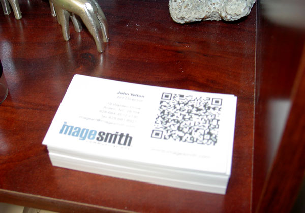
Business Cards with a QR Code
QR Codes connect your print marketing materials to web content

Think of QR Codes like a barcode you see on all product packaging. The main difference is that QR Codes are 2D matrix codes that are capable of holding MUCH more information. Consumers “scan” the codes with their camera-enabled smartphone – in other words that just snap a picture. (the software is free online – but most smartphones come preloaded with a QR Code reader.) What happens? Depending on the type of code, their phone will automatically link via web browser to specific online content or activate any one of a number of smartphone functions (such as email, IM, SMS, contact info, etc.). Probably the most basic application is on business cards – take a picture of my business card and it will add my contact info directly into your smartphone’s address book.

How Can You Use These QR Codes?

The possibilities are endless… but the bottom line is QR codes should be a part of any promotions or marketing campaigns you begin. You can print them on virtually anything (all printed materials and signage, as well as anything from t-shirts to car wraps, billboards, etc.) and drive traffic to your website or online content of your choice. What information could you supply via QR Code:

  • Directions to your business
  • Coupons or special offers
  • Free downloads
  • Feedback forms
  • Product information
  • Instructions for product use
  • Event promotions or announcements
  • Sign ups for giveaways or mailing lists
  • Price lists
  • … you get the idea – any information you want people to access

A Case Study: Putting QR Codes to Work

Check out this link to read about how CENTRAL PARK IN NYC incorporated QR Codes into the heart of their events for Arbor Day this year. This example really got my mind working about the many ways these codes could be used to promote any event or marketing campaign. Very soon, consumers will begin expecting to find these codes as a way to get the information and opportunities on any purchases they make, or any places they visit.

We have more information on QR Codes at our website… check it out! Talk to us at ImageSmith for great ideas and practical help in getting started with QR Codes in all your promotions.