Microtype: Because One Size Typography Does Not Fit All

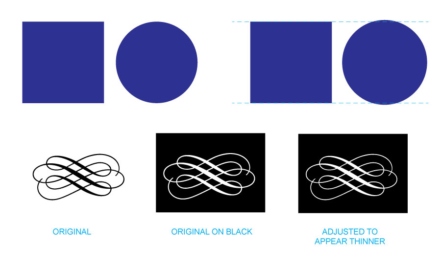
MicrotypeSeeing something enlarged to a great size can reveal unseen tiny flaws – think of that bad selfie in harsh lighting. But by the same token, greatly reducing an image can create it’s own problems with recognition and readability. That’s where microtype and optical sizing can create better design.

Microtype of product labelGreat typography is a pleasure to read. But the requirements for that readability change with a font’s size. Today the need for easy-to-read small or “micro” type sizes is increasing in both print and digital applications. Why now more than before? E-books, smart watches, phones, and other devices with small screens require fonts with quick readability at a small size and resolution. On the print side, prescription bottles with dosage directions, food packaging with nutritional info, and almost all product packaging that includes ingredients or warnings need a readable font at small point sizes to clearly impart information.

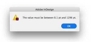
Type size limits in InDesignIn general, most fonts were designed for the average reading environment – as in comfortably reading a book or newspaper – in the 8 point to 14 point range, and for a viewer with 20/20 vision. Being vector-based – they can scale both tiny or huge with no loss of detail. The assumption is generally that “one size fits all.” Yet the human eye definitely has different requirements. 

When fonts are scaled up larger – think billboards or wide format signage – small imbalances that were unnoticeable at 10 point become very noticeable. Designers usually adjust tracking and kerning to compensate, which works well as there are usually a relatively small number of words on most really large displays. 

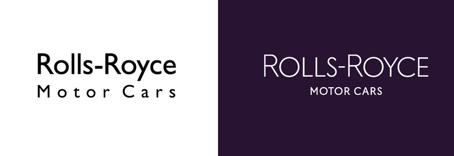
Microtypography deals with type generally below 8 point in size. Certain letterforms at small sizes tend to blend together or become indistinguishable from other similarly shaped letters. Loosening kerning and tracking to give the type more “air” is a quick fix, but definitely not an ideal solution. The great type foundries and classic font designers are now addressing this need for easily legible microfonts.

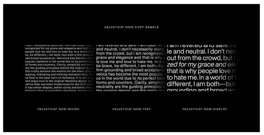
Monotype's Helvetica NowOne great example is Monotype’s Helevetica Now. They have redesigned all 40,000+ characters in the font for the 21st century and its demands. Designers can choose from three optical  masters: Micro for small point sizes, Text for what we consider normal print applications, and Display for large, wide format designs. Each is designed to perform most effectively at its own size, taking into account all the visual nuances and needs the human eye demands for a comfortable reading experience.


Call us at 828.684.4512 for any marketing needs. As a printer, we understand communication, design, and teamwork. Your printer should be able to provide you with the latest information, inspiration, technical advice, and innovative ideas for communicating your message through print, design and typography, signage, apparel, variable data printing and direct mail, integrated marketing and environmentally responsible printing. If they can’t, you have the wrong printer! The best advice, always, is to ASK YOUR PRINTER!

ImageSmith is now partnered with Extreme Awards & Engraving – our in-house partner providing custom engraved trophies and awards for employee recognition programs, sporting events, and promotional needs. With our new sister company, we will be sharing space, resources and expertise in a collaboration designed to further provide you with one place to meet all of your marketing needs… Under One Roof! Visit them online at www.extremeae.com or call direct at 828.684.4538.


ImageSmith is a full-service print and marketing provider located in Arden, North Carolina. Contact us at ImageSmith for quotes on all your print and marketing projects, and more useful tips on how to create custom, effective, high impact marketing solutions.

The Rebirth of Brutalism – Graphic Design’s Edgy Experiment

Virgile Flores, Art direction, Graphic design

Playful or angry? Radical or bland reproduction? Utilitarian or chaotic? Brutalism in graphic design thrives on uncertainties.

A common goal of design, especially in a print marketing or web commerce environment, is to stand out from the crowd – to grab attention. As a result, the current or hottest trends in the design world are often reactionary… an effort to gain notice by their difference, unique nature or even shock value. While this may not be a good fit for everyone’s brand message, it can convey the spirit of innovation, freshness and creativity that just following the norms can never accomplish.

Brutalism---Just2

The latest trend, according to many experts in the design world, is a current reimagination of the genre of Brutalism. Brutalism is based in the modernist architecture movement of the 1940s-1970s, closely associated with the work of Le Corbusier. The word itself is from the French for “raw,” as in the raw exposed concrete used on much of the buildings’ facades. Think stark, rugged, cold, institutional – much like the architecture that comes to mind when you think of gray cities in eastern Europe during the Cold War era. The structure and utility of the object is shown, not hidden. There is little room for ornamentation. Perhaps the best way to describe Brutalism is to define what it is not: the goal of a brutalist approach is not to appear easy or comfortable. It is not light, fun or friendly.

Brutalism - WildTurtles

Brutalism web design

A great place to get a feel for the range and style of a brutalist aesthetic is the Washington Post’s gallery of Brutalist Websites. The Post describes the genre in this way: “In its ruggedness and lack of concern to look comfortable or easy, Brutalism can be seen as a reaction by a younger generation to the lightness, optimism, and frivolity of today’s web design.” Brutalism - retroOften it bears a resemblance to the images of the early days of digital graphic design and the internet – pixellation, jarring color combos and clunky typography – a partial nod to the retro or nostalgic approach.

Check out the creative work all over the internet now and see if your brand or marketing might benefit. It will mean breaking a lot of rules design school taught you never to attempt – in color choice, font selection, imagery, content and even the coding of webpage development.

(For a humorous take, look at ux.design.cc for their idea of what an imaginary framework for what a brutalist design process might look like.)

Brutalism - roTopo

Brutalism---SportsTragedy

Vitelli website


Call us at 828.684.4512 for any marketing needs. As a printer, we understand communication and design. Your printer should be able to provide you with the latest information, inspiration, technical advice, and innovative ideas for communicating your message through print, design and typography, signage, apparel, variable data printing and direct mail, integrated marketing and environmentally responsible printing. If they can’t, you have the wrong printer! The best advice, always, is to ASK YOUR PRINTER!

ImageSmith is now partnered with Extreme Awards & Personalization – our in-house partner providing custom engraved trophies and awards for employee recognition programs, sporting events, and promotional needs. With our new sister company, we will be sharing space, resources and expertise in a collaboration designed to further provide you with one place to meet all of your marketing needs… Under One Roof! Visit them online at www.extremeae.com or call direct at 828.684.4538.


Call us at 828.684.4512. ImageSmith is a full-service print and marketing provider located in Arden, North Carolina. Contact us at ImageSmith for quotes on all your print and marketing projects, and more useful tips on how to create custom, effective, high impact marketing solutions.

Beyond Emoji: A Need for New Punctuation?

Artwork for new punctuation


Our language is constantly evolving regardless of how many grammar and standardized rules we define. Typography, in time, evolves as well under the influence of both the spoken language and the newly emerging digital modes of interaction. Digital communications have inspired an increase in some new experimental punctuation marks – attempts to bring more clarity to non-verbal, non face-to-face conversation.

Is New Punctuation Needed?

Digital communications have run into a few unforeseen limits. Have you found yourself being more easily misunderstood in email and text messaging than you are face to face or by phone conversations? So much of our communication actually occurs through physical cues, expressions, body and hand gestures, intonation and vocal signals – none of which are accessible in a text message or a 140 character tweet!

Whenever a limitation arises in communication, language begins to morph and adapt to overcome that difficulty. It’s inevitable. Currently, emoticons or emoji are an attempt to “add on” a little explanation or commentary with unspoken cues in symbolic form. They are often used in a playful way – perhaps more as decoration, personalization or humor than a standard punctuation mark. But recently a few nominees have emerged for induction into our standard set of periods, commas and semicolons.

The Exclamation and Question Commas

exclamation comma and question commaThe Exclamation Comma, and its cousin the Question Comma (or Quoma), are attempts to move emphasis from the entire contents of a sentence to a phrase within the statement or question. The Grammarly blog cites the Exclamation Comma as an invention from 1992 that was patented in Canada, and then largely forgotten. The pressing need for either of these marks might be debatable, but they do serve a clear purpose as in the examples below:

“While I love your new outfit (exclamation comma) I’m certain the invitation called for formal attire.”

“Who do you think you are (question comma) a winner or a loser?”

SarcMark, Interrobang, Irony Point

SarcMark: to denote sarcasmA more formal attempt to alter the written language is an attempt at a punctuation change called the SarcMark: a registered trademarked symbol that you can purchase to use in order to denote sarcasm or irony in a statement.The SarcMark is the creation of Paul and Doug Sak who started Sarcasm Inc. They saw the need (and business opportunity) for a punctuation mark that denotes sarcasm, especially in a digital communication. As their video says, “Only $1.99 for lifetime use… and never be misunderstood again.” It works on both Mac and PC platforms, and has both a font option for type or texting, or a graphic option if you know the person on the other end has not downloaded the symbol as well. Smark marketers, the Saks have also created branded apparel and other items to encourage the use of their new punctuation.

Punctuation marks for Sarcasm and irony

The Interrobang is a combination of question mark and exclamation point, and is used by some to mark a rhetorical question that does not require an answer, or to show excitement or disbelief in the form of a question (“Did you just do what I think you did?!) The irony point (a backwards question mark) is a French attempt to create a punctuation mark to indicate there is a second meaning to what is being said.

Perhaps the proof of whether any of these marks have a lasting place in our typography will be when one or more of them make it into the standard set of glyphs for our most used font families – or even onto our keyboards. Time will tell.


Call us at 828.684.4512 for any marketing needs. As a printer, we understand communication and design. Your printer should be able to provide you with the latest information, inspiration, technical advice, and innovative ideas for communicating your message through print, design and typography, signage, apparel, variable data printing and direct mail, integrated marketing and environmentally responsible printing. If they can’t, you have the wrong printer! The best advice, always, is to ASK YOUR PRINTER!

ImageSmith is now partnered with Extreme Awards & Engraving – our in-house partner providing custom engraved trophies and awards for employee recognition programs, sporting events, and promotional needs. With our new sister company, we will be sharing space, resources and expertise in a collaboration designed to further provide you with one place to meet all of your marketing needs… Under One Roof! Visit them online at www.extremeae.com or call direct at 828.684.4538.


Call us at 828.684.4512. ImageSmith is a full-service print and marketing provider located in Arden, North Carolina. Contact us at ImageSmith for quotes on all your print and marketing projects, and more useful tips on how to create custom, effective, high impact marketing solutions.

“First Among Many”: Library of Congress Exhibit on Early American Printing

Thomas Paine's Common Sense


If you find yourself in Washington, DC this summer, the Library of Congress has a must-see, free public exhibit covering the foundation of printing in the American colonies.  Called “First Among Many: The Bay Psalm Book and Early Moments in American Printing,” the exhibit will run from June 4, 2015 to January 2, 2016. The LoC press release says the amazing collection of printed papers will:

“…tell the story of early printing in the American colonies, spanning 100 years, as printing evolved from a colonial necessity to the clarion of freedom.”


The centerpiece of the exhibit is two copies of the Bay Psalm Book of 1640. Only 11 copies are known to exist, and the book is both the first English-language book in North America and the first printed book of American poetry. It is also the most expensive printed book ever – having sold at Sotheby’s for $14,165,000 to entrepreneur and philanthropist David Rubenstein in 2013.

You can peruse the Bay Psalm Book online for free (see below), courtesy of the Old South Church in Boston – but nothing tops the ability to see the actual printed work in person this year at the Library of Congress.

Digital Bay Psalm Book


Other rare printed items from the colonial period will also be on exhibit:

  • A Poor Richard’s Almanac by Ben Franklin from the 1740s
  • Thomas Paine’s Common Sense pamphlet from 1776
  • The Federalist essays of 1788 from Alexander Hamilton, James Madison and John Jay
  • Poet Phillis Wheatley’s 1773 Poems on Various Subjects, Religious and Moral. Wheatley was the first African American published poet and the first published African American woman
  • An Algonquian Indian Bible from 1663
  • The first novel ever printed in the colonies: The Power of Sympathy, 1789 by William Hill Brown

Phillis Wheatley's poems and Poor Richard's Almanack


For those unable to get to DC, the Library of Congress will also maintain an online version – here. This exhibit truly highlights the role printing played in America’s founding and independence. That influence continues today as print evolves through an ongoing information and technological revolution. Print is communication – it will change, but never be relegated to just a museum exhibit.


Call us at 828.684.4512 for any marketing needs. As a printer, we understand communication and design. Your printer should be able to provide you with the latest information, inspiration, technical advice, and innovative ideas for communicating your message through print, design and typography, signage, apparel, variable data printing and direct mail, integrated marketing and environmentally responsible printing. If they can’t, you have the wrong printer! The best advice, always, is to ASK YOUR PRINTER!

ImageSmith is now partnered with Extreme Awards & Engraving – our in-house partner providing custom engraved trophies and awards for employee recognition programs, sporting events, and promotional needs. With our new sister company, we will be sharing space, resources and expertise in a collaboration designed to further provide you with one place to meet all of your marketing needs… Under One Roof! Visit them online at www.extremeae.com or call direct at 828.684.4538.


Call us at 828.684.4512. ImageSmith is a full-service print and marketing provider located in Arden, North Carolina. Contact us at ImageSmith for quotes on all your print and marketing projects, and more useful tips on how to create custom, effective, high impact marketing solutions.

Quick InDesign Tip: Discover the Story Editor


InDesign Story Editor

Many InDesign users may primarily work on image heavy, single page documents such as flyers, office stationary, business cards, posters or ads. But if you have ever found yourself in charge of laying out significant amounts of text for projects such as annual reports, directories, or even your great American novel, the often-overlooked Story Editor in InDesign can be your best friend.


Toolbox for PageMaker 4.0, before Adobe Systems purchase
The Aldus PageMaker 4.0 Toolbox

Like most every feature in an Adobe product, you will discover layers of functionality the deeper you decide to explore. This article intends to just open the door on a feature that is a little bit hidden. Back in the days of PageMaker, the InDesign predecessor originally produced by a company named Aldus, manipulation of text was the heart and soul of the program. Tools to import and arrange graphics and photos were essential and expanding with every upgrade, but PageMaker’s “reason to be” was styling and control of text and the Story Editor was it’s powerhouse. Whenever you work with large amounts of text, it still is today.

Artwork from PageMaker Story Editor

The most basic function of the Story Editor is to allow you to see overset text that fills up a text frame or page without having to go ahead and flow the rest of your text onto new pages or off on the pasteboard area. Click within a block of text and hit Command+Y (Ctrl+Y) or Edit > Edit in Story Editor to open up your text in its own window. Think of it like a “word processor” view of the entire placed text, scrollable even for hundreds of pages in one long view. (The original Aldus software manual described the Story Editor as “PageMaker’s word processor.”) This view of your text does not show line breaks, styling (other than basic bold, italic, underlined), or other design/layout attributes – what you get is the raw complete text where you can write, edit, correct, search and manipulate without the distractions of the layout. (If you are familiar with WordPress, the Story Editor is similar to the Text or HTML view rather than the Visual tab.)

From this window you can work on large amounts of text flow in a multi-page document. If you are still writing your content, or just searching out edits and corrections, this view gives you the control to write and edit without turning pages, screen redraws, or design distractions. If you ever find yourself confused as to why a portion of text is not “acting” as expected, check the Story Editor to see any hidden text variable or markers such as Drop Caps, Index Markers or Hyperlinks. Often you can delete or edit these here much easier than in the normal layout view. Even if you are just working on text that is difficult to see on screen due to size, rotation or special effects, a quick Command+Y will let you see and edit the text in a straightforward window and the changes will update live in both displays. The Story Editor is also the place to manage more advanced tricks like footnotes, XML or tagged text, and conditional text.

Open your Story Editor just to get a feel for how it can benefit you in your own style of working with InDesign.

Story Editor Preferences Pane
Set the font and appearance for your Story Editor view

Be aware that each independent text block or series of linked blocks will open its own Story Editor window – there is not one single Story Editor for an entire Indesign document. Also know that you can customize the look and display of your editor from the InDesign Preferences/Story Editor Display window. Take a few moments to explore the Story Editor and save yourself a lot of time, clicks and frustration on future design jobs.


Call us at 828.684.4512 for any marketing needs. As a printer, we understand communication and design. Your printer should be able to provide you with the latest information, inspiration, technical advice, and innovative ideas for communicating your message through print, design and typography, signage, apparel, variable data printing and direct mail, integrated marketing and environmentally responsible printing. If they can’t, you have the wrong printer! The best advice, always, is to ASK YOUR PRINTER!

ImageSmith is now partnered with Extreme Awards & Engraving – our in-house partner providing custom engraved trophies and awards for employee recognition programs, sporting events, and promotional needs. With our new sister company, we will be sharing space, resources and expertise in a collaboration designed to further provide you with one place to meet all of your marketing needs… Under One Roof! Visit them online at www.extremeae.com or call direct at 828.684.4538.


Call us at 828.684.4512. ImageSmith is a full-service print and marketing provider located in Arden, North Carolina. Contact us at ImageSmith for quotes on all your print and marketing projects, and more useful tips on how to create custom, effective, high impact marketing solutions.

Great Balls of Fire: Two Great Stories on the Longevity of Print

Civil Defense brochure found in Dictionary

Print has a way of sticking around.

And while it can often be neglected in the excitement surrounding digital and cutting-edge communications today, print continues to thrive and surprise. It’s very physical, tactile nature is the reason for the powerful impact and longevity of print. Two great illustrations of that popped up on the same day.

Here at the print shop sat an old dictionary from the mid 1950s, purchased at Good Will, and gathering dust. Yesterday our bindery manager discovered, tucked back inside the pages, a Civil Defense brochure from 1959 outlining the emergency drill in case of a direct nuclear attack on Asheville or Buncombe County. Seems our proximity here to the Oak Ridge facility in Tennessee put us in harm’s way. Interesting reading – a great insight into the mindset of the Cold War days. The brochure, printed in patriotic red and blue, had hardly ages at all, well preserved between the dictionary pages.

Great Balls of Fire Brochure

And the same day we stumbled across the story online of a rediscovered typeface – Doves Type – that had spent almost 100 years at the bottom of the Thames River in London. Designer Robert Green led the search for the type which had been thrown off a bridge into the Thames in 1917 in an attempt to settle a dispute over it’s usage. Green’s team retrieved about 150 metal type  pieces, rediscovering what was once a lost typeface. (Watch a short BBC film about the story below.) And to bring the story totally up to date, you can now follow Doves Type on Twitter @thedovestype.

So you never know where you might find a lost piece of print history – tucked in the musty pages of a forgotten book or at the bottom of a river. Either way, print can surprise you, proving itself to be influential long past your wildest expectations.

Doves Typeface on Twitter


Call us at 828.684.4512 for any marketing needs. As a printer, we understand communication and design. Your printer should be able to provide you with the latest information, inspiration, technical advice, and innovative ideas for communicating your message through print, design and typography, signage, apparel, variable data printing and direct mail, integrated marketing and environmentally responsible printing. If they can’t, you have the wrong printer! The best advice, always, is to ASK YOUR PRINTER!

ImageSmith is now partnered with Extreme Awards & Engraving – our in-house partner providing custom engraved trophies and awards for employee recognition programs, sporting events, and promotional needs. With our new sister company, we will be sharing space, resources and expertise in a collaboration designed to further provide you with one place to meet all of your marketing needs… Under One Roof! Visit them online at www.extremeae.com or call direct at 828.684.4538.


Call us at 828.684.4512. ImageSmith is a full-service print and marketing provider located in Arden, North Carolina. Contact us at ImageSmith for quotes on all your print and marketing projects, and more useful tips on how to create custom, effective, high impact marketing solutions.