 Seeing something enlarged to a great size can reveal unseen tiny flaws – think of that bad selfie in harsh lighting. But by the same token, greatly reducing an image can create it’s own problems with recognition and readability. That’s where microtype and optical sizing can create better design.
 Great typography is a pleasure to read. But the requirements for that readability change with a font’s size. Today the need for easy-to-read small or “micro” type sizes is increasing in both print and digital applications. Why now more than before? E-books, smart watches, phones, and other devices with small screens require fonts with quick readability at a small size and resolution. On the print side, prescription bottles with dosage directions, food packaging with nutritional info, and almost all product packaging that includes ingredients or warnings need a readable font at small point sizes to clearly impart information.
 In general, most fonts were designed for the average reading environment – as in comfortably reading a book or newspaper – in the 8 point to 14 point range, and for a viewer with 20/20 vision. Being vector-based – they can scale both tiny or huge with no loss of detail. The assumption is generally that “one size fits all.” Yet the human eye definitely has different requirements.
When fonts are scaled up larger – think billboards or wide format signage – small imbalances that were unnoticeable at 10 point become very noticeable. Designers usually adjust tracking and kerning to compensate, which works well as there are usually a relatively small number of words on most really large displays.
Microtypography deals with type generally below 8 point in size. Certain letterforms at small sizes tend to blend together or become indistinguishable from other similarly shaped letters. Loosening kerning and tracking to give the type more “air” is a quick fix, but definitely not an ideal solution. The great type foundries and classic font designers are now addressing this need for easily legible microfonts.
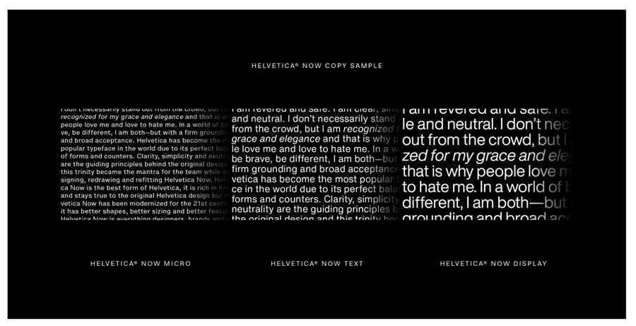
 One great example is Monotype’s Helevetica Now. They have redesigned all 40,000+ characters in the font for the 21st century and its demands. Designers can choose from three optical masters: Micro for small point sizes, Text for what we consider normal print applications, and Display for large, wide format designs. Each is designed to perform most effectively at its own size, taking into account all the visual nuances and needs the human eye demands for a comfortable reading experience.
Call us at 828.684.4512 for any marketing needs. As a printer, we understand communication, design, and teamwork. Your printer should be able to provide you with the latest information, inspiration, technical advice, and innovative ideas for communicating your message through print, design and typography, signage, apparel, variable data printing and direct mail, integrated marketing and environmentally responsible printing. If they can’t, you have the wrong printer! The best advice, always, is to ASK YOUR PRINTER!
ImageSmith is now partnered with Extreme Awards & Engraving – our in-house partner providing custom engraved trophies and awards for employee recognition programs, sporting events, and promotional needs. With our new sister company, we will be sharing space, resources and expertise in a collaboration designed to further provide you with one place to meet all of your marketing needs… Under One Roof! Visit them online at www.extremeae.com or call direct at 828.684.4538.


