Skip to content
ImageBlog

ImageBlog

Communication | Print | Web | Design | and Beyond

Tag: logo

Posted on June 26, 2014

Custom Embroidery and Printwear To Keep Your Team in Style


Custom Embroidery

Consistent, cohesive and high quality branding is important for small businesses. Your logo design and identity should work for you across each aspect of your business, wherever you interact with the public. That includes signage, building design, interior decor, employee apparel and work gear, website branding, direct mail outreach…. you have a chance at each of these points when the public sees your business to make a good impression.

Outfitting your employees with branded apparel and work gear makes a strong impression both in store and outside of your place of business. The public will see your team doing quality work, in quality gear. Consider standardizing the look, color and design of your team’s apparel, whether it is a typical uniform or a more casual style. Through embroidery and screen printing, most all work clothing can be customized to reflect and promote your brand. Digitize your logo for embroidery, or choose screen printing or full color tshirt printing for other more casual garments. Even tools, construction gear and footwear can be part of your public image.

Embroidery and Screen Printing

Begin to browse online for ideas and you will discover a huge variety of high quality, custom apparel to help you achieve the right look for your team. Your provider should be able to help you decide which applications are best for use with embroidery, screen printing  or full color, direct-to-garment printing (dye sublimation). This branding offers a stylish, crafted finish to almost any garment. You recognize the UPS drivers immediately – do your customers recognize your employees? Even if you feel your business is not suitable for a uniformed workforce, an embroidered shirt in your brand’s color for employees who deal with the public is attractive.


Rely on your printer for advice and direction with any questions you have in fashioning your brand or designing your marketing materials. They should be able to provide you with the latest information, inspiration, technical advice, and innovative ideas for print, signage, apparel and integrated marketing. If they can’t, you have the wrong printer! The best advice, always, is to ASK YOUR PRINTER!

Shop our full ImageSmith catalog online here. We can work with you to find the best option to suit your needs. Please note, prices in online catalog do not include decoration, but call us for a quote at 828.684.4512. ImageSmith is a full-service print and marketing provider located in Arden, North Carolina. Contact us at ImageSmith for quotes on all your marketing projects, and more useful tips on how to create custom, effective, high impact marketing solutions.
Posted on April 11, 2014

A Self-Marketing Guide for Freelancers


Tips for Freelancers

Establishing a successful career as a freelancer in the graphic design and marketing fields can be both incredibly rewarding and challenging. But as in any industry where contractors are plentiful, it can be difficult to separate yourself from the masses and identify how exactly you fit into the market. Fortunately, in the era of social media, self-promotion and marketing are much easier than you may think. In an effort to help all struggling, up and coming freelancers here are some self-marketing tips and strategies:

Identify Your Niche

According to It’s My Business, there are currently 10.3 million independent contractors working in the U.S. Whether you’re a writer, graphic designer, or consultant, the most important component to finding success as a freelancer is identifying your niche. In what areas do you excel? What are your weaknesses? What are you passionate about, and what are you most interested in working on? It’s critical to know the answers to such questions before you begin your freelance journey.

Create Your Own Brand

Once you’ve determined what types of services you want to offer, you can begin to shape your own brand and image. Don’t hesitate to share your expertise and enthusiasm on blogs, question boards, and other forums. Establish your name within the industry and prompt users to explore your name and website further. Consider creating a unique email extension with your own name and design a logo you can use when sending around work samples. One of your greatest resources: your local printer who wants to establish an ongoing relationship with you as you grow your business and reputation in the community. You will find no richer resource for technical, creative and promotional information.

Build A Professional Portfolio

Creating a unique and user-friendly way to display and showcase your work allows you to show potential employers just how talented you are. Though you should always be prepared to provide both digital and hard copies, building an online portfolio is crucial. You can collect your work via a blog or website, or create a digital reel of your work to present. Keep it simple without being too generic — allow your personality to shine through.

Digital Payments

Now that you’ve got a grasp on the basics, it’s time to discuss some logistics. As a freelancer, it can often be tedious and difficult to send and track invoices. Digitize your payment process by implementing mobile processing resources. This not only saves you time and frustration, but it is also incredibly easy to use for both yourself and clients. Track payments and manage accounts wirelessly all at the tip of your finger.

Utilize All Social Media Outlets

Take advantage of free social media platforms by posting links to or photos of your most recent accomplishments. Solicit your services and provide contact information for your users while maintaining a professional, eye-catching page. Consider creating social pages explicitly for professional use, and keep your personal accounts private.

Take On Pro Bono Work

Though you may not be jumping at the thought of taking on free work, such opportunities can often lead to paid gigs and/or referrals. This is also a great way to gain experience or dabble in an industry you’re not usually comfortable with. Furthermore, this give you the chance to network with potential clients for future projects – and while you gain useful experiences you also help others.


Small business entrepreneurs and talented freelancers are at the heart of Asheville and western North Carolina’s exciting economic growth – and we are committed to helping meet your marketing needs. ImageSmith is proud to be a printer in such an exciting era of digital communication. Your printer should be able to provide you with the latest information, inspiration, technical advice, and innovative ideas for communicating your message through print, design and typography, signage, apparel, variable data printing and direct mail, integrated marketing and environmental responsible printing. They should also be able to work with you to solve any difficult prepress issues with your files. If they can’t, you have the wrong printer! The best advice, always, is to ASK YOUR PRINTER. Ask Imagesmith!
Call us at 828.684.4512. ImageSmith is a full-service print and marketing provider located in Arden, North Carolina. Contact us at ImageSmith for quotes on all your print and marketing projects, and more useful tips on how to create custom, effective, high impact marketing solutions.


Posted on February 25, 2014

Can Your Logo Multitask? Design With Versatility in Mind.


Multitasking Logos ImageSmith


The story may be true or may be apocryphal, but either way it illustrates a good point: The logo below was Apple’s logo until the day Steve Jobs decided they needed to order embroidered polo Original Apple Computer Co. logoshirts.

That logo would never work well stitched at a small size onto your work shirt. Is your logo up to the demands of integrated marketing? Does it fly as well in print as online, stitched onto clothing, 10 feet wide on outdoor signage? While your goal is one unified brand image, that does not necessarily mean you will only have one logo for all purposes.

The logo design you tweaked and approved back on day one is really put to test when you begin to market across different media. Initially, many folks think of their logo only in terms of how it will appear on a card, letterhead or envelope – or perhaps how it will appear in full RBG color on their website home page. But when you begin to explore other marketing needs, the very design of that logo may prove to be limited, to not carry the same impact. For instance, a logo design may look great in full color, but when the day comes you need a solid white logo reversed out on a dark background as an awning over the front doorway entrance, the limitations of the design become apparent. Many times, more complex designs look great at a large scale but then don’t work well if you try to imprint them onto small promotional objects or on websites. Balance is also important – a logo with one oversized element may look fine onscreen, but when printed at a small scale the type can be illegible due to the difference in size with the larger element. The logo that looks great in full color on your website will need to work just as well embroidered on company uniforms, imprinted onto promotional keychains or ink pens, and embossed onto a formal letterhead. That initial design process needs to include the logo in all its variations.

Many brand images are designed with some built in variety to accommodate varying layouts and usage needs: for instance, your designer should offer you a “wide” version, a “tall” or “stacked” version, a version with and without a tagline or company “motto”. This set of logos will allow versatility in your marketing without altering the impact and unity of your brand image. Likewise, your designer can create your logo in the necessary range of color combinations: all black, reversed out as all white on a black or colored background, spot color versions using one or more defined PMS colors, and a full color version as both CMYK and RGB.

Various versions of the Coca-Cola logo
Famous brands like Coca-Cola employ a variety of type-styles, logos and brand images to differentiate their products and campaigns.

And the simplest part is often the one forgotten: once finalized, you will definitely want to have control of your brand by having possession of your actual logo… er, logos! Even if you do not have the software necessary to edit or change your logo, you will want to have the digital files in hand and a basic understanding of what file types you need for different outputs. Your designer and printer should be happy to supply you with these files.

Files… because there is never just one file that works for all occasions. While it is certainly not mandatory, a logo that begins it’s life as a vector is a happy logo! It can be edited, scaled, redesigned, converted, and proves to be the most conveniently versatile file type. Vector logos can be saved as a native .ai file or an .eps file. These can then be easily converted to other common file types such as .tiff, .jpg, .gif or .png. While you do not have to know all the mechanics behind each of these file extensions, you may be asked to provide specific ones. Your web designer may need a .gif or .png while your t-shirt vendor may ask for a vector file in two spot colors. With just the options mentioned in this post, your final logo set would consist of 30 separate digital files!

So, saving or exporting your logo to exist as different file types is not so difficult (well, if it begins as a vector file!) A well-designed logo will work well in spot colors, full color, reversed or as black and white. A logo that is created as part of a design package including a style manual will have its usage already thought out — work with your designer to ensure the versatility of your logo and brand, and once finalized to understand your different file types for marketing usage.

Multitasking Logos Cale Rogers


ImageSmith is proud to be a printer in an exciting era of digital communication. Your printer should be able to provide you with the latest information, inspiration, technical advice, and innovative ideas for communicating your message through print, design and typography, signage, apparel, variable data printing and direct mail, integrated marketing and environmental responsible printing. They should also be able to work with you to solve any difficult prepress issues with your files. If they can’t, you have the wrong printer! The best advice, always, is to ASK YOUR PRINTER!
Call us at 828.684.4512. ImageSmith is a full-service print and marketing provider located in Arden, North Carolina. Contact us at ImageSmith for quotes on all your print and marketing projects, and more useful tips on how to create custom, effective, high impact marketing solutions.


Posted on January 30, 2014

The Name Game: Acronyms, Portmanteaux and Design

Hello, my name is...


A business name is, in a very real sense, the cornerstone of the brand – it both drives and anchors the graphic development of the logo, the marketing and the overall design aesthetic that evolves to represent the company. In practically all cases for the designer, the company name is perhaps the one and ONLY given at the start of the design process or refresh. While you can suggest new colors, fonts, tag lines, voice and outreach methods, it would be a rare client who would let you change their company name! So that word or words become the starting point of design and inform every decision that follows. At the start of that process, long, technical or unexciting company names tend to be altered in one of two ways.

Acronyms as Company Logos

Acronyms

In line with what seems a current linguistic obsession of reducing words to initials, many successful brands rely on acronyms to fix their name in the public’s mind. Think IBM – where International Business Machines isn’t such a catchy, sleek moniker. These acronyms become part of our language. In time, we forget, if we ever knew, what the letters stand for and simply accept the newly formed “word” on it’s own merit.

  • CVS – Consumer Value Stores
  • GEICO – Government Employees Insurance Company
  • IKEA – Ingvar Kamprad (company founder) + Elmtaryd (his birthplace) +  Agunnaryd (his current home)
  • 3M – Minnesota Mining and Manufacturing
  • UBS – originally, United Bank of Switzerland, though now the company says the letters are “no longer considered an acronym.”

Portmanteaux

Different from an acronym, a portmanteau is the combination of two or more words or parts of words (also called morphemes) and their definitions into a new word. Even the word “portmanteau” is a portmanteau – a combination of the the French words porter (to carry) and manteau (coat), with the combination of the two taking on a new definition apart from the French word porte-manteau, meaning coat rack. Anyway…

The meanings, as well as the sound of the original words, are also fused together. For instance, smoke and fog combine to form smog. The media seems to be enthralled with combining celebrity names (Lindsay Lohan is LiLo, Ben Affleck and Jennifer Garner become a new entity called Bennifer). Bromance, cankles, Frankenfood, spambot, it just goes on and on.  But for marketing purposes, many successful company names were born out of the combination of sounds and meanings in this fashion.

Portmanteaux

Some combine words we all know to represent the company’s product or service, a very common trick among websites, mobile apps and the naming of pharmaceuticals:

  • Groupon – Group + Coupon
  • Instagram – Instant + Telegram
  • Pinterest – Pin + Interest
  • Travelocity – Travel + Velocity
  • Verizon – Veritas + Horizon
  • Prevacid – Prevent + Acid
  • Flonase – Flow + Nasal
  • Fruitopia – Fruit + Utopia

pormanteau in logo design


Others combine relevant names or products to create their new mark:

  • Hasbro – founders, the Hassenfeld Brothers
  • Adidas – founder, Adolf (Adi) Dassler
  • Kyocera – Kyoto Ceramics
  • Nabisco – National Biscuit Company
  • Linux – Linus (Torvalds, inventor) + Unix
  • Mattel – Harold “Matt” Matson and Elliot Handler

From these acronyms and portmanteaux, designers use typography as an inspirational starting point to fashion the logo and direct the brand development.  The shape of the letters themselves function as design and symbolism in a way that unwieldy longer words and phrases could not. For instance, the Merle Norman logo switches the emphasis from the entire name to a graphic, art deco inspired “MN” as focal point. The typography of the acronym becomes their design.

typography in logo design

Designers see new shapes arise from the placement of letters, or from the white space between the letters. Clever and inspired meanings are referenced from the letters when they begin to function as shapes beyond normal typography. Successful logos rely on symbolism that often works subconsciously to the viewer. The FedEx logo incorporates arrows in the negative space between the letters, a shape that often goes unnoticed. In our company name, for example, the mirror image of the “im” and “mi” merge together, a subtle symbol for the merging, fluid and integrated state of the technology and communication at which our business excels.

Whether or not your business venture uses any of these techniques in your logo and brand design, studying the way others represent themselves is instructive. Hopefully noticing the companies and products that employ this trick well – and not so well – can inspire your creativity.


ImageSmith is proud to be a printer in an exciting era of digital communication. Your printer should be able to provide you with the latest information, inspiration, technical advice, and innovative ideas for communicating your message through print, design and typography, signage, apparel, variable data printing and direct mail, integrated marketing and environmental responsible printing. They should also be able to work with you to solve any difficult prepress issues with your files. If they can’t, you have the wrong printer! The best advice, always, is to ASK YOUR PRINTER!
Call us at 828.684.4512. ImageSmith is a full-service print and marketing provider located in Arden, North Carolina. Contact us at ImageSmith for quotes on all your print and marketing projects, and more useful tips on how to create custom, effective, high impact marketing solutions.


Posted on November 26, 2013

Bending Rules – Vintage Adobe Poster, 1987


Retro adobe poster

What a great old poster from Adobe in 1987 that has been around the shop here all this time. It is nice to realize the illustrated typography advice here is just as applicable today as it way back before InDesign and the Creative Cloud, and indeed anytime in the history of printing or graphic design.  In essence, the message is “Rules – once learned – are made to be broken.” Or to be more precise, don’t let a strict adherence to rules blind you to the opportunities that lie beyond them.

In typography, relying on auto-kerning, hyphenation, line spacing, etc. can be convenient yet often yield jarring, hard to read results – a problem only compounded when several fonts are used together. Good design creates pleasure in reading. Whether it’s an advertisement, job resumé, wedding invitation or webpage, the goal is surely to get your message read. Often, bending away from the status quo in any creative endeavor can create nice surprises and greater success – not a bad idea to keep in mind.

Speaking of good design, check out the old retro Adobe logo circa 1987 in comparison to the one used today. Quite a change.

Adobe logo circa 1987

Consider the ways you can use inspired graphic design to market your small business. Your printer should be able to provide you with the latest information, inspiration, technical advice, and innovative ideas for communicating your message through print, design and typography, signage, apparel, variable data printing and direct mail, integrated marketing and environmental responsible printing. They should also be able to work with you to solve any difficult prepress issues with your files. If they can’t, you have the wrong printer! The best advice, always, is to ASK YOUR PRINTER!

Call us at 828.684.4512. ImageSmith is a full-service print and marketing provider located in Arden, North Carolina. Contact us at ImageSmith for quotes on all your print and marketing projects, and more useful tips on how to create custom, effective, high impact marketing solutions.
Posted on November 21, 2013

7 Reasons to Love Promotional Products

Promotinal Products

Seed packets. Tiaras. Custom-etched wine bottles. Roadside tool kits. Wisconsin cheese platters. Guitar picks. Carbon monoxide detectors. A pen shaped like a pickle.

I just took a quick stroll through our online promotional products catalog and found it hard to imagine NOT being able to find an appropriate gift idea for just about any business enterprise. If the quick list above doesn’t entice you to consider promo products in your marketing, here are 8 good reasons to explore what they can do for you:

  • Quality speaks loudly. The convenience, usefulness and desirability of a branded promotional product will reflect on your business. The message it sends whenever someone sees, uses or finds it helpful –  speaks for you as well. Consider the message you want your promotional products to say about your business?
  • Longevity. Promotional products have a lifespan far greater than direct mail or an online banner ad. The more useful they are, the longer they stick around – representing you. The gift keeps on giving!
  • Generosity. Whether including promotional products in your marketing plan as holiday gifts for staff or customers or everyday bonuses, making generosity a part of your brand is good for everyone. Customers appreciate and remember special treatment and paying it forward is just the right thing to do.
  • Price range and variety. When browsing, you can sort your online search by price, choosing from items as inexpensive as a pen or keychain to high-end electronics or jewelry in the thousands of dollars. The selection accommodates any budget.
  • Creativity. Consider creative ways to incorporate a promotional product into your company message or identity. Do you want to emphasize adventure?  Backpacks or hiking supplies. Dependability? Clocks or umbrellas. Security? First aid kits, flashlights. Environmental commitments? Herb starter kits and products from recyclable materials.
  • The info you need, up front. Shopping online for promotional products is like strolling through a huge mall, but with less effort. Search by item type, number or description on our search tool, sorting results by price, quantity or name. Browse page after page of items with easy references to minimum quantities, production times, and price breaks.
  • Low unit pricing. You’re not being a Scrooge to be concerned with the bottom line. When you purchase promotional gifts in bulk you receive the lowest wholesale pricing possible – a big plus for any marketing budget.
…and 2 Reasons to Order from ImageSmith
  1. We handle the hassle. Often the biggest concern with branding promotional products are the technical issues involved in providing your logo and/or text, proofing, correct color matching and sizing. With most sites you are left to do the best you can and hope for good results. We have years of experience with printing, embroidery and promotional products and can answer any questions.
  2. We’re only a phone call away. Unlike many online sites that purposely keep you separated from being able to talk to a real person, you can call – or email, or visit! –  ImageSmith to get immediate answers to any questions or concerns that come up about your order, delivery schedule, branding options… or any advice about further promotions you might have in mind.

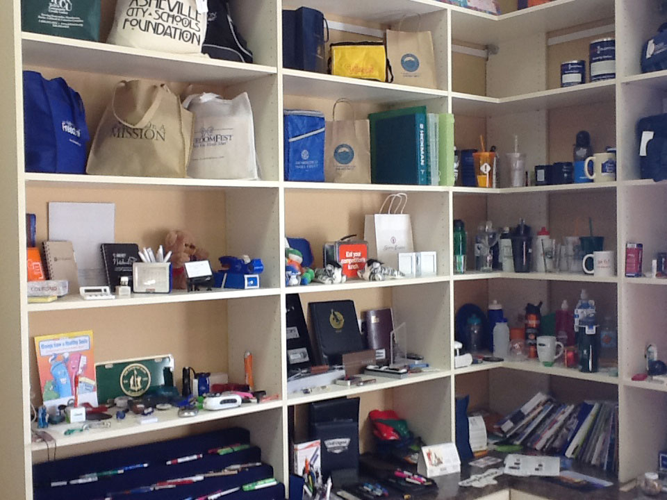
Our lobby displays a variety of promotional products


Oh, and if you’re interested, you can click here for the link to the pickle pen!

Consider the ways you can use inspired graphic design to market your small business. Your printer should be able to provide you with the latest information, inspiration, technical advice, and innovative ideas for communicating your message through print, design and typography, signage, apparel, variable data printing and direct mail, integrated marketing and environmental responsible printing. They should also be able to work with you to solve any difficult prepress issues with your files. If they can’t, you have the wrong printer! The best advice, always, is to ASK YOUR PRINTER!

Call us at 828.684.4512. ImageSmith is a full-service print and marketing provider located in Arden, North Carolina. Contact us at ImageSmith for quotes on all your print and marketing projects, and more useful tips on how to create custom, effective, high impact marketing solutions.
Posted on October 10, 2013

Business Magnets: Branding that Sticks Around

So here’s why magnets prove to be a good marketing tool:

Full color business magnets

They get stuck up…

Something about the irresistible urge to see an object magnetically attracted to the wall causes the child in all of us to toss up that magnet on a refrigerator, file cabinet, or any nearby metal object. See if it “works,” right? Back in our print shop, take-out lunch advertisements beside the phone in our Press Room gather and stick around a long time; and a useful magnet with measurement conversions is always up on the Bindery cutter.

and

Desk magnet, apple logo 90s

They stick around…

…often long after the person who put it up even finds it useful! If your design and/or logo is pleasing, your little magnetic parasite may well stay there for the life of the host. (See above!) It becomes a decoration, and any marketing piece that involves your brand in that kind of longevity is well worth the small investment!

Avoid the mess of stickers with marketing magnets

Magnets work great for car bumpers and even in large format for vehicle branding on doors and delivery vans. Removable, they don’t damage the vehicle’s finish and can be switched out easily whenever needed. Magnets are also nice and flat so great for direct mail inserts. People might ditch the printed promo, but generally hang onto the magnet.

Making your marketing magnets useful increases their longevity as well. The phone numbers for lunch delivery help restaurant magnets stick around. As a designer, information such as decimal conversions for measurements, PMS colors, envelope and sheet sizes, or other handy prepress data would be a keeper. Calendars are useful for most any workstation. Consider what useful information related to your business would be handy to have nearby your customers’ workstation – they will also be seeing your logo and message every day. That’s marketing success.

Our lobby displays a variety of promotional products

Promotional products, like marketing magnets, come in a huge variety of useful objects.  Think about how to use them to market your small business. Your printer should be able to provide you with the latest information, inspiration, technical advice, and innovative ideas for communicating your message through print, design and typography, signage, apparel, variable data printing and direct mail, integrated marketing and environmental responsible printing

. They should also be able to work with you to solve any difficult prepress issues with your files. If they can’t, you have the wrong printer! The best advice, always, is to ASK YOUR PRINTER!

Call us at 828.684.4512. ImageSmith is a full-service print and marketing provider located in Arden, North Carolina. Contact us at ImageSmith for quotes on all your print and marketing projects, and more useful tips on how to create custom, effective, high impact marketing solutions.
Posted on July 11, 2013

Multimedia Graphic Design Done Right: TCM Spotlight


TCM graphic design

Classic movies and classic graphic design – both sources of inspiration, and no one does it better than TCM. Their commercials, program intros, event branding, website, print publications and products all are branded with the same retro, distinctive TCM style. This unity of great design across platforms and media is a basic goal for any successful marketing, regardless of a company’s size or budget. TCM is well worth a look if you need a little inspiration.

Turner Classic Movies is the cable/satellite channel owned by Turner Broadcasting, a division of Time/Warner.  The TCM logotype, which sets the graphic tone for all the consistent branding TCM does so well, was created by the charles s. anderson design co. of Minneapolis, MN. This world class firm holds a client list which reads like a Who’s Who of great branding and marketing success. (They also maintain an incredible royalty free image library of highly curated pop culture artwork, a great resource for any designer, called csaimages.) Their website relates the story of how the original TCM logo design was created with 30 different icons to represent the multiplicity of the movie industry and its ever-changing nature as a medium. When presented to Ted Turner, he wanted to know “which one is the logo?” The answer: all of them! “But which one?”

TCM branding and graphic design

The multi-faceted approach of that original design sets the standard for the cross-platform, diversified branding of TCM that maintains the same look, feel and tone across it’s print media, television production, expansive website and product creation. The tone is distinctly retro, but with a modern, polished, and high-tech flavor. Having open access to one of the world’s largest, richest film libraries for your inspiration and imagery is a resource of which any graphic designer can only dream! But the folks at TCM consistently use those images in a fresh, larger-than-life way to maintain the thematic look of their brand without exploiting or tarnishing the classic films from which the images are appropriated. That, in itself, is a tough task and speaks to the integrity of the TCM design process. For example:

The first half of the clip above demonstrates this balance well – a humorous look at the man on the street’s reaction to the iconic image of Sue Lyon in Stanley Kubrick’s classic film “Lolita.” The second half of the clip sets a perfect film noir mood, creating an homage to American artist Edward Hopper’s famous painting “Nighthawks.” This is smart marketing that know’s its audience and upholds the value and integrity of its film archive.

Studying how the big players excel is valuable instruction for the rest of us. For those of us who cannot afford the guidance of a charles s. anderson design team and don’t have the budget of a Ted Turner, a few takeaways are:

Develop and know your image. Be sure, at the most basic level, you understand and control the “look” of your brand – what it stands for, how it will represent and how you want the public to perceive your business. This begins, typically, with a basic logotype and then expands throughout all the activities of your enterprise.

Respect yourself. Your passion for your work should show through in your business’ design and marketing efforts. Work with a designer and printer to create marketing material that inspires you, makes you feel proud of what you do, and represents quality.

Work to maintain consistency of your brand in all the ways the public encounters your business. The design and flavor of your print materials should be a consistent match to any representation of your business that your public will see. Consider all the areas this might include: signage, website, direct mail, social media, print/tv/radio/web advertisements, employee uniforms, retail spaces and lobby decor, promotional products as well as the actual goods or services produced and supplied.


Printers understand communication and design. Your printer should be able to provide you with the latest information, inspiration, technical advice, and innovative ideas for communicating your message through print, design and typography, signage, apparel, variable data printing and direct mail, integrated marketing and environmental responsible printing. They should also be able to work with you to solve any difficult prepress issues with your files. If they can’t, you have the wrong printer! The best advice, always, is to ASK YOUR PRINTER!

Call us at 828.684.4512. ImageSmith is a full-service print and marketing provider located in Arden, North Carolina. Contact us at ImageSmith for quotes on all your print and marketing projects, and more useful tips on how to create custom, effective, high impact marketing solutions.
Posted on May 24, 2013

Logo Design Tip: Avoid the Swoosh (or, It Pays to be Original)


Swoosh in logo design

A fairly safe rule for logo design: avoid the SWOOSH.

The Nike logo story is now part of graphic design legend: how Carolyn Davidson, a student at Portland State, randomly met Phil Knight, co-founder of Nike, in the hallway at school and accepted his offer to work on a logo for his growing company – one that would “convey motion and look good on a shoe.” After many hours of work and a $35 payment for her trouble, Knight’s initial reaction: “Well I don’t love it, but maybe it will grow on me.”

Millions of dollars later, somehow that Nike swoosh has become THE iconic example of a brand mark and logo identity that do their job right – it represents both Nike and the value of a recognizable brand mark. The logo has been on Nike shoes since 1972 and is internationally recognized. “Swoosh” even has its own Wikipedia entry.

This popularity has, of course, bred imitations. While that exact “swoosh” is the property of Nike, the swoosh-type shape has been borrowed and appropriated for many, many other enterprises. Keep your eyes open online and in print, and you’ll see the swoosh again and again… and again.

Just a quick glance through our shop here, and a few magazines that were lying about, yielded these examples:

overuse of the Nike swoosh

logos similar to Nike swoosh

Designs similar to Nike Swoosh

While one company certainly can’t monopolize a basic geometric shape, originality matters in effective logo design. You want to get noticed, not blend in with the crowd. Avoiding the “swoosh”, for the foreseeable future, is probably a good rule to keep in mind when branding your business.

FYI – for further reading…

Author Per Mollerup has an amazing, newly revised book out called “Marks of Excellene: The History and Taxonomy of Trademarks.” It covers the history of the human need to create trademarks, and is useful for anyone interested in branding, advertising, and design. It is reviewed by Slate.com here.


Printers understand communication and design. Your printer should be able to provide you with the latest information, inspiration, technical advice, and innovative ideas for communicating your message through print, design and typography, signage, apparel, variable data printing and direct mail, integrated marketing and environmental responsible printing. They should also be able to work with you to solve any difficult prepress issues with your files. If they can’t, you have the wrong printer! The best advice, always, is to ASK YOUR PRINTER!

Call us at 828.684.4512. ImageSmith is a full-service print and marketing provider located in Arden, North Carolina. Contact us at ImageSmith for quotes on all your print and marketing projects, and more useful tips on how to create custom, effective, high impact marketing solutions.
Posted on April 3, 2013

Print or Web: 6 Reasons You Need a Vector Version of Your Logo

Vector shapes can be resized
Both of these images are .EPS files, but the one on the left is pixellated. The one on the right is a true vector logo.

Want to make a change to your logo without totally rebranding yourself? Want to print in wide format at a large size for your new signage? Want to use spot color printing to standardize all your stationary? Then in each case, you should be using a vector version of your logo! While you may not be able to place or use it in a Word document, for any high quality printing or output (or for spot or “2-color” printing) your vector logo is the gold standard and you should insist on it from your graphic designer beforehand. Preferably, it will be the way your logo was originally created, and you will not have to pay or struggle to convert it from a pixel-based image after it has already become an integral part of your brand. Here are the reasons why:

  • You can easily switch a vector logo to any type of pixel-based file needed (.TIF, .JPG, .PNG, etc.) for manipulation, web use or other purposes… yet it is difficult and sometimes impossible to travel from pixel to vector in a satisfactory manner, especially once type has been rasterized. Use this logo as the basis for any and all marketing – all other necessary file types for any other printing, web development, further creative design or marketing can be easily made from this original, keeping all colors and appearance clearly defined. You will consistently maintain your brand across all your marketing efforts, holding all vendors accountable to true reproduction of the original!
  • Vector artwork can be scaled to any size needed and maintain its perfect clarity. They have crisp edges at any size as they are based on mathematical formulas rather than a bed of pixels.
  • They maintain a clear, transparent background when placed over other artwork or elements in your design. PNG files also have this ability but are pixel based so… (see reason #1)
  • When you inevitably want to “tweak” your logo or add something in the future, you can easily do that in a vector-based program such as Adobe® Illustrator, but might find yourself limited if your logo is pixel-based. We often have customers need to make additions to a logo after the fact, such as adding an “Inc.” on the end, changing a tag line as their buisiness focus evolves, update their brand with a new color without totally reinventing the wheel. Also, you do not have to return to the original artist who created your logo to get the files necessary to make the change, as is often the case if the original was created in PhotoShop.
  • They can function either in RGB or CMYK color modes as well as carry spot color definitions. You can select exact PMS color matches so that your brand is always reproduced consistently. While there are methods to include spot color information in a pixel-based file (DCS files from PhotoShop with spot color channels) they are, again, not resizeable and do not include easy trap information for printing.
  • This last reason can be debatable, and I am sure there are exceptions to the rule, but: as most logos need to be clean, vivid and memorable, vector shapes readily lend themselves to these qualities. The logos you know and remember are almost always designed as vector shapes rather with fuzzy, artistic brushstrokes or photographic effects.

WARNING:  pixel-based files can be saved from photo-editing software as EPS files, so remember that just because a file has an EPS suffix, it has not been magically converted to a vector file. Also, pixel images can be placed into vector draw programs like Illustrator and saved as .AI or .EPS files. Again, not vector!
Rely on your printer for advice and direction when creating your files. They should be able to provide you with everything from encouragement along the way to complete design, layout, copywriting, production, multi-purposing and distribution of your marketing outreach. If they can’t, you have the wrong printer! The best advice, always, is to ASK YOUR PRINTER!

ImageSmith is a full-service print and marketing provider located in Arden, North Carolina. Contact us at ImageSmith for quotes on all your marketing projects, and more useful tips on how to create custom, effective, high impact marketing solutions.

Posts navigation

Previous page Page 1 Page 2 Page 3 Page 4 Next page

Recent Posts

  • ImageSmith Named a Top NC Printing Company by The Startup Pill
  • Post-Pandemic Plan: Is Now the Time to Rebrand?
  • Uplift and Empower with Promo Products for the Pandemic
  • Does Your Logo Need a Digital Refresh? Rolls Royce Did.
  • Microtype: Because One Size Typography Does Not Fit All

Recent Comments

  • Big Dog Love: the Canine as Logo and Brand Mascot - Printing Impressions on Big Dog Love: the Canine as Logo and Brand Mascot
  • Making Print Social: Interactive Media and Integrated Marketing - Printing Impressions on Making Print Social: Interactive Media and Integrated Marketing
  • Auto Generate QR Codes with Data Merge in InDesign CC 2014 | QR Code ® Artist on Auto Generate QR Codes with Data Merge in InDesign CC 2014
  • Auto Generate QR Codes with Data Merge in InDes... on Auto Generate QR Codes with Data Merge in InDesign CC 2014
  • Keeping Cool in the Juggling Act of Multichannel Marketing « Printing Hub Printing Hub on Multichannel Marketing Powers Print and Digital Success

Archives

  • May 2022
  • March 2021
  • October 2020
  • August 2020
  • March 2020
  • February 2020
  • May 2019
  • January 2019
  • December 2018
  • November 2018
  • December 2017
  • June 2017
  • February 2017
  • January 2017
  • November 2016
  • October 2016
  • August 2016
  • July 2016
  • April 2016
  • February 2016
  • January 2016
  • November 2015
  • October 2015
  • September 2015
  • August 2015
  • July 2015
  • June 2015
  • May 2015
  • April 2015
  • March 2015
  • February 2015
  • January 2015
  • December 2014
  • November 2014
  • October 2014
  • August 2014
  • July 2014
  • June 2014
  • May 2014
  • April 2014
  • February 2014
  • January 2014
  • December 2013
  • November 2013
  • October 2013
  • September 2013
  • August 2013
  • July 2013
  • June 2013
  • May 2013
  • April 2013
  • March 2013
  • February 2013
  • January 2013
  • December 2012
  • November 2012
  • October 2012
  • September 2012
  • August 2012
  • July 2012
  • June 2012
  • May 2012
  • April 2012
  • March 2012
  • February 2012
  • January 2012
  • December 2011
  • October 2011
  • August 2011
  • July 2011
  • June 2011
  • May 2011
  • April 2011
  • March 2011
  • February 2011

Categories

  • Awards and Personalization
  • Bindery
  • Books
  • Branding
  • Color
  • Color Management
  • Community
  • Creativity
  • Database Management
  • Design
  • Direct Mail
  • Embroidery
  • Entertainment
  • Film
  • Graphic Design
  • History
  • Integrated Marketing
  • Language
  • Literature
  • Logos
  • Magazines
  • Magnets
  • Mail
  • Music
  • Nonprofits & Charitable Giving
  • Paper
  • Photography
  • Politics
  • Popular Culture
  • Posters
  • Prepress
  • Print
  • Promotional Products
  • Promotions
  • Psychology
  • Screenprinting
  • Shop Local
  • Signs
  • Small Business
  • Social Media
  • Social Media
  • Style and Fashion
  • Trade Shows
  • TV
  • Typography
  • Uncategorized
  • Web
  • Web Developement
  • Wide Format

Meta

  • Log in
  • Entries RSS
  • Comments RSS
  • WordPress.org
Proudly powered by WordPress
Bitnami