Why Did My Blue Print Purple?! How to Avoid the Color Shift

Blue Printed as Purple

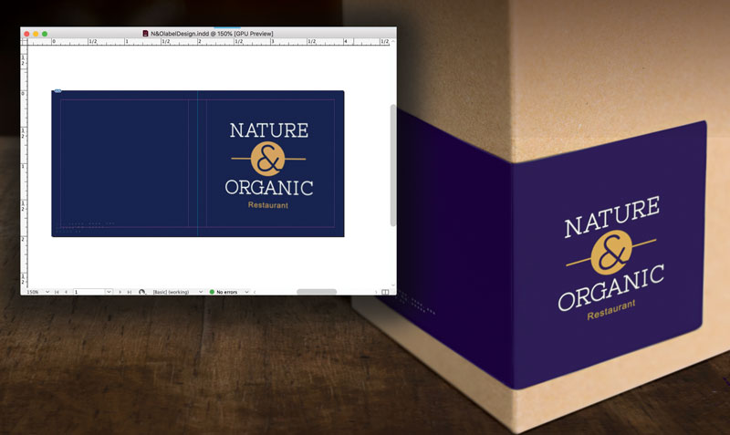
“My perfect new reflex blue brand color printed PURPLE!”

Whether you are a designer or business owner who hired a designer,  you expect your color choices to look the same on paper as they did on your desktop monitor — and also the same on your boss’ cellphone where he viewed your proof, on your website where a coworker converted your design into a webpage, on signage, on packaging, and on all your marketing tools that will reach your audience. What sounds deceptively simple at first is actually a VERY tall order in a world where color reproduction and color perception are influenced by so many factors. 

That’s where the collaboration between a  trustworthy printer and experienced designer come to the rescue! Technology makes the creation, production, and sharing of amazing designs incredibly easy. And while color management is now standardized and more affordable than in comparison to “the old days,” it is NOT a given and requires more understanding and communication up front to avoid any pitfalls and nasty surprises at print time.  Digital speed has still not changed some basic, unalterable facts of the science of color and how our eyes perceive it. Your blue came out purple because of the divide between RGB and CMYK color gamuts.

Color spectrum - RGB & CMYK gamuts
Color Gamut Comparison

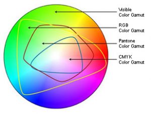
In simplest terms, the colors available in the RGB color gamut (what you can see on your screen) are much greater than the colors available in the CMYK gamut (what can be printed). There are many ways print professionals try to minimize the color shift in the conversion from RGB to CMYK, but they are not all perfect solutions and some colors reveal much more visible differences than others. While the RGB gamut can display a large number of shades and nuances in darker blues, the CMYK gamut is more limited. In trying to reproduce those faint differences, the cyan and magenta used to create the blue with ultimately blend toward purple. Understanding this way back at the point of inspiration and design is essential to avoiding disappointment at the point of print.

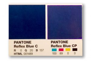
One of the most standard ways to guard against unwanted results (like purplish blues) is to base designs in the Pantone® Matching System library of colors. If you define the blue in your design as a specific PMS blue, then your printer will know, and then be able to take steps to match the color against this “universal” standard. You will both have a standard against which to measure your blue. It is like a built-in instruction of how the color should be rendered.

Reflex Blue Swatch v. ProcessDefining a “spot blue” in your work does not mean you must always print offset, using the spot ink. Still, it gives your printer a marker of what you intend that blue to be at output. Now here comes the next hurdle – you will need to take into account the color shift that will happen when printing a PMS-defined color in CMYK. Again, we can thank the differences in color gamuts for that. For many colors, the shift is slight – for others it can be significant. Designers and printers should be able to show you both color swatches of the PMS color you chose, and of any color shift that will occur from switching to the CMYK equivalent of that color.

And not to make things seem even harder, but color perception is also influenced by a host of other issues. The type, color and material of substrate you are printing on can vastly alter certain colors. Specialty finishes like gloss overlaminates or UV coating can as well. Screen calibrations of monitors used in the design and proofing process can influence how colors appear, and the lighting where any screen or print is viewed is also a factor.

One more interesting phenomenon: metamerism. Without getting into the science behind the term, some colors that are actually different will appear identical to the human eye under certain lighting conditions and different under others. There are at least 12 conditions that can create this metamerism: light, angle of view, size, distance, time, scenery, gloss… even differences in the human eye itself. 

So what about that problem with dark blues? If you are using blue in your logo or designs, and are concerned about a color shift toward purple, be certain that the cyan and magenta values in the CMYK definition of your blue color vary by at least 30% (some recommend 40%). Anything less than that, especially with dark colors, and the blue and red will mix to render purple – it is just a fact of physics. 

Knowing these types of technical color issues is important if you choose to buy your print online from a large, bulk print provider. They will print exactly what you sign off on when you submit your file. When you work with your local printshop, a good relationship between you, your designer, and your printer will bring you a team approach to getting the exact color you want on all your valuable marketing.  

Call us at 828.684.4512 for any marketing needs. As a printer, we understand communication, design, and teamwork. Your printer should be able to provide you with the latest information, inspiration, technical advice, and innovative ideas for communicating your message through print, design and typography, signage, apparel, variable data printing and direct mail, integrated marketing and environmentally responsible printing. If they can’t, you have the wrong printer! The best advice, always, is to ASK YOUR PRINTER!

ImageSmith is now partnered with Extreme Awards & Engraving – our in-house partner providing custom engraved trophies and awards for employee recognition programs, sporting events, and promotional needs. With our new sister company, we will be sharing space, resources and expertise in a collaboration designed to further provide you with one place to meet all of your marketing needs… Under One Roof! Visit them online at www.extremeae.com or call direct at 828.684.4538.


ImageSmith is a full-service print and marketing provider located in Arden, North Carolina. Contact us at ImageSmith for quotes on all your print and marketing projects, and more useful tips on how to create custom, effective, high impact marketing solutions.

Foil Stamping Shines – More Options from Metallics

Foil Stamping - Hot, Cold and Digital

Foil stamping is a great way to add eye-catching shine and metallic glow to your print projects. Even a small touch of foil on a printed piece can bring it alive in a way regular inks never can. Foils have been around a long time (having once been done by hand) and today there are also several new digital and toner-based processes that can help meet the demands of any print budget, deadline, or run length. From the design side, defining the foil stamp area is generally no harder than defining a new spot color in your layout.

Probably the most well-known foiling process is Hot Foil Stamping. It requires a special metal die that is heated and pressed into the paper, creating a nice indentation in the finished piece. The hot foil process uses only one color of foil at a time, and is generally too costly for short runs. The final effect, however, elevates any print piece from average to classic – in other words, perfect for that customer who always says to “make it pop!”

Sample Foil Swatches 
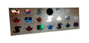
Cold Foil Transfer is accomplished on a 6-color press. The first 2 units apply adhesive and foil, the other 4 are for CMYK printing. Overprinting CMYK onto the foil creates a whole gamut of metallic colors that would not be possible with one-color hot foil stamping. Besides gold, silver, and copper foil, there are also holographic foils which reflect a broad spectrum of colors back to the eye, as well as matte, gloss, pearled and pigmented foils from which to choose. Again, this can be a costly process, is often limited to coated stock only, and is not a great fit for a short-run budget.

New digital processes use either toner or a polymer varnish to attach the metallic foil, and can be cost-effective on short or medium sized runs. Also, metallic foil substrates are a great option – opaque CMYK inks are illuminated by the metallic media, and white can be under printed on specific elements to retain true or non-metallic color where desired. PaperSpecs has a great “Foil Cheat Sheet” you can download free here, outlining all the current processes.

InDesign Layout for Foil Stamping

To define the foil stamp area in your layout, just make all those objects be a new spot color – name it “FOIL” if you choose. You can get clear specs from your vendor or PSP, but in short they will need a separation from your design that only contains the area to be “foiled.” Foil stamping is also a great option when choosing from the huge variety of promotional products that can be branded for your marketing. Foiling can be used on most items from keychains to coffee mugs – in a wide variety of colors and finishes.

And speaking of varnishes, spot UV varnish coatings can give a flash of highlights to a printed piece in much the same way a metallic foil does. When the paper catches the light, these elements shine and give the illusion of depth and dimension but in a more subtle way than a metallic ink or foil. They too are simply defined in prepress as a spot color separation in the same way the foil is setup.spot UV coating adds gloss to print

So the options are out there today for employing great metallic foils and effects without any extra hassle for design, prepress, or budget concerns. The main limitation is often envisioning what the final product will look like — you will not really be able to create a digital or hard copy proof that will accurately preview the often stunning effects foil stamping can create. Perhaps the best way to do that is to ask your print provider for a sample of previous projects that successfully used foil. They should be happy to help you out.

In fact, rely on your printer for advice and direction with all of your integrated marketing. They should be able to provide you with everything from encouragement along the way to complete design, layout, copywriting, production, multi-purposing, online implmentation and distribution of your marketing outreach. If they can’t, you have the wrong printer! The best advice, always, is to ASK YOUR PRINTER!

ImageSmith is a full-service print and marketing provider located in Arden, North Carolina. Contact us at ImageSmith for quotes on all your marketing projects, and more useful tips on how to create custom, effective, high impact marketing solutions.

Using Templates to Design – Print, Promo Products & Signs


Designing on templates

Trade show booths, converted envelopes, coffee mugs, die cut folders, POS displays, folded mailpieces… what first step do all these design projects share? In each case, you will want to ask for a template from your printer before you design.

The print, signage and promotional products world continues to diversify with custom branding opportunities that allow you to print on just about any object you could want. Throw in the creative use of die-cuts, spot coatings, textures, and folds and starting your project layout on the right foot becomes all the more important. For the designer, that means working with vendor-supplied templates to make sure your design ends up printing in the right spot with no expensive surprises or added cost.

Vendors are usually glad to supply a pre-press template for your specific project. In fact, many require your files be submitted on their template – and for very good reason. The positioning, size, and bleed area are critical for successful output on projects using various substrates and printing surfaces, and complex bindery or finishing processes. When you submit files that need no adjustments, you save prepress and art department fees that would be needed to correct or modify your files, or perhaps save having to pay for a job that did not print as you hoped.

Often, however, instructions are vague about exactly HOW to work with the template. Here are a few pointers that may help. In MOST cases, the template you will receive is a PDF. If you are using the most common desktop publishing software – anything from Quark Xpress to the Adobe Creative Cloud Suite – the PDF can be used in several ways to guide your layout without getting in the way of your work.

We love Illustrator for many great reasons and it is generally our preferred software for design of promotional products, wide format signage, vehicle wraps, and even some regular print jobs that have complex die cuts or folds. The PDF template can be placed into Illustrator like an object, on its own layer, and used as a guide. But the most helpful way is to begin by choosing File–Open With (rather than just File Open) and pick Illustrator as your app rather than Acrobat. (If, as sometimes happens, the template PDF uses fonts that your computer does not have, just ignore the warnings. While they may not print well on your end, the vendor who made the template will have them, so no problem.)

Trade show booth template

Templates are almost always vector objects that will open and be editable in Illustrator. Of course you don’t want to edit the template, but it can be helpful to have the ability to manipulate it when using many layers or when you need to hide parts of the template in order to proof your project to a customer. You may also need to copy and use curved shapes or other features of the template when creating masks or other design elements.

Layers palette in IllustratorMany PDF templates are very user-friendly in Illustrator. They use specific non-printing colors to designate the layout and help you see the placement of things like folds, edges and dyelines while specifying how much bleed area you need to allow as well. They will generally have the template elements on locked layers so you don’t accidentally edit them. Most have a blank layer already prepared for you to work on. If not, always leave the template on it’s own layer(s) and create a new layer to contain your print elements.

Layers palette in InDesignSometimes, it is preferable to prepare your layout in InDesign or another page layout application. You can simply File–Place the PDF template into your document. It makes sense to create – and lock – a layer just for the template file. You can then turn visibility on and off as needed and move it up or down in the layer order as well. Your document size in InDesign should be the same size as the entire template, including crop marks if applicable. Upon export, you would generally turn all fonts to outlines and create your PDF/X1A with no crops or bleeds other than whats included in the template.

These PDF templates generally include other important information to guide your design. They will specify whether you need to use PMS spot colors or stick to all process. They define needed bleed area. And they usually spell out the resolution, size, and embedding specs for any images you include.

Templates save time, headache, and money throughout the course of your design project. Make it a practice to ask ahead of time for a template, and make the template your friend.

Call us at 828.684.4512 for any marketing needs. As a printer, we understand communication and design. Your printer should be able to provide you with the latest information, inspiration, technical advice, and innovative ideas for communicating your message through print, design and typography, signage, apparel, variable data printing and direct mail, integrated marketing and environmentally responsible printing. If they can’t, you have the wrong printer! The best advice, always, is to ASK YOUR PRINTER!

ImageSmith is now partnered with Extreme Awards & Personalization – our in-house partner providing custom engraved trophies and awards for employee recognition programs, sporting events, and promotional needs. With our new sister company, we will be sharing space, resources and expertise in a collaboration designed to further provide you with one place to meet all of your marketing needs… Under One Roof! Visit them online at www.extremeae.com or call direct at 828.684.4538.


Call us at 828.684.4512. ImageSmith is a full-service print and marketing provider located in Arden, North Carolina. Contact us at ImageSmith for quotes on all your print and marketing projects, and more useful tips on how to create custom, effective, high impact marketing solutions.

Print Housecleaning: Stirring Up the Digital Divide


Office cleaning

The turn of a new year is always time for some housecleaning here at ImageSmith. And, as usual, amid the dust, paperwork and clutter that accumulates in any production environment we always find a few surprising reminders of how quickly and drastically times have changed.

The print and marketing world found itself on the cutting edge of change very early in the desktop computer revolution of the 70s and 80s. As prepress and print digitized – altering the methods of how print had been produced for centuries – the ensuing communications revolution altered the very core processes of how businesses function and market themselves. The speed of that change, in hindsight, is truly astounding.

Zip Disks stored digital print jobsZip Disks: remember these? From the iOmega company in 1994, Zip disks were a removable, read and write storage device – the successor to the floppy and the short-lived Syquest disk – that held 100MB of data. Print jobs were still in the process of becoming all digital (no longer relying on physical photography, paste-up, or typesetting for plate-making), and the resulting were increasing rapidly as computer graphics software grew more sophisticated. Floppies were no longer big enough to hold even one job. You needed an external (or for a time, built in) Zip disk and drive. iOmega was proud to tout the drag-and-drop storage capability: “Share large files with co-workers, friends and clients” and “Consolidate 70 floppies onto a single Zip disk.” Before CDs, DVDs, zip drives and cloud storage, we gladly adopted the Zip disk as a storage device, and it was common for customers to bring in their work on a Zip disk. (Just remember, they wanted it back.) They also fit neatly into a CD holder.

Dynamic Graphics magazine and CDs, circa 2000Before online subscription services and Google searches could bring you almost any image or artwork imaginable, Dynamic Graphics brought art departments out of the days of clunky clip art to a more modern world of increasingly sophisticated digital graphics and stock photography. In the 90s, that process happened through the US mail – with a monthly CD of artwork, and a printed catalog/index that showed you what the CD contained. Without an online search function, how else were you going to find the right photo to use on your ad layout? Flip through the monthly magazines searching for your keyword – think manual, and time-consuming, Google search. The photo to the right is of the January 2000 cover from Dynamic Graphics publication Concepts & Designs. 2000 doesn’t seem that long ago but the dated layout and imagery in this cover design reveal how quickly styles and the times have changed.

Finally, we found our company Christmas card from 1996. No digital version existed – it was tossed out in the great floppy disk purge of a few years ago or possibly during this year’s Zip disk purge. But one lonely print copy remained. Santa at his Mac (the Power Macintosh 8500) is checking our old America Online email address under the heading “High Tech Solutions.”  For the inside of the card, we used PhotoShop (version 4.0 had just come out) to impose our Christmas card message onto Asheville illustrator and artist Orrin Lundgren’s original elves-on-the-press artwork – a very high-tech maneuver for us at the time.ImageSmith christmas card, circa 1996

Can’t help but wonder how quickly and how far out of date our email, mobile app and online communications will appear after the next fifteen years. Back to housecleaning.


Here’s a link to some helpful tips on how to properly dispose of old computer equipment and other e-waste from the National Resources Defense Council. If you live in our local Asheville area, here is a link to Asheville Greenworks schedule for Hard-to-Recycle events in 2016.


Call us at 828.684.4512 for any marketing needs. As a printer, we understand communication and design. Your printer should be able to provide you with the latest information, inspiration, technical advice, and innovative ideas for communicating your message through print, design and typography, signage, apparel, variable data printing and direct mail, integrated marketing and environmentally responsible printing. If they can’t, you have the wrong printer! The best advice, always, is to ASK YOUR PRINTER!

ImageSmith is now partnered with Extreme Awards & Personalization – our in-house partner providing custom engraved trophies and awards for employee recognition programs, sporting events, and promotional needs. With our new sister company, we will be sharing space, resources and expertise in a collaboration designed to further provide you with one place to meet all of your marketing needs… Under One Roof! Visit them online at www.extremeae.com or call direct at 828.684.4538.


Call us at 828.684.4512. ImageSmith is a full-service print and marketing provider located in Arden, North Carolina. Contact us at ImageSmith for quotes on all your print and marketing projects, and more useful tips on how to create custom, effective, high impact marketing solutions.

EDDM – Is Every Door Direct Mail Right For You?

EVery Door Direct Mail Simplified

The USPS direct mail program called Every Door Direct Mail, begun in 2011, makes saturation mailing affordable for small businesses. Offer coupons, publicize events, send thanks, announce sales or online promotions, and discover new customers from areas you target – all at the lowest price ever.  However, as with all things postal, you may also encounter a few potentially confusing rules and paperwork. Read on for a little clarification…

What is Every Door Direct Mail?

EDDM is a USPS program that seeks to make direct mail easier and less costly for small businesses. Using EDDM Retail, you send your mailpiece without a list of addresses or a permit to every address in targeted areas (carrier routes) which you select. Each printed mailpiece will be exactly the same (i.e., no cost for variable data addressing, no individualized addresses). Customers go online and use the USPS EDDM Retail program to select carrier routes and generate necessary paperwork. Of course this saturation mailing has some limitations: you can only mail 5,000 pieces per mailer per day, your piece must meet the specs for a standard machinable flat, your piece must be printed with the correct EDDM indicia, and you must bring the mail physically to the Post Office that services the carrier routes you chose. Also you must fill out the requisite postal forms and labeling, as well as follow bundling and packaging requirements. You can read more online at usps.com/everydoordirectmail.

What is the Difference between EDDM Retail and EDDM BMEU?

BMEU stands for Business Mail Entry Unit. EDDM BMEU allows larger businesses who already maintain a mailer’s permit for payment and tracking of their direct mail to use their permit and to drop off their EDDM to the Business Mail Entry Unit. With this method, mailers are not limited to 5000 pieces per day and the rules for what type of mailpiece qualify are more flexible.

While you can go it alone with the Post Office online, EDDM may be a daunting task for anyone new to bulk mail. (You can check out details of the USPS program online here.) The USPS has posted an in-depth video presentation on the EDDM service. We have broken the video into two parts and you can watch them by clicking the video links:

Every Day Direct Mail Video 1
Watch the EDDM video part one

Every Day Direct Mail Video 2
Watch the EDDM video part two

What are the Benefits of Every Door Direct Mail?

Every Door Direct Mail service lets your business send advertising without the need of an address list or the cost of addressing. The USPS rate for EDDM averages $0.175 per piece! A letter carrier delivers your piece along with the day’s mail to every address on the routes you choose. EDDM allow you to:

  • TARGET every address
  • REDUCE production costs
  • SIMPLIFY the mailing process

Discover the Possibilities…

  • Invite customers to a Grand Opening or Open House
  • Offer timely coupons or promotions
  • Announce events & sales
  • Publicize your participation in community events
  • Highlight your hours of operation, new services,
  • menu, mission statement or products
  • Emphasize your location and enhance your brand
  • Thank customers for their patronage

EDDM helps retailers and service-based businesses reach their local target customers – a good fit for the following:

auto dealers and repair shops  •  restaurants  •  pharmacies
clothing stores  •  furniture dealers  •  flower shops
coffee shops  •  bakeries  •  attorneys  •  schools  •  real estate firms
health-care professionals & practices  •  dry cleaners  •  home-improvement companies

Downside?

EDDM paperwork
There’s always paperwork involved!

Perfect for some businesses and some direct mail objectives, EDDM is not always the smartest option for everyone. Why? In general, targeted direct mailings – where you “edit” your mailing list for various factors such as age, income, and lifestyle of the folks you want to reach – produce greater results and therefore greater profits. Consider these situations: if you are a restaurant and want to get coupons out into the hands of locals who pass by your place daily and are the most likely to stop in, EDDM saturation mailing could be your smartest approach. But if you are a business selling products specifically for the elderly or homebound, sending mailpieces to every address in a neighborhood could be a waste of your investment. A targeted mailing to only elderly or disabled residents in a wider area would yield more positive results.

Best advice?

Talk to your printer about which mailing strategies will work best with your budget and your direct mail goals. Rely on their experience with the USPS and with integrated marketing to make your life a little easier… and more affordable.

Contact us at ImageSmith to get started with Every Door Direct Mail today. You choose, through the USPS site, exactly the areas you wish to saturate with your mailing and we’ll handle all the paperwork, packaging and regulations. No mail list, no hassle, and – if you decide to take advantage of EDDM BMEU – no need to apply for a postage permit, you can use ours at no added cost.


Hard to Hide: Disabling an Overactive Welcome Screen in Illustrator CC 2014

Illustrator CC 2014 Welcome Screen


When the Welcome gets worn out…

With each new software upgrade, organizing your workspace and learning the new tools and interface changes can take a little time. Creative Cloud software generally launches by default a Welcome screen with helpful info on “What’s New” in the latest release. For the first few days, these are helpful; after that they begin to feel intrusive. With Illustrator CC 2014, the “Welcome” screen is pretty persistent in trying to keep on welcoming. The fix is a simple one – albeit not as simple as it could be!

InDesign Welcome screenIn previous version of Illustrator, the Welcome screen appeared with each launch, but the checkbox to hide the screen on future launches was always located at the bottom in plain view. With InDesign CC 2014, it is still there and easy to access. With PhotoShop CC 2014, there is no “Welcome” screen – it just lives under the Help menu and will take you to an Adobe webpage when chosen. But Illustrator expanded the Welcome screen for CC 2014, putting in four tabs to access different information. I wonder if Adobe is pushing a little harder to introduce PhotoShop and InDesign users to Illustrator?  The expanded screen can be useful, but it seems Adobe went a little further in trying to make you work to hide it.

Illustrator CC 2014 Welcome ScreenThe “Create” tab, which is the default screen on my installation and includes the easy access to open recent docs or new projects, does not include the box to hide the Welcome screen. I have no idea why. For some reason, only three of the four Welcome screen tabs have the check-able option to hide the window in the future. And, even on those three tabs, the bottom of the window is not visible until you scroll down to find the check box.

The Welcome screen info always lives under the Help menu, so if you find it annoying like I do, just click on any of the three tabs other than “Create” and scroll to the bottom of the window. There you can access the SLIGHTLY more elusive than normal “Don’t Show Welcome Screen Again” box.

How to hide the welcome screen in Illustrator


Strive to buy your print locally! A community printer will understand communication and design, with a special emphasis on your local market. They should be able to provide you with the latest information, inspiration, technical advice, and innovative ideas for communicating your message through print, design and typography, signage, apparel, variable data printing and direct mail, integrated marketing and environmentally responsible printing. If they can’t, you have the wrong printer! The best advice, always, is to ASK YOUR PRINTER!

Call us at 828.684.4512. ImageSmith is a full-service print and marketing provider located in Arden, North Carolina. Contact us at ImageSmith for quotes on all your print and marketing projects, and more useful tips on how to create custom, effective, high impact marketing solutions.

Designing Product Labels: Stick a Label on a Bottle with Illustrator and PhotoShop


Creating a wine label in Illustrator and Photoshop

OUR PROJECT: design a label and show it in use on the actual product. We need to create print-ready label files AND on-product demos for proofing those labels – a very common scenario for the designer. Moreover, our goal is also to end up with a usable set of files that are organized, fully editable and ready to be repurposed for any integrated marketing projects that lie ahead. What is the best approach for digitally sticking a label on a bottle?

We love Illustrator.  The ability of vector artwork to be edited, printed in spot colors, redefined for other purposes and resized to any dimension without loss of resolution or quality makes it a versatile winner for multipurpose projects. On the other hand, PhotoShop is essential for realistic product presentation. Amazing effects can take a vector label file from the design stage to a true retail appearance and on-product photo. Using both programs in a coordinated way will leave you with a flexible set of files that can be used for offset or digital printing, wide format product displays, realistic proofing and any other application you might need. When you return to prepare other labels, these files are invaluable time-savers.

The label design for this whiskey bottle began in Illustrator. The customer’s requirements were a matte finish paper with a die cut shape. The handiest solution was to create the label in Illustrator, then manipulate that file into PhotoShop for the proofing and on-product look. Here, all of the type and design elements were created as vectors in Illustrator, and assigned the PMS spot colors that would be needed for offset printing. This part of the job is essentially a typical design/print job.

Creating a wine label in IllustratorWhile working in Illustrator, it helps to be able to see your design on the actual bottle as you work. So, we placed the .tif image of the bottle on its own layer and locked it. An image of the paper was placed on another layer – just for reference – along with the outer shape of the label. We then made a clipping path of that shape on the paper layer so that with all layers turned on, the Illustrator file appeared like the finished label on the bottle – minus the PhotoShop effects. These two layers are not for print purposes – only to help you visualize the end product while designing. Play around with the design of the label until finished, turning off the “bottle” and “paper” layers as needed. From this file, we can generate any actual print files for production of the label.

Now – over in PhotoShop: we wanted to show the label on an actual bottle, both for proofing to the customer and to create imagery for use in several related projects (no special photoshoot necessary!) We start with the photo of the bottle itself. This image is much larger in size than the actual bottle, being a high resolution image suitable for wide format output. If you have worked in Illustrator at the actual label size, you will need to enlarge the vector design when you bring it into PhotoShop – no problem as vectors can be easily resized with no loss of quality. Copy the parts you want to use in Illustrator and paste into their new PhotoShop layers as Smart Objects. By working with Smart Objects in this way, you can double-click on your layer and the artwork will open in the native application (in this case, Illustrator) for editing. When done, click save and the art updates in your PhotoShop file. Learn more about how great Smart Objects are for design versatility here.

Tip: be sure and carefully name each layer you create. I often think I will remember which is which, only to wind up confused and searching through layers one by one to see what I have created. You can easily use dozens of layers in one simple project, so take the time to name them as you create them.

For certain effects to work in PhotoShop, you must rasterize the Smart Object layer before you can proceed. If you are unsure and want to do that safely, make a copy of your Smart Object layer and turn its visibility off – that’s your backup. Now rasterize the original layer and proceed. You can always trash that if the results aren’t right and turn back on the layer you saved. Here, we brought in vector pieces of the label in different groupings so as to be able to apply various lighting effects and filters on different parts, hopefully recreating the appearance of a realistic label. You can experiment with various layers to find which works best for your project. In this case, all the ink coverage (the red bar, the type, the logos) were kept together in order to use a light reflection effect on them that would simulate the ink on paper. Using Photoshop to create Wine LabelThe outer border required a different look, as it was set to print in metallic ink. We brought in a layer that looked like gold foil and a layer which held the label frame as a Smart Object. First we selected the pixels on the frame layer and turned its visibility off, switched over to the foil layer, selected the inverse and deleted. What was left is the shape of the frame, but filled with the reflective foil (see photo at right). As this is not a Smart Object layer, you can go ahead and apply bevel and emboss effects to make it stand out a little more from the rest of the matte label.

Save this heavily layered version of your project – it allows you to easily edit individual parts during proofing or for future applications. You could easily switch out the paper layer, substitute a silver background, entirely redesign the label, or even insert a new bottle and background. By starting off on the right foot, you can confidently edit and repurpose your designs with a minimum of wasted or repeated effort.


Strive to buy your print locally! A community printer will understand communication and design, with a special emphasis on your local market. They should be able to provide you with the latest information, inspiration, technical advice, and innovative ideas for communicating your message through print, design and typography, signage, apparel, variable data printing and direct mail, integrated marketing and environmentally responsible printing. If they can’t, you have the wrong printer! The best advice, always, is to ASK YOUR PRINTER!

Call us at 828.684.4512. ImageSmith is a full-service print and marketing provider located in Arden, North Carolina. Contact us at ImageSmith for quotes on all your print and marketing projects, and more useful tips on how to create custom, effective, high impact marketing solutions.

What’s New in Illustrator CC 2014: Live Corners & Friendlier Pen and Pencil Tools


New features in Adobe Illustrator CC 2014

Illustrator CC 2014 brings graphic designers some cool new improvements to enhance the “drawing” experience of this vector program. I’ve always loved using Illustrator, although the disconnect between the feeling of drawing on paper vs. fashioning a vector shape onscreen can seem awkward. The new Illustrator perks: a more user-friendly Pen and Pencil tool and the new Live Shapes/Corners functionality give much more accessible controls to vector drawing and design. The best part of these new improvements? They are very intuitive. While an explanation or overview is helpful to know what has changed, the best way to understand them is to just get in there and create! The new tweaks will become second nature to a user with previous Illustrator experience in no time.

Live CornersInset Widget on Live Corners in Illustrator what a great enhancement for drawing and manipulating shapes! While this feature does nothing that was not possible in earlier versions of Illustrator, the sense of control is now much more integrated into the actual drawing process. Selecting any shape, or point on a shape, with the Direct Selection tool will reveal an on-art control point or “inset widget” at each of the corners. You can drag that widget to alter the shape of the corner. Double clicking the widget will open your dialog box for controls over the corner style (round, inverted round or chamfered), the corner radius dimension, and rounding that is Absolute or Relative. Option (or Alt) clicking will toggle between the three styles. Adobe offers some easy online video tutorials to cover all these features, but the process is so intuitive, just playing around with the new features is your best teacher. (BTW, I learned a new word with that “chamfered” corner feature.)

The Pencil Tool fly-out menu in IllustratorThe Pencil tool, in CC 2014, has advanced away from being more of a freestyle drawing tool often relegated to imprecise sketching and moved more toward a companion of the Pen tool. Double clicking the Pencil tool in the Tools palette will bring up its Options where you can set the fidelity of the line you are creating to the actual movement of your cursor. This is a great way to smooth curves when needed, or to create sketchy curves when that is point. Holding down your Option (or Alt) key will constrain the Pencil tool to a straight line; holding down the Command (or Ctrl) key will constrain it to horizontal, vertical or 45° angles. As you can see, this is very much like the Pen tool. The Pencil tool also toggles out to access the Smooth and the Path Erase tools. The Smooth tool is a handy way to touch up a path shape with which you aren’t quite happy. It subtracts excess points and contours to create a smoother shape. The Path Erase tool is your eraser, pure and simple – even stopping mid-segment to create a new end point.

The CC 2014 Pen tool sports some major enhancements as well. Pen Tool Path PreviewOne change you will notice right away is the Pen tool Path Preview. When drawing a shape, it is helpful to see exactly where the path will fall before dropping the point onto the document; this new tool previews that path for you with a colored preview line extending from the last point dropped to the position of the pen before you click in a new point.  Adobe also gave us advancements on the manipulation of anchor points: repair broken anchor point handles, draw uneven handles when needed, and other new ways to finesse closing the shape of a path without distorting your drawing. The Pen tool in Illustrator has always been one of those tools that really needs hands-on practice to understand. Often the description of what or how the tool works is longer and much more confusing than the actual process of using it. So dive in – the new features will become second nature as you use the tools and incorporate the new perks into your work routine.

Launching Illustrator CC 2014 will bring up a Welcome screen that does a great job in introducing everything you need to know: the tabs for New Features, Getting Started, and Tips & Techniques include video tutorials and links to the great online library of Adobe help documents. (You can always access this screen when needed by going to Help – Welcome in the menu bar.) Have fun making some great vectors.


Strive to buy your print locally! A community printer will understand communication and design, with a special emphasis on your local market. They should be able to provide you with the latest information, inspiration, technical advice, and innovative ideas for communicating your message through print, design and typography, signage, apparel, variable data printing and direct mail, integrated marketing and environmental responsible printing. If they can’t, you have the wrong printer! The best advice, always, is to ASK YOUR PRINTER!

Call us at 828.684.4512. ImageSmith is a full-service print and marketing provider located in Arden, North Carolina. Contact us at ImageSmith for quotes on all your print and marketing projects, and more useful tips on how to create custom, effective, high impact marketing solutions.

Upgrading to Adobe CC 2014 for Print – The Designer’s Not-Quite-Definitive Guide


Creative Cloud 2014

The Adobe suite of Creative Cloud programs continues to expand, encompassing far more than the standard prepress desktop publishing tools to which many graphic designers and printers have become accustomed. In addition to our graphic design/print trifecta of InDesign, PhotoShop and Illustrator, CC includes over a dozen separate industry-leading programs for website and mobile app development, video and audio editing, and additional perks like Bridge, TypeKit and Behance. The entire bundle – as well as the upkeep of consistent fixes and updates – can seem a daunting beast to contain.

So… after getting settled in with the Adobe cloud-based versions and their new subscription service last year, the introduction of CC 2014 seemed to come around pretty suddenly. With all new stand-alone installations of InDesign, PhotoShop and Illustrator – didn’t we just do this? – the rapidity of updates might seem a little unsettling. Luckily, Adobe has made the change this time as painless as possible. While I in no way pretend to be up on all the latest tech improvements and cutting-edge changes in the Creative Cloud suite (the website says there are “hundreds”), I can tell you some of the perks we encountered installing the new programs that take the edge off the change and even got us excited about the new improvements.

First, Acrobat has not changed in the 2014 update. Acrobat is essential for file transfer between graphic designers and printers, so new updates can often impact standard procedures in unexpected ways! In our printshop, we use some very specific third-party plug-ins for Acrobat XI Pro that are essential to our prepress workflow – imposition, preflighting, repurposing, etc. Traditionally, when Acrobat upgrades to an entirely new version, we have to wait a while for all the plug-ins to release compatible updates. That won’t be a problem for you this time around.

To be clear, InDesign, PhotoShop and Illustrator CC 2014 are all new versions. You can leave your previous CC and CS versions installed and running, and choose to uninstall them at a later time if you desire. You will, however, have to reinstall any plug-ins to your new 2014 versions in order to access them.

InDesign CC 2014

Adobe did a GREAT job in creating a seamless transition experience for InDesign users. Updating to InDesign CC 2014 will automatically migrate your presets and settings from the previous version to your 2014 joint. No jarring initial view that bears little resemblance to the InDesign interface you have grown to love – your workspaces, preferences, and keyboard shortcuts are all automatically transferred. The “What’s New” introductory pop-up window includes access to easy-to-view videos of the 5 major enhancements as well a link to the Adobe website with more information on all 11 of the important changes. The videos will introduce you to: InDesign CC 2014 Migrates Presets

  1. The aforementioned seamless update to customize your interface just like you had it before. (Even our plug-in for Ajar’s HTML5 export installed – wasn’t expecting that.)
  2. A new EPUB fixed layouts export definition. It does a better job of handling illustrations and photography when exporting to EPUB, as well as creating your Table of Contents and handling interactive video and audio.
  3. An awesome new feature that allows you to move rows and columns in Tables with just a click and drag.
  4. The handy ability to group colors within your swatches palette.
  5. Enhancements to the Search feature: you can now search forward and backward using “Find Previous” as well as “Find Next.”

PhotoShop and Illustrator have some great new features for designers preparing files for print, also. Illustrator’s new attractions are a newly rebuilt pencil tool, the ability to reshape path segments, Live Shapes, Live Corners and integration with Typekit. The “Welcome” screen does a good job of introducing all of the new features. PhotoShop includes new Path and Shape Blur Effects, Typekit, new Smart Guide features, and selection of an area based on what is in focus. Installing the new versions did not automatically import my old workspace and preferences, unfortunately.

Overall, don’t fear the change of an update to CC 2014 – the new perks are worth the effort and the transition for us went hitch-free. With that behind you, you’ll be ready for the next one coming down the line.


Strive to buy your print locally! A community printer will understand communication and design, with a special emphasis on your local market. They should be able to provide you with the latest information, inspiration, technical advice, and innovative ideas for communicating your message through print, design and typography, signage, apparel, variable data printing and direct mail, integrated marketing and environmental responsible printing. If they can’t, you have the wrong printer! The best advice, always, is to ASK YOUR PRINTER!

Call us at 828.684.4512. ImageSmith is a full-service print and marketing provider located in Arden, North Carolina. Contact us at ImageSmith for quotes on all your print and marketing projects, and more useful tips on how to create custom, effective, high impact marketing solutions.