THE HAND-OFF: the moment of truth in a smooth, successful marketing project comes when you transfer your digital files to your print service provider. Below are seven of the most common roadblocks that are sure to frustrate you and defeat your deadline.
FAIL #1: Giving the printer EVERYTHING. A good rule of thumb is to not give your printer any file that you do not want printed! It is tempting to try to save time in back and forth file transmissions and endless emails to just hand over every related file for a project. Often customers will drop off a disk or jump drive with all their marketing materials on it. At the design stage, this can be a good resource to have, but if your design is finalized for a specific project, you just astronomically increased your chances of getting the wrong thing printed!
FAIL #2: Missing fonts, missing links. Not gathering all the necessary digital files to print your job is really the heart of all file submission problems: missing fonts, image links, profiles – they all stop your project dead in it’s tracks. Probably the most common is missing image links. A printer will not be able to output high resolution images from an “unlinked” page layout. If they request the specific images, be aware that placing a picture onto a page in a Word document (this applies for InDesign, Quark, or any other page layout program as well) is NOT sending the actual image file. You will need to find the original file itself to send. Missing fonts will also derail your project – fonts work on the computer where your files were created because they are installed on that machine. Ship the file to another computer and the fonts will substitute to ones with which you will NOT be happy. Most layout programs now, thankfully, have a feature that allows you to package all necessary files into one bundle for printing. Also, creating print-ready pdf files will allow you to avoid all the link and font issues as the pdf can be a self-contained file suitable for print.
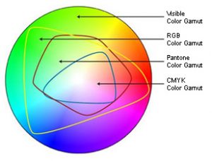
FAIL #3: Mixing process, RGB and spot color definitions in the same file. Color management can be a complicated process, but in general you should be aware of the “colorspace” your layout is created in and it’s intended output. Using spot or PMS colors in a design will require them to be converted at some point if you plan to print in CMYK. You can design in an RGB workspace, but be aware that colors will shift when the conversion takes place to offset or digital printing. A common mistake is also using spot or PMS colors in a file that contains transparency – ie, uses drop shadows, gradients, photo effects that incorporate transparent layers. Most programs will warn you to look out for “unexpected results.” They aren’t lying!
FAIL #4: When a different file type is requested than the one used, just change the file extension name by retyping it. Yes, this happens often! It seems like such a simple fix, but predictably, it changes nothing. A pixel-based tif or jpg file cannot automatically become a smooth, resizeable vector file just by typing a suffix onto the filename.
FAIL #5: When a vector file is needed, just drop your pixel-based image onto a page in Illustrator and save as .eps. This is similar to just changing the file extension in the name. When a vector file is required – usually for spot color separation or to be resized for smooth output at a large scale – a file type that is pixel-based will not become a vector file by simply placing it into a program that is vector-based.
FAIL #6: Supply your logo or an image by right (or option) clicking on a website and saving to your desktop …or tell a printer just to go the website for the art they need. As a rule, the resolution of any art on a website will be too low for good print quality. Just count on it.
FAIL #7: Neglect to specify a PMS color match for a specific color output that must be exact. Remember, blue is never just blue.
So, all of those are common mistakes to avoid during file submission. The good news is there is one simple fix – talk to your printer! Call them on the phone and ask for guidance in preparing and transferring your files. They will be eager to walk you through any questions or problems you encounter. The advice is free, and will most likely save you additional pre-press charges that you can incur if they have to fix or adjust your files for digital or offset output. If you are dealing with an online printer and cannot get an actual person on the phone you have discovered one of the reasons they are able to offer lower prices: low standards for customer service.
Communication is the answer – it will save you time and money. If your service provider can’t provide the needed answers or doesn’t have time to chat with you, you have the wrong printer! The best advice, always, is to ASK YOUR PRINTER!