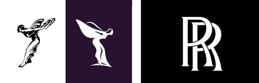
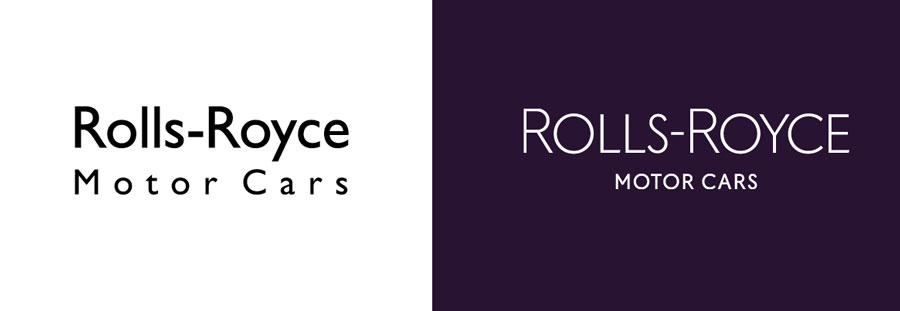
Rolls Royce has premiered a new identity for its Motor Cars division, a successful and elegant rebrand that illustrates how to move forward with digital-friendly marketing that remains true to the core identity of a luxury brand. Marina Willer and her team at Pentagram retained the RR monogram we all know, but updated and elevated other elements in usage, mainly the “Spirit of Ecstasy” symbol you will recognize as the hood ornament on the classic automobiles.
From small businesses to the big players, successful marketing is currently focused on making brands and logos “digital friendly.” Small screens and social media apps create visual perceptions differently than print. A great look in print can lose it’s vitality and impact within a smartphone app or digital ad. Designers are asked to solve this problem, yet retain continuity between the established look and style of the brand.
Below are several areas to consider when recharging a logo/brand to perform more powerfully on digital media.
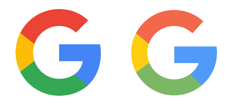
- COLOR: tweaking color for a more RGB-friendly environment can require one color for print, a slightly different one for digital. Some, like the PBS rebrand in 2019, went from black to a completely new electric “PBS Blue” in their digital overhaul.
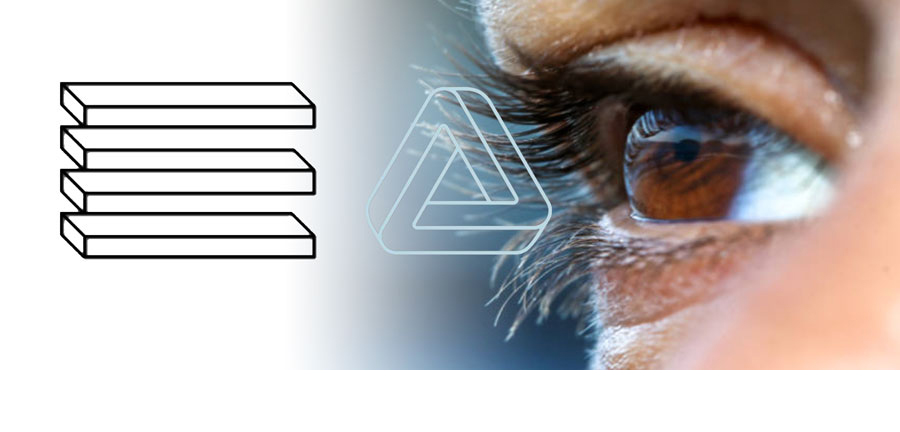
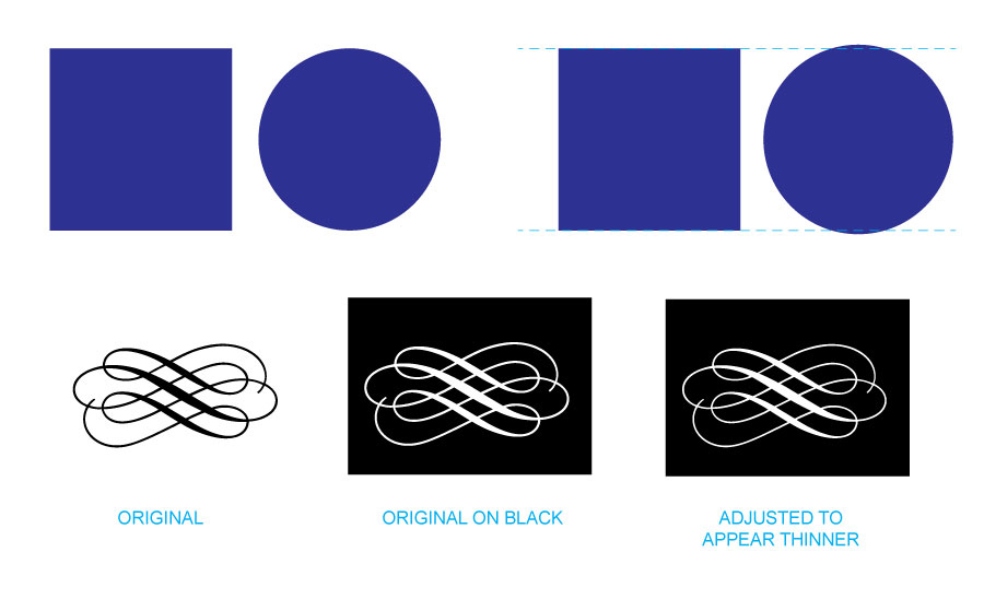
- SIMPLIFICATION: at small sizes or lower resolution, much detail or texture is either lost or unfortunately seems to “dirty” up the appearance onscreen.
- FLATTENING: probably the most common current trend for “digitalizing” brands, removing shadows, bevels, embossing, and any 3D effects can provide a logo’s shape and color with more visual impact on digital screens. The goal here is, again, simplification for a stronger impact.
- FONT CONSIDERATIONS: often typography on small screens calls out for changes in kerning, spacing and letter shapes both for readability and aesthetics. The challenge with an established brand is to remain true to the spirit of the historic typography but enhance it for greater success in digital channels. The great foundries are responding to this with the creation of multiple masters in typefaces to meet the needs of “microtype.”
- OVERALL BALANCE: just like with typography concerns, the relationship of the logo, wordmark, tagline, images, copy, or any other branding elements can need to change and update for better functionality onscreen.
Every brand can benefit from a “logo review” as our online identities expand and grow. The example of Rolls Royce above shows a smooth transition that maintains the integrity of the original brand expression but allows it to function more fully in a digital environment. An example of a brand struggling with that transition is pointed out over on Creative Review in a great article about the BMW refresh.
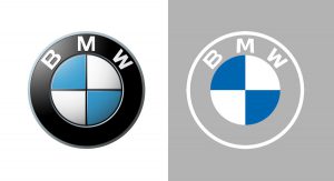
BMW’s well-known logo has a beveled appearance, matching the actual badge on the vehicles themselves. In trying to make a more digital-friendly logo, BMW tries to straddle both worlds by using a “flat” version for “communications” and retaining the other for use on vehicles and showrooms. Could be a confusing distraction. Both hold good inspirations for taking a new look at your current brand, logo, wordmark and marketing.
Call us at 828.684.4512 for any marketing needs. As a printer, we understand communication, design, and teamwork. Your printer should be able to provide you with the latest information, inspiration, technical advice, and innovative ideas for communicating your message through print, design and typography, signage, apparel, variable data printing and direct mail, integrated marketing and environmentally responsible printing. If they can’t, you have the wrong printer! The best advice, always, is to ASK YOUR PRINTER!
ImageSmith is now partnered with Extreme Awards & Engraving – our in-house partner providing custom engraved trophies and awards for employee recognition programs, sporting events, and promotional needs. With our new sister company, we will be sharing space, resources and expertise in a collaboration designed to further provide you with one place to meet all of your marketing needs… Under One Roof! Visit them online at www.extremeae.com or call direct at 828.684.4538.