Skip to content
ImageBlog

ImageBlog

Communication | Print | Web | Design | and Beyond

Posted on August 18, 2020 by ImageSmith

Optical Corrections: Designing for the Eye, not the Grid

Optical Illusions Optical Correction

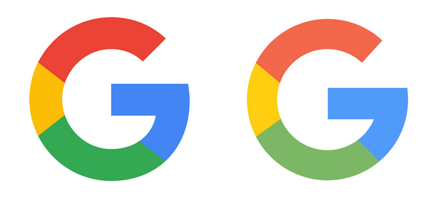
Recently we noticed a great blog post by Ian Paget over on LogoGeek about the importance of making Optical Corrections in logo design. As he points out, most designers are trained to work from a grid pattern, aiming to achieve perfect uniformity and  balance in layout and design. But too strict an adherence to the mathematical perfection of following a grid can create shapes that visually appear to be imperfect. Paget uses the great example of the Google”G” icon: when the overall shape of the G is a perfect circle, the crossstroke section appears to jut out too far to the right. Optically, the shape appears more circular with that area slightly smashed back in!

Optical Correction of Google G
Left: Actual Google icon. Right: With “G” in perfect circle shape, making it look somewhat distorted visually.

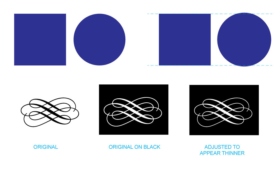
This post goes on to point out two important phenomenon that make optical correction more easy to understand: overshoot and irradiation. Overshoot involves slightly extending certain shapes past the  height or width of others in order to make them appear equal in size or weight. To the eye, a black square appears larger than a black circle of the same height and weight. Much of the art of typography depends on these optical adjustments. Irradiation is the illusion that when a shape is reversed out on a black background it often appears thicker to the eye.

Overshoot and Irradiation
Top: Overshoot is adjusting the circle to be slightly larger in order to look the same size as the square. Bottom: Irradiation phenomenon

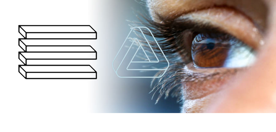
A previous ImageBlog post covers a couple of other similar optical illusions. A repeated curved pattern along a straight line can often make the line appear like it bends. Also, side-by-side gradients can trick the eye into seeing oneas darker than the other.

Optical illusions on press sheets
Left: repeating patterns can make a straight line appear to bend. Right: side-by-side gradients can make one side seem darker.

Ultimately, the eye rules. Great design is adjusted to satisfy visual perception, not mathematical specs. WAY back in 1987, Adobe came out with a great poster that really encapsulates the philosophy of “Bending Rules.” We’ve had this up on the wall throughout the years. Though in ’87, the poster dealt specifically with typography and typesetting, the same truth applies to all design. Rules are there for a reason, and are necessary for learning the basics, but perhaps the biggest rule of all is to design for the eye.

Adobe poster from 1987 Bending Rules
1987 Adobe poster on bending the rules of typography

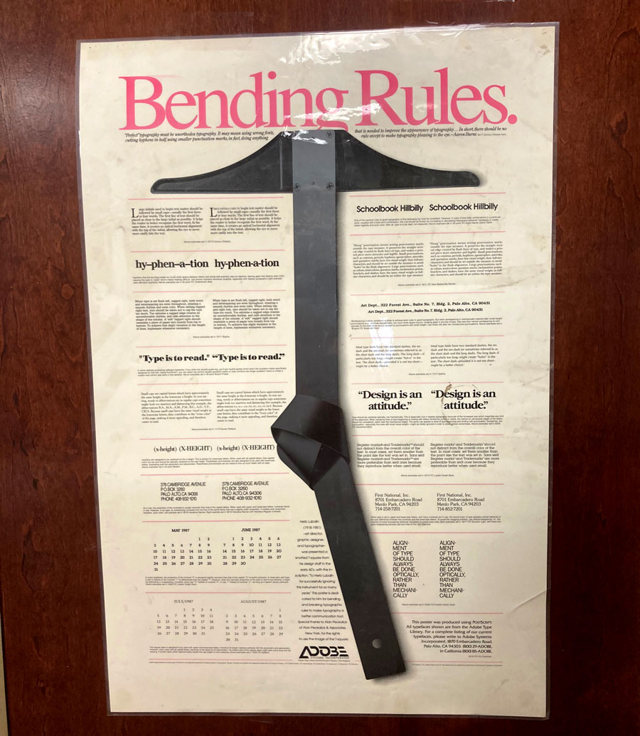
“Perfect typography must be unorthodox typography. It may mean using wrong fonts, cutting hyphens in half,  using smaller punctuation marks, in fact, doing anything that is needed to improve the appearance of typography…In short, there should be no rule except to make typography pleasing to the eye.” — Aaron Burns

Call us at 828.684.4512 for any marketing needs. As a printer, we understand communication, design, and teamwork. Your printer should be able to provide you with the latest information, inspiration, technical advice, and innovative ideas for communicating your message through print, design and typography, signage, apparel, variable data printing and direct mail, integrated marketing and environmentally responsible printing. If they can’t, you have the wrong printer! The best advice, always, is to ASK YOUR PRINTER!

ImageSmith is now partnered with Extreme Awards & Engraving – our in-house partner providing custom engraved trophies and awards for employee recognition programs, sporting events, and promotional needs. With our new sister company, we will be sharing space, resources and expertise in a collaboration designed to further provide you with one place to meet all of your marketing needs… Under One Roof! Visit them online at www.extremeae.com or call direct at 828.684.4538.


ImageSmith is a full-service print and marketing provider located in Arden, North Carolina. Contact us at ImageSmith for quotes on all your print and marketing projects, and more useful tips on how to create custom, effective, high impact marketing solutions.
CategoriesBranding, Creativity, Design, Graphic Design, Logos, Print, Typography, Uncategorized Tagsadobe, branding, design, graphic design, irradiation, logo, logo design, marketing, optical illusion, overshoot, print, typeface, typography

Post navigation

Previous PostPrevious Marketing Plan: Get More from Your Print Flyers
Next PostNext Microtype: Because One Size Typography Does Not Fit All

Recent Posts

  • ImageSmith Named a Top NC Printing Company by The Startup Pill
  • Post-Pandemic Plan: Is Now the Time to Rebrand?
  • Uplift and Empower with Promo Products for the Pandemic
  • Does Your Logo Need a Digital Refresh? Rolls Royce Did.
  • Microtype: Because One Size Typography Does Not Fit All

Recent Comments

  • Big Dog Love: the Canine as Logo and Brand Mascot - Printing Impressions on Big Dog Love: the Canine as Logo and Brand Mascot
  • Making Print Social: Interactive Media and Integrated Marketing - Printing Impressions on Making Print Social: Interactive Media and Integrated Marketing
  • Auto Generate QR Codes with Data Merge in InDesign CC 2014 | QR Code ® Artist on Auto Generate QR Codes with Data Merge in InDesign CC 2014
  • Auto Generate QR Codes with Data Merge in InDes... on Auto Generate QR Codes with Data Merge in InDesign CC 2014
  • Keeping Cool in the Juggling Act of Multichannel Marketing « Printing Hub Printing Hub on Multichannel Marketing Powers Print and Digital Success

Archives

  • May 2022
  • March 2021
  • October 2020
  • August 2020
  • March 2020
  • February 2020
  • May 2019
  • January 2019
  • December 2018
  • November 2018
  • December 2017
  • June 2017
  • February 2017
  • January 2017
  • November 2016
  • October 2016
  • August 2016
  • July 2016
  • April 2016
  • February 2016
  • January 2016
  • November 2015
  • October 2015
  • September 2015
  • August 2015
  • July 2015
  • June 2015
  • May 2015
  • April 2015
  • March 2015
  • February 2015
  • January 2015
  • December 2014
  • November 2014
  • October 2014
  • August 2014
  • July 2014
  • June 2014
  • May 2014
  • April 2014
  • February 2014
  • January 2014
  • December 2013
  • November 2013
  • October 2013
  • September 2013
  • August 2013
  • July 2013
  • June 2013
  • May 2013
  • April 2013
  • March 2013
  • February 2013
  • January 2013
  • December 2012
  • November 2012
  • October 2012
  • September 2012
  • August 2012
  • July 2012
  • June 2012
  • May 2012
  • April 2012
  • March 2012
  • February 2012
  • January 2012
  • December 2011
  • October 2011
  • August 2011
  • July 2011
  • June 2011
  • May 2011
  • April 2011
  • March 2011
  • February 2011

Categories

  • Awards and Personalization
  • Bindery
  • Books
  • Branding
  • Color
  • Color Management
  • Community
  • Creativity
  • Database Management
  • Design
  • Direct Mail
  • Embroidery
  • Entertainment
  • Film
  • Graphic Design
  • History
  • Integrated Marketing
  • Language
  • Literature
  • Logos
  • Magazines
  • Magnets
  • Mail
  • Music
  • Nonprofits & Charitable Giving
  • Paper
  • Photography
  • Politics
  • Popular Culture
  • Posters
  • Prepress
  • Print
  • Promotional Products
  • Promotions
  • Psychology
  • Screenprinting
  • Shop Local
  • Signs
  • Small Business
  • Social Media
  • Social Media
  • Style and Fashion
  • Trade Shows
  • TV
  • Typography
  • Uncategorized
  • Web
  • Web Developement
  • Wide Format

Meta

  • Log in
  • Entries RSS
  • Comments RSS
  • WordPress.org
Proudly powered by WordPress
Bitnami