Removable vinyl wall murals and wide-format graphics can recreate your office, showroom, factory or store. Custom wall murals, window graphics, even floor and ceiling graphics: take a look at some of the images below as an inspiration to what you can accomplish in your business or even home setting. These products are removable, repositionable, durable and fade resistant. Inspire your staff with a visually stunning workspace, or promote your brand in an eye-catching, innovative way that will position you for greater success in 2012. Call us to talk about this easy, affordable way to give your workplace a whole new attitude!
(ImageSmith Communications makes no claim to ownership of the images below. Click on the images to visit their original websites and view their ownership.)
Floor graphics can be visually stunning and useful, even in a warehouse or industrial setting. Form and function. The use of text as design is very effective in these examples, as they combine both the instructional intent of the signage with a visual aesthetic that intrigues and pleases the viewer.Make a memorable impression on the walls of your lobby, showroom or workplace with full color, vinyl murals that reinforce your brand.Perforated Vinyl Window Graphics take advantage of your most valuable, and probably underused advertising real estate… your lobby or store windows. They are removable, UV protected and can be visually stunning.If you’re inspired by Michaelangelo, a ceiling mural takes advantage of some more prime real estate.
Contact us at ImageSmith for quotes on all your marketing projects, and more useful tips on how to create custom, effective, high impact marketing solutions.
Tangible, portable, engaging, accessible, user-friendly, multiuse, renewable, versatile and creative… all great reasons to make print the foundation of your marketing campaign. Its very nature as a physical, rather than digital, object makes it effective and respected in the consumer’s mind. With advances in digital printing, the cost of print is even more affordable than ever for short or long runs. But by combining print with the new tools available online for personalized, trackable, interactive communication, you can boost your ROI with a truly integrated marketing campaign.
Print is user-friendly. All market segments feel comfortable viewing and reading information in print — therefore it can be used to lead those who are reticent about online purchasing or digital communications to check out your webpage, ‘click’ and follow a QR code, or visit their own personalized landing page (PURLs). Print is an easy stepping stone that works in coordination with online marketing to guide interested customers into a more interactive realm of communication and commerce. At the same time, print will reinforce your brand and online message in a concrete way.
With variable data printing (VDP), print is more user-friendly than ever. It speaks to each recipient in your database individually. From the printed contact, lead them to respond with more information about themselves and their interests, either online or by mail. With that information you have enriched your database and can target each customer in an even more personal way — trackable, multitouch, measurable results from your marketing dollars.
Contact us at ImageSmith for quotes on all your marketing projects, and more useful tips on how to create custom, effective, high impact marketing solutions.
Each December, Pantone chooses a “color of the year.” As the Pantone Matching System is used across all creative industries as a color standard, the annual selection has come to be influential for many designers and is chosen with careful consideration to the marketplace and overall consumer culture of the day. The color this year? Tangerine Tango (no, not reddish-orange!)
Pantone says the vibrant color “provide(s) the energy boost we need to recharge and move forward.” They call it “sophisticated but at the same time dramatic and seductive.”
The selection of a bright, high visibility hue is consistent with current trends in fashion and design that rely on loud, warm color choices over muted or more conservative ones. We’ve written in this blog before about “color psychology” which defines perceptions of orange as energetic but balanced, inviting, and best employed to give the feeling of movement and energy without being overpowering. Does PMS 7625C do it for you? Visit the Pantone website to download the color palettes for Adobe applications and begin to make reddish-orange… uh, Tangerine Tango… the star of your next marketing campaign.
Contact us at ImageSmith for quotes on all your marketing projects, and more useful tips on how to create custom, effective, high impact marketing solutions.
PDF stands for Portable Document Format… a friend of mine says it really stand for “Pretty Darn Fast.” And they do travel with much lower file size than your root documents and images. However there are many different “flavors” of pdfs that can be created with different end-uses in mind. Think of a pdf as a suitcase – you will have to decide what and how much to “stuff” into that suitcase so that everything needed at its destination will be there… and nothing that is not needed (therefore saving on file size).
Creating a print-ready PDF/X-1a file from your desktop application will save you time, money, and is your best bet to ensure error-free printing from your digital files. Unless you want your printer to be able to alter or edit your documents, just follow these easy steps to “pdf” your files.
Choose File – Export. At the bottom of the dialog box, for Format choose Adobe PDF (Print). See Fig. A below.
In the Export Adobe PDF window, you will initially start on the General tab (they are listed at the left). On this tab, at the top under Adobe PDF Preset, choose [Adobe PDF/X1-a: 2001]. This will adjust ALMOST all of the settings you need to create your print-ready file. See Fig. B below.
Click on the Marks and Bleeds tab. Under the Marks section, check the box for crop marks, leaving the others unchecked. Notice that the Offset is set to 0.0833 in. by default. Under the Bleed and Slug area, enter 0.5 in. bleed for all four sides and leave other boxes unchecked. Whether or not your document has a bleed, we prefer all PDF/X-1a files to be submitted with crop marks and the 1/2 inch bleed area around the outside edges. See Fig. C below.
And that’s it!
Figure A: File – ExportFigure B: the Export Adobe PDF windowFigure C: Crop Marks and 1/2 inch Bleed Area
These steps are specifically for Adobe’s Creative Suite and InDesign. You can create your pdf files directly out of PhotoShop and Illustrator as well. If you are using another desktop application, such as QuarkXpress or even Microsoft Word or Excel, all these controls will be there in different locations… you will still need to find where to select the PDF/X-1a preset and the accomodations for crop marks and bleed area.
We have many tools and tricks to adjust and control the output of properly made print-ready pdf files for offset printing. By using the pdf workflow, we bypass the problems of the past that included unwanted font substitutions, missing images, and accidental changes that could occur when reopening or editing root documents.
Contact us at ImageSmith for quotes on all your marketing projects, and more useful tips on how to create custom, effective, high impact marketing solutions.
Yes… you need a vector version of your logo! You may not be able to place or use it in a Word document, but for any high quality printing or output (or for spot or “2-color” printing) you should insist your designer supply you with the vector logo. Preferably, it will be the way your logo was originally created, and you will not have to pay or struggle to convert it from a pixel-based image after it has already become an integral part of your brand. Here are the reasons why:
Vector artwork can be scaled to any size needed and maintain its perfect clarity. They have crisp edges at any size as they are based on mathematical formulas rather than a bed of pixels.
They maintain a clear, transparent background when placed over other artwork or elements in your design. PNG files also have this ability but are pixel based so… (see reason #1)
They can function either in RGB or CMYK color modes as well as carry spot color definitions. You can select exact PMS color matches so that your brand is always reproduced consistently. While there are methods to include spot color information in a pixel-based file (DCS files from PhotoShop with spot color channels) they are, again, not resizeable and do not include easy trap information for printing.
You can easily switch a vector logo to a pixel-based file (.TIF, .JPG, .PNG, etc.) for manipulation, web use or other instances… but it is difficult and sometimes impossible to travel from pixel to vector in a satisfactory manner.
This last reason can be debatable and I am sure there are exceptions to the rule, but: as most logos need to be clean, vivid and memorable, vector shapes readily lend themselves to these qualities. The logos you know and remember are almost always designed as vector shapes rather than fuzzy, artistic brushstrokes or photographic effects.
WARNING: pixel-based files can be saved as EPS files, but be aware that just because it has an EPS suffix it has not been magically converted to a vector file. Also, pixel images can be placed into vector draw programs like Illustrator and saved as .AI or .EPS files. Again, not vector!
both of these images are .EPS files, but the one on the left is pixellated. The one on the right is a true vector logo.
Contact us at ImageSmith for quotes on all your marketing projects, and more useful tips on how to create custom, high impact graphics and marketing solutions.
Just as colors vary from the natural world to your monitor to print (see Color Printing 101: the RBG & CMYK Gamuts), black is never JUST black. Rich Black, Cool Black, Warm Black, “Plain” Black, “Designer’s Black”…. each has their own reason for being. It is important to know them all, because on your computer monitor they all appear exactly alike!
Below are the standard compositions for some varieties of black used in the printing world.
Using these wisely will enrich your design and allow you a spectrum of black to use for different effects. While designers use rich black for visual effect, printers occasionally rely on rich black to solve trapping issues when text is printed over a colored background. It can hide slight misregistration of plates that would otherwise result in a small gap in color.
In the RGB world of your monitor’s display, black (um… ‘pure’ black?) is composed of R0, G0, B0 (no light is emitted from any of the three channels). Regardless of how you define black for printing purposes, it will be rendered this way on your monitor and thus appear the same – a fact that has caused many bad results over the years. Photoshop has contributed to this with the fact that the “Fill with Black” command defines black as C100, M100, Y100, K100. The image you are working with may have a black area that will match perfectly onscreen, but once printed you will see the difference in your black and the rich black Photoshop used in the fill areas.
Left: on your monitor, a .jpg logo may appear fine, but Right: once printed you see Plain vs. Rich Black
Many times we have seen, for example, a .jpg or .tif logo with a black background placed onto a larger black background in a page layout program – onscreen the result if fine, but once printed you immediately notice the marked difference between the logo area and the black box onto which it was placed.
The use of rich black or its variants can enrich printed graphics, but remember that too much ink coverage on certain papers can create other unintended problems, especially when used over large areas of coverage:
damage to lower quality papers
problems with ink drying times
ink offsetting onto the sheet above or below
increased costs of production.
Always consult your print provider for guidelines or concerns.
Contact us at ImageSmith for quotes on all your marketing projects, and more useful tips on how to create custom, high impact marketing solutions.
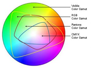
The science behind color itself is at the heart of printing – and key to meeting the expectations you have for a beautifully printed project. The first step in understanding the boundaries of printable color is to know that the human eye can detect much more color than is possible for your computer monitor to display. In turn, your monitor can show more colors than it is possible to reproduce in offset printing.
The best illustration of this is a color gamut comparison chart where you can actually see the ‘real estate’ involved in each spectrum. (It’s always seemed odd to me that we use this illustration either on a printed page or a monitor… both of which are limiting the actual colors they are trying to represent!) In the figure below, the entire color shape represents all the visible spectrum of light.
Color Gamut Comparison
The RBG color area represents the specific wavelengths of light your monitor emits, and is clearly a much smaller area. Even smaller is the CMYK gamut showing colors that can be reproduced with printing inks. Cyan, Magenta and Yellow pigments (K or Black is added to create depth, definition and ensure a true black color) work as filters that subtract certain wavelengths of light and reflect others. They combine to create a spectrum of printable color.
Switching a file from RGB to CMYK in PhotoShop on your screen can visually show you the color shift that occurs when you switch to a more restrictive gamut. Try it on a random image and see if you notice a significant loss of color. Some printers prefer you leave your images in RBG mode with ICC profiles attached, while others prefer you go ahead and switch to CMYK mode, as that will inevitably happen before the printing process.
Most cameras and scanners capture color in RGB mode (or to get even more technical, the “sRGB” mode, or a standard definition of what colors can be shown on a computer monitor, as opposed to all the RGB colors that can be seen visually with reflective light). Some cameras have the aRGB (AdobeRGB) definition or a selection called “Raw” – it can capture more colors digitally than you will be able to see, but may be helpful when you edit and adjust your photographs in an editing program such as PhotoShop.
Printing methods are able to reproduce only a certain gamut of colors as well. When files contain colors that fall outside of that gamut, the RIP process must decide what to do with those colors – i.e., how to alter them in specific ways to make them become a color which is printable – and this is decided by the Rendering Intent options of the RIP software or printer driver. Rendering intents are mathematical formulas that alter out-of-gamut colors in predefined ways.
When an exact color match is needed on your print project, consider using a spot color ink in your design. Metallic inks also can give a great effect that isn’t possible with combinations of just the 4-color process inks. Paper or media choice will also affect and enhance the quality of printed colors.
Contact us at ImageSmith for quotes on all your marketing projects, and more useful tips on how to create custom, high impact marketing solutions.
Color choice in design – whether you are painting a bedroom or developing a brand – involves a critical set of decisions that can easily lead your project astray. As in most things, some people have a talent for choosing color – its appropriate use, mixing and matching with other colors, varying hues and shades to create a desired effect – and they can do it intuitively. But for the rest of us, there is help – lots of it – in making color selections based on the security of a more scientific approach, or at least a time-tested one.
Good color selection for any project is critical to its success.
Please don’t choose a color for your website or print project based on the fact that you like green. It’s great to like green… but it may not be the most effective choice for the brand you are illustrating or effect you are hoping to create. Also, any color on the color wheel has an almost unlimited variation of hue and saturation that can take a warm color into the cool spectrum and a happy color into melancholy! The choice of secondary colors in your palette can also disturb or enhance the effect you are creating and must be selected with all of this in mind. A lot of things to think about – right?
Two great resources to get you thinking about what your color selection might convey: check out Andy Crofford’s infographic at TechKing.com for a beautiful illustration of the color spectrum and how each stop along the way can best be used in design and what it represents.
Another great infographic is from Kissmetrics.com, explaining how color selection affects purchasing among consumers.
Here’s a brief framework of color psychology basics (at least on the positive side – with changes in hue and saturation, these colors can take on societally defined negative connotations as well):
White: clarity, openness, simplicity Black: power, elegance, mystery Gray: calm, a conservative approach Brown: stability, hearth & home Blue: dependability, security Purple: wealth, nobility, creativity Green: balance, rejuvenation, spring Yellow: happiness, light, energy Orange: energetic, warm, autumn Red: passion, aggression, fire
Bear in mind, these are attributes Western society attaches to these colors. Many marketers have found out the hard way that these do not always hold consistent cross-culturally!
A great resource for developing a palette of colors to work with on any project is Adobe Color CC (formerly kuler) – built directly into InDesign and accessed with the Color Theme Tool. You can create various color themes with a simple click on any photo or artwork, add them to your swatches or export them into Creative Cloud Apps.
If your issue is the color paper you are printing on, Neenah Paper has both an app and an online Paper Selector to help.
Contact us at ImageSmith for quotes on all your marketing projects, and more useful tips on how to create custom, high impact marketing solutions.
Customized Microsoft Tag high-capacity barcode (HCCB)
We designed our first Microsoft® Tag high-capacity color bar code (HCCB) this week, incorporating a custom tag image. Microsoft® provides in-depth direction about creation and usage of Tags for print, electronic display, apparel, etc. at their Development Center website.
This is also where you will visit to generate the actual tag. The site is rich with information about tag usage, tracking and implementation in marketing campaigns. A quick read of the Implementation Guide provided here will ready you for Tag creation.
Step by Step Tag Creation
When you arrive at this site you will be prompted to create a free user account, from which you can create Tags in either color, black and white or (using dots instead of triangles) for custom Tag images.
There are 4 types of content for Microsoft® Tags:
URL tag: This is the default category of the Tag Manager. This tag will open the web browser on the mobile device and display the website you choose.
Free Text Tag: Sends a free text message to the user’s phone
vCard Tag: an electronic business card with 17 contact fields to send your information to the user’s address book
Dialer Tag: dials a phone number on the user’s smartphone
The resulting Tags are suprisingly versatile in form – they can then be manipulated in either Powerpoint or Adobe® Illustrator, customizing the look and appeal of the codes in a way impossible with the black and white QR code. (Again, the site gives you step by step guidance if you are unfamiliar with the software.)
Microsoft HCCB Tag Varieties
You can choose to create the Tags with dots rather than triangles, allowing more space for inclusion of a background image and a more intricate design. The limitations for customizing are maintaining the borders and white clearance space around the tag, and not changing the position of the dots. Otherwise, dots can be disguised by new design elements or hidden in fields of the same color, and any shape, color or image can be used in the open space between the dots. You are even allowed to vary the hue of the essential color dots themselves within a certain range. With some imagination, you can create an interesting graphic barcode that will be much more eye-catching for consumers to notice and hopefully ‘snap’ with their smartphone.
The Microsoft Tag Manager website is where you create a “category” taxonomy to organize your Tags and their usage. By default, a Tag will be designated with the category “Main.” To provide better results, you will need to decide on your taxonomy of categories up front. Tags can be moved from category to category, but only if they were created AFTER the category was defined. Here you will also be able to generate a number of reports to track, compare and chart data about the scans and performance of your Tags. By the way, all of this is free!
As this technology develops, Microsoft® is making new resources available under the Tag Manager. A new app now recognizes which type of smartphone or device is reading youre Tag and will provide that user with the appropriate user experience for their interface. You can explore this feature in the App Download Tag section.
Microsoft® requires, at least for now, that when you display their HCCB tags you include basic instructions near the Tag on how to download and use the Microsoft® Tag Reader application. Their preferred text is: “Get the free mobile app at http://gettag.mobi.” Overall, their Tag Developement Center web site does a great job in giving you the knowledge to get started with Tags in a clear way that won’t take all day to school yourself.
Contact us at ImageSmith for quotes on all your marketing projects, and more useful tips on how to create custom, high impact marketing solutions.
If you layout your 8.5 x 11 brochure for a tri-fold by splitting your page into 3 equal columns, it will NOT fold correctly. Text and images will appear off center once folded on several of the panels. The thickness of the paper during the fold must be accounted for to achieve a finished panel that is centered. The panels on the inside, being a mirror image in placement of the ones on the outside, must also be offset an equal but opposite (in the other direction) amount. The amount of offset, however, can vary depending on if you are printing on text weight, cover stock, or other paper types. Below you will find a general setup that works for a tri-fold brochure. (With InDesign, multiple page sizes are supported within one document so you can set up your different sized panels there as a 6 page document as well).
How to set-up a tri-fold, 8.5 x 11 brochure:
Allow a .375” margin on all four sides of the paper (unless you are sure you are printing on oversized paper to accommodate a bleed.) Two panels are 1/16” larger than the third. Pages 1 & 2 of your document must be set up INDIVIDUALLY with different panel widths, being mirror images of each other – see the diagrams below. Unless you are using heavy paper, an amount more than 1/16” will be far too much for a fold allowance.
The FRONT COVER or outside panels:
Panels 2 & 3 must be slightly larger than Panel 1.
The Back or INSIDE PANELS:
Panels 1 & 2 must be slightly larger than Panel 3 (the mirror image of the outisde setup)
Dimensions for the inside panels of a Tri-Fold brochure
Contact us at ImageSmith for quotes on all your marketing projects, and more useful tips on how to create custom, high impact marketing solutions.